
Most people pick an accountant the way they pick a dentist: Google it, open three tabs, go with whichever site doesn’t make them feel like they’re about to get overcharged. And most accounting firm websites make that decision hard. Same stock photos. Same “we serve individuals and businesses.” Same buried contact form.
We reviewed dozens of accounting firm websites and the ones winning clients answer one question fast: “can I trust you with my money?”
Avalon Accounting
Brand personality that makes accounting feel human

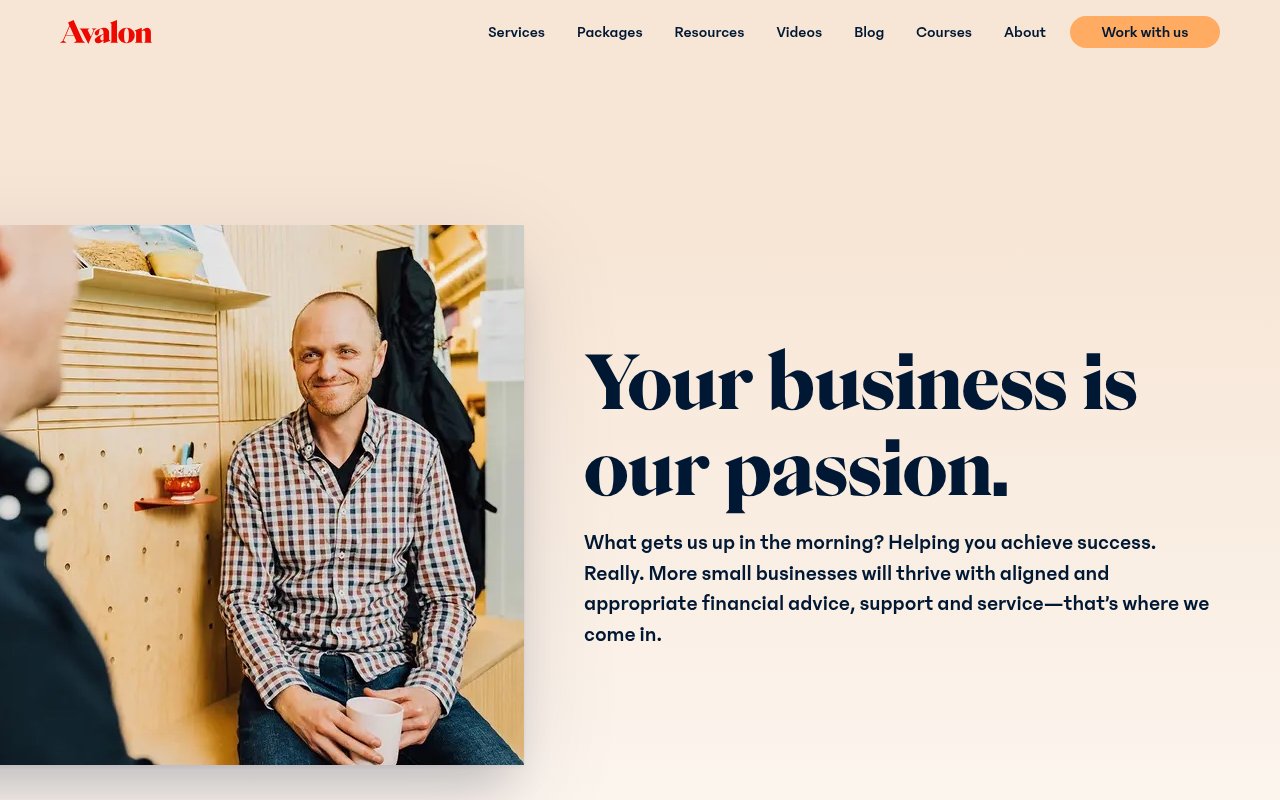
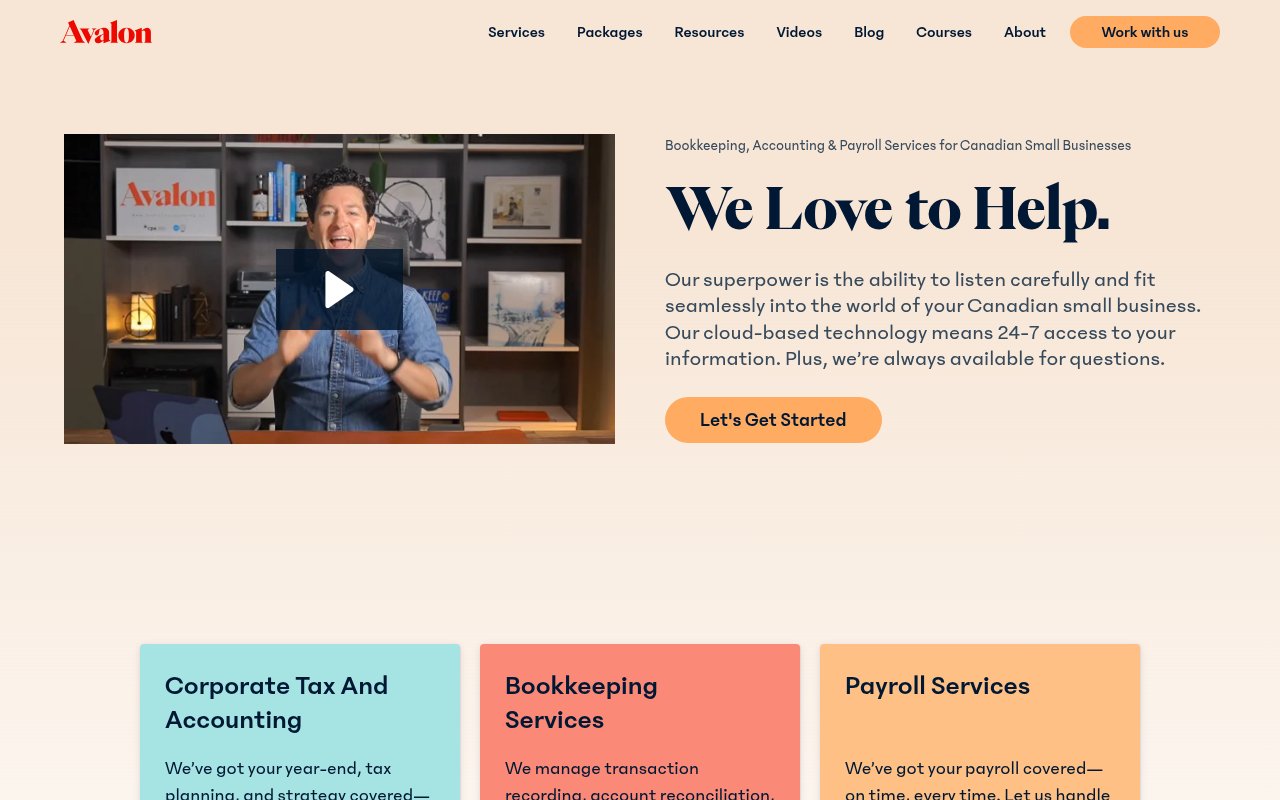
Avalon Accounting is a Canadian firm built on Webflow that looks nothing like an accounting website. Warm peach-and-cream palette, bold serif typography, candid team photos in their actual workspace. The voice is playful, direct, and occasionally funny. Accounting is a commodity, and the first firm that feels like real people tends to win the relationship.
The content goes deep: transparent tiered packages, a blog, video courses, and free guides. Seven named testimonials include titles and cities, including one noting the firm breaks complex topics down to a fifth-grade level. The team page lists 20+ staff by name with co-owner credentials.
The gap: no phone number and no live chat. The entire conversion path runs through forms and scheduled calls. For prospects who want to talk to someone now, that’s friction.
Taxes for Expats (TFX)
Multi-channel conversion machine for expat tax filers
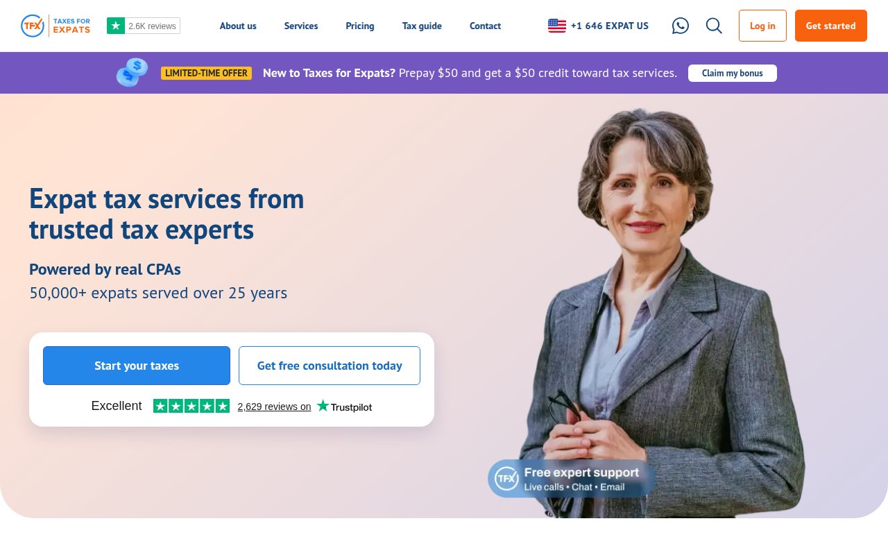
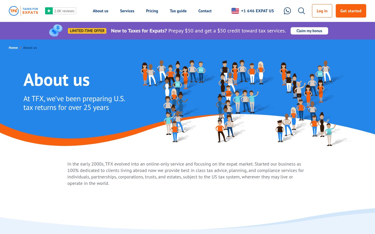
Taxes for Expats has the most complete conversion stack we found. Six conversion paths are visible without scrolling, from WhatsApp to a prepay-credit sticky banner creating urgency.
Social proof sits in the hero: a Trustpilot widget showing 2,629 reviews with a top-tier rating, plus 50,000+ clients across 193+ countries. Service pages cover expat tax compliance with specific pricing, and the site emphasizes that every return goes through a peer-reviewed multi-step process.
The about page uses cartoon-style graphics instead of real team photos. The firm claims experienced staff but never shows who actually works there. For a company handling sensitive international tax filings, that anonymity undercuts the trust the rest of the site builds.
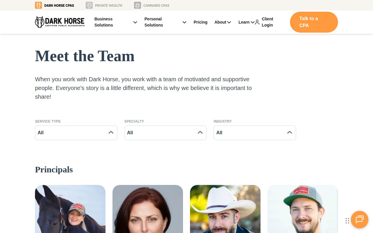
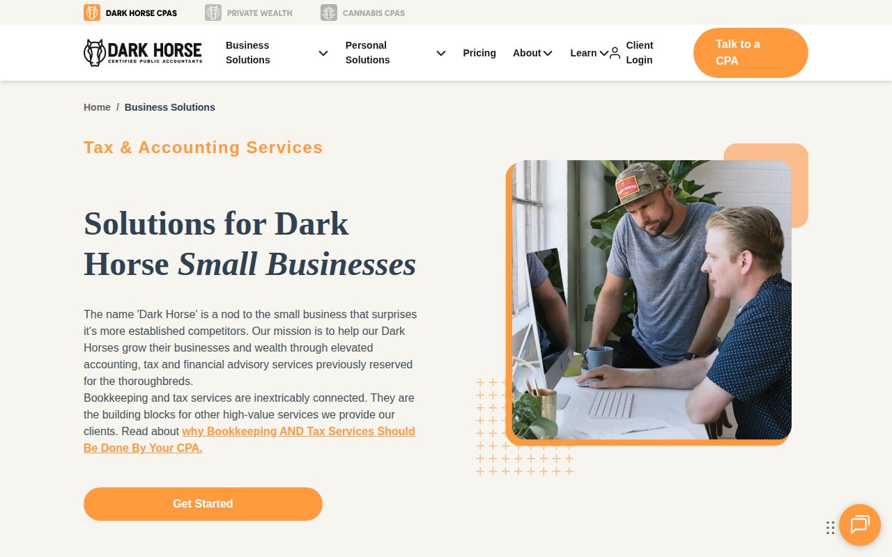
Dark Horse CPAs
Filterable CPA directory that matches clients to specialists
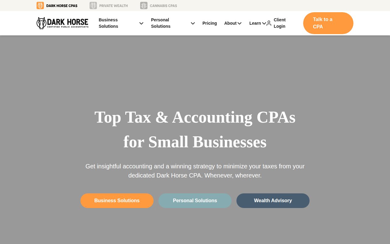
Dark Horse CPAs leads with three quantified metrics: 80% NPS (industry average is 38-39%), 550+ 5-star reviews on Google and Yelp, and 90% client retention. Each metric expands into an explanation. Numbers with context beat numbers alone.
The team page is a filterable directory where prospects search CPAs by service type, specialty, and industry. Casual branded photos (cowboy hats, horses) give the firm personality without looking unprofessional. It’s cloud-based with 40+ location pages and SOC 2 compliance, which matters for a firm handling financial data remotely.
The design is polished but not visually distinctive the way Avalon or Little Fish are. It reads as a well-executed corporate site rather than a brand statement.
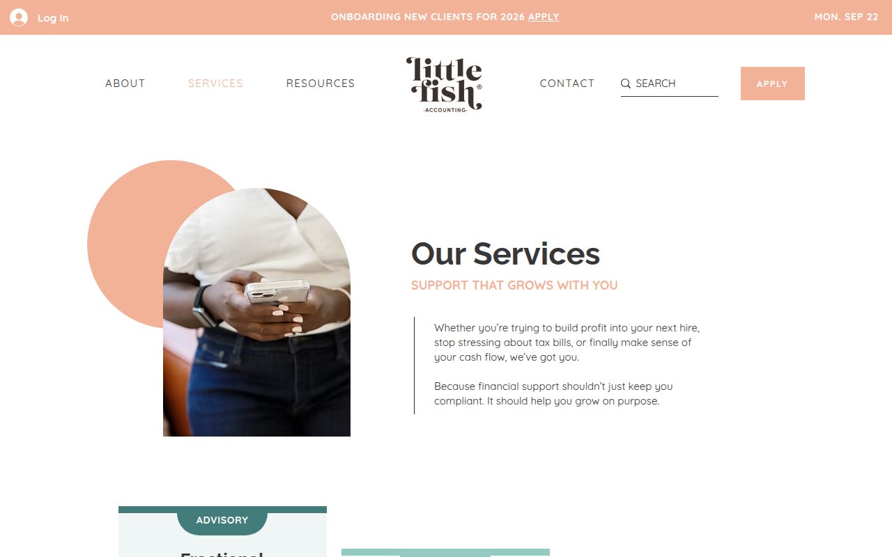
Little Fish Accounting
Boutique brand design that flips the CPA-client dynamic
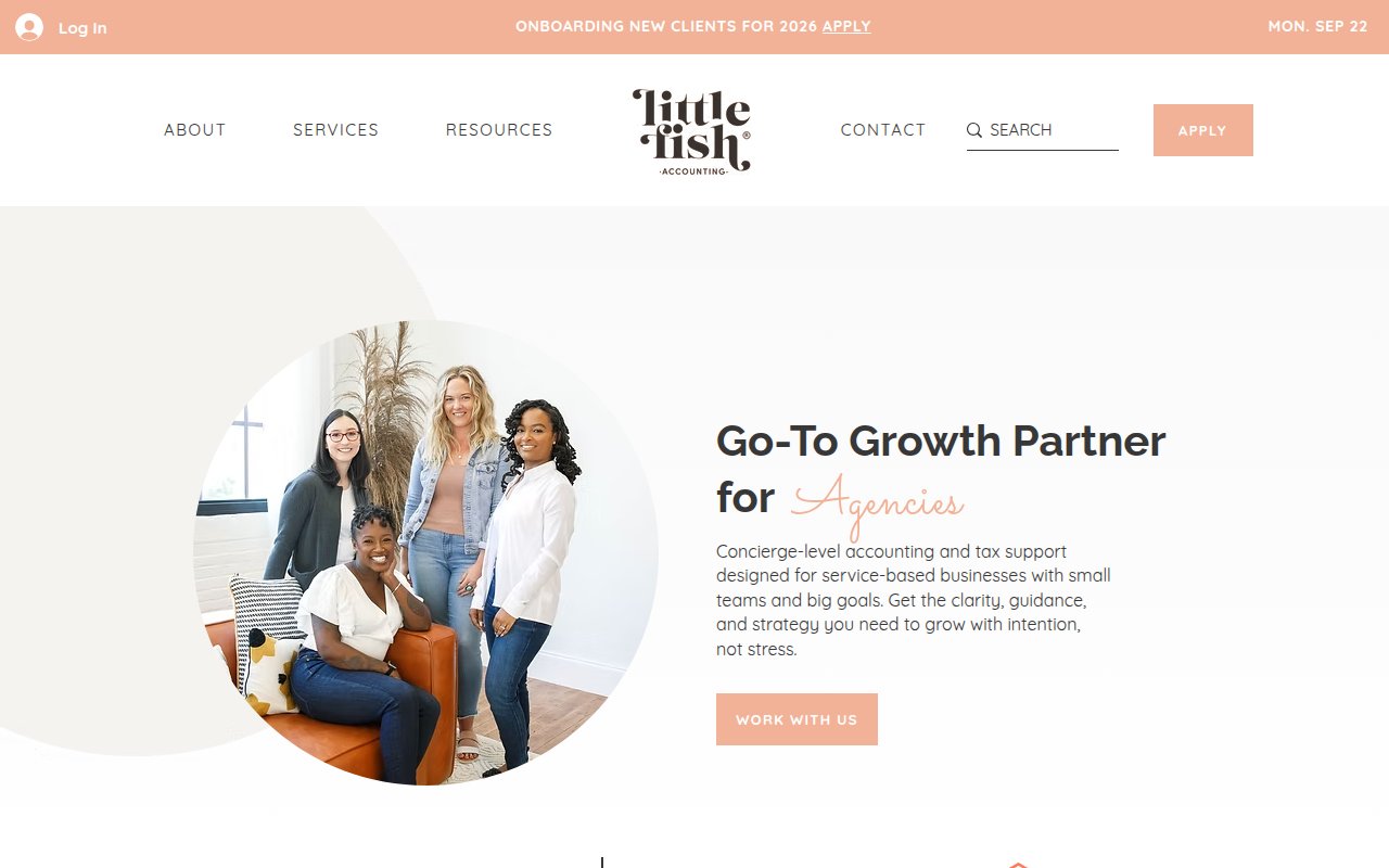
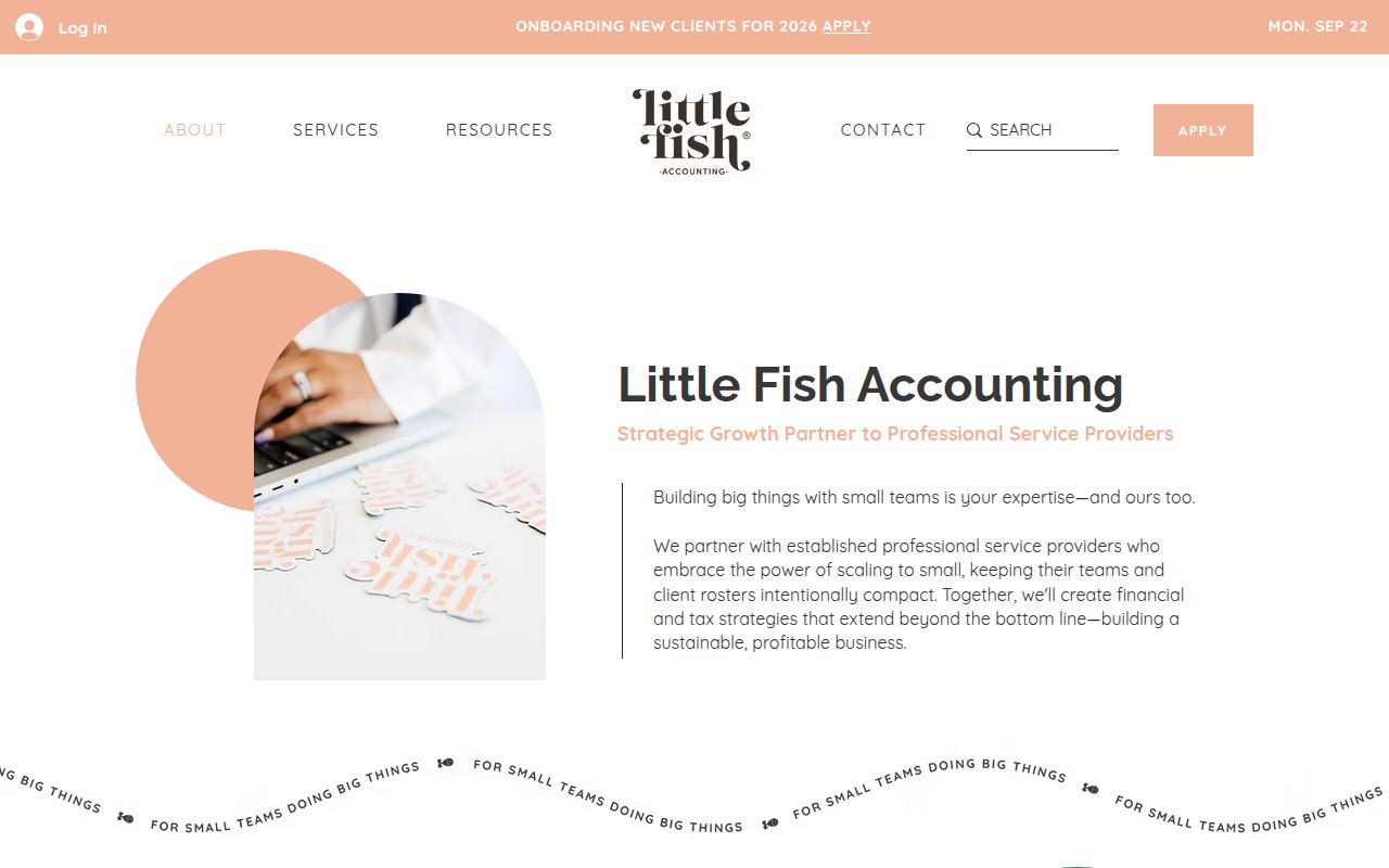
Little Fish Accounting uses an “Apply” CTA instead of the usual “Contact Us,” signaling exclusivity. An announcement bar mentions they’re onboarding new clients, reinforcing scarcity.
The design looks more like a lifestyle brand than a CPA firm. Built on Squarespace. Founder Keila leads a team of six, and the service tiers scale from bookkeeping up to fractional CFO, so prospects can see a growth path with the firm.
Conversion is where it gets thin. No phone number, no chat, no embedded form on the homepage. The “Apply” framing works as positioning but could frustrate prospects who want to engage quickly. Social proof is limited to one named testimonial from a CEO and a few badge logos.
David French CPA
Premium dark design that signals generational wealth advisory

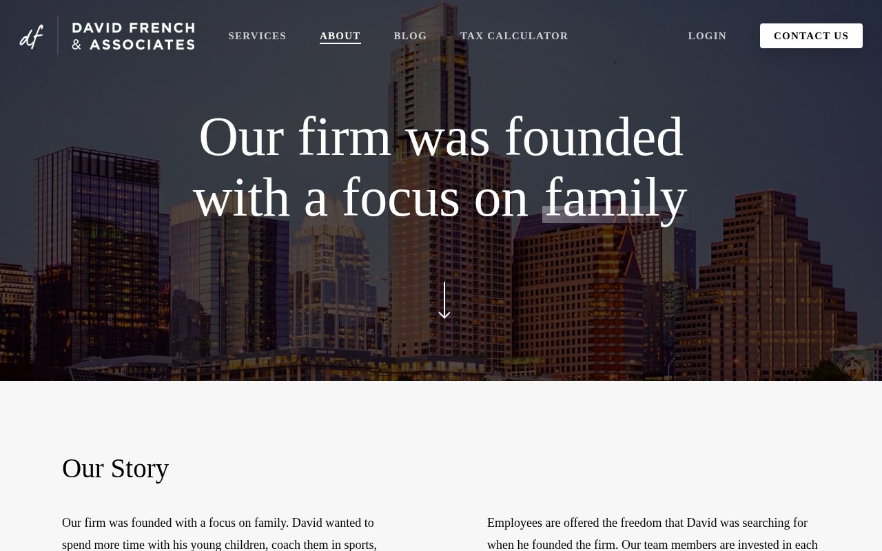
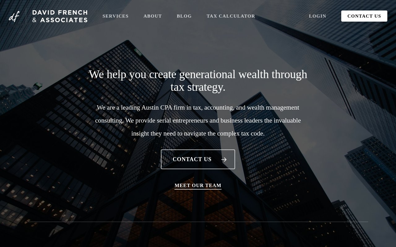
David French CPA looks more like a private wealth firm than a CPA practice. Dark design, architectural photography, and messaging centered on generational wealth through tax strategy. It targets serial entrepreneurs and family offices. Built on Squarespace.
David left corporate life because “there was only room for one boss in his life” (his wife Samantha holds that title). Sister Kaycee runs daily operations. Real family and team photos replace the usual corporate headshots. Specialties cover tech startups, real estate developers, and other high-net-worth segments.
Conversion is the weak spot. There’s a contact button above the fold and a tax calculator in the nav, but no phone number, no chat widget, and no embedded forms.
Greenback Expat Tax Services
Instant pricing calculator for expat tax prep


Greenback Expat Tax Services has a tax prep cost calculator that gives prospects an instant personalized quote before committing. That’s rare in accounting.
71k+ successful returns and 190+ countries served, with a Trustpilot badge to back it up. Co-founders Carrie and David McKeegan were American expats in the UK in 2009 who experienced expat filing frustrations firsthand and started the company to fix it. A lead capture form sits above the fold alongside live chat and discovery calls.
The weakness is transparency. Team member listings use first names only (CEO Mike, Directors, Customer Champions) without last names. For a firm handling sensitive financial data, full names would strengthen credibility.
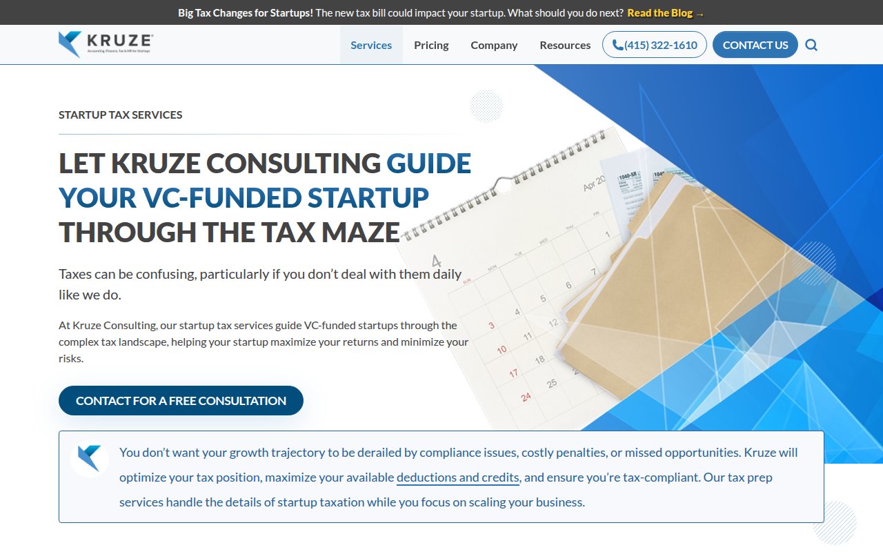
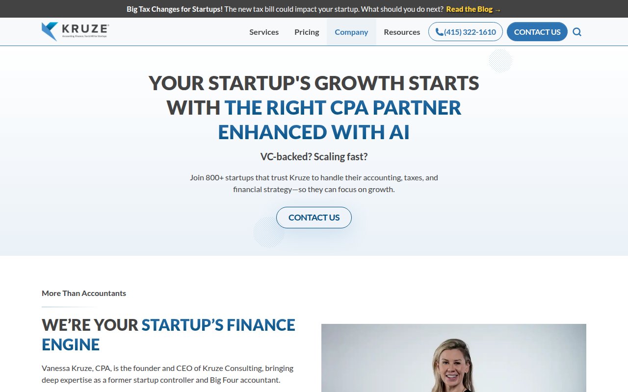
Kruze Consulting
Data-backed proof that clients are 2x more likely to be acquired
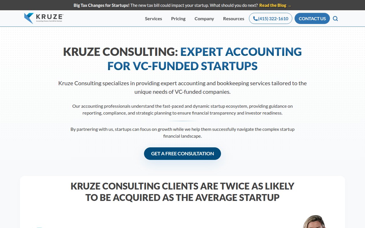
Kruze Consulting leads with a specific claim: Kruze clients are twice as likely to be acquired, backed by Carta data (5.2% of startups incorporated in 2018 were acquired versus 11.5% of Kruze clients). They also cite 800+ startup clients and $15B+ in funding raised.
Content depth is strong. They’ve built standalone pages for every service plus free tools like financial models and a CEO salary report that double as lead magnets. Founder Vanessa Kruze CPA is featured with a real photo and Big Four background. Pricing is transparent: three tiers from $650 to $1,500+/month.
The tradeoff is design polish. The homepage hero is text-heavy with no imagery above the fold, and the layout feels like a polished WordPress template. For a firm with 150+ employees and major VC clients, the visual design doesn’t match the brand’s market position.
Lewis CPA
Personal team bios that make accountants feel like people
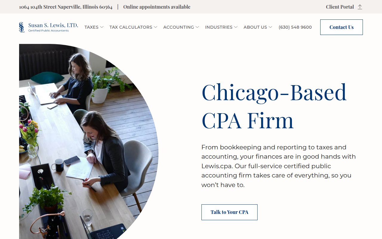
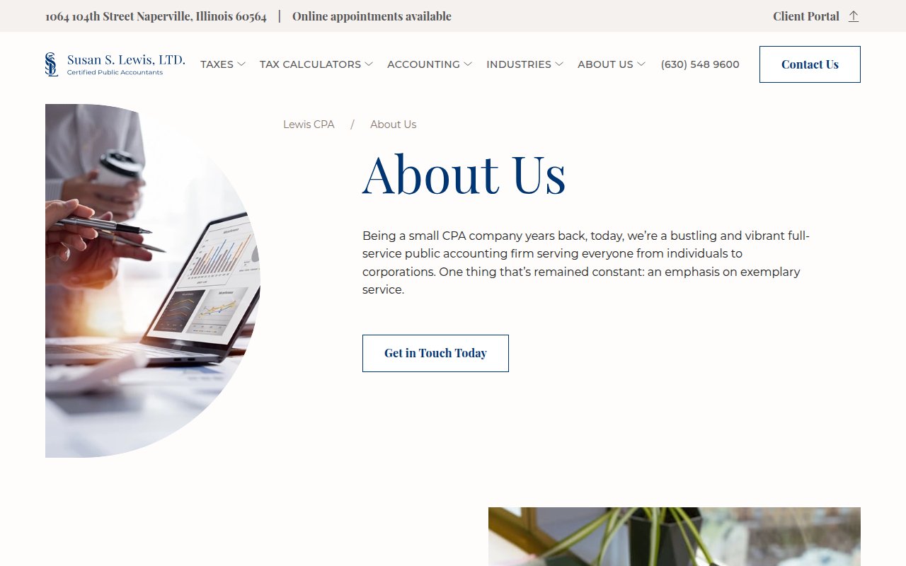
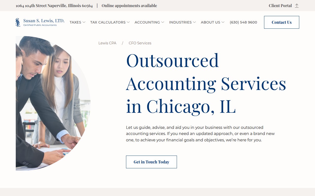
Lewis CPA is a Chicago/Naperville firm serving high-net-worth individuals ($1M to $30M+). Team bios include personal hobbies and interests. Founder Susan S. Lewis is named, and photos are genuine team shots.
The design splits the difference between premium and approachable. Conversion paths are well-covered, with a phone number in the header and a hero CTA that says “Talk to Your CPA” instead of generic “Contact Us.”
The quantified claims are big (4,000+ clients, 39 years, 52 states and territories), but not a single testimonial, review widget, or named client reference backs them up.
Founder's CPA
Startup-native positioning with $500M+ client funding proof
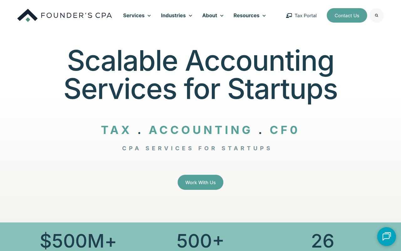
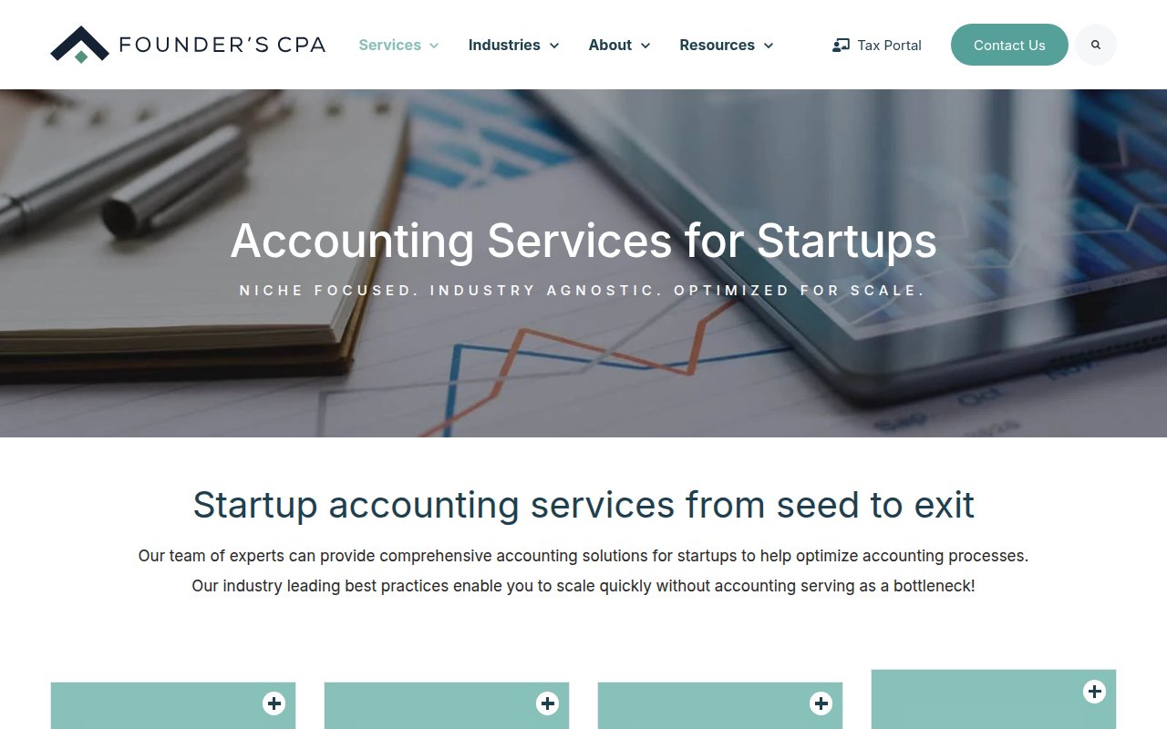
Founder’s CPA speaks exclusively to startup founders. The homepage leads with $500M+ in funding raised by clients, backed by accelerator logos and named founder testimonials.
Conversion is well-layered with live chat, free consultations, and an eBook lead magnet. The team page names all 26 members with credentials, and service pages are tailored to startup stages (including blockchain and crypto, which most CPA firms won’t touch).
The Squarespace base is clean but limits interactive features. The design is professional without being visually memorable, reading as competent rather than distinctive.
Haven
Fintech-style dashboard that reframes accounting as software
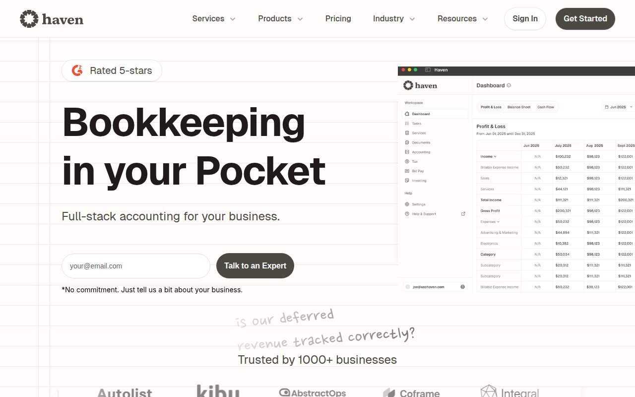
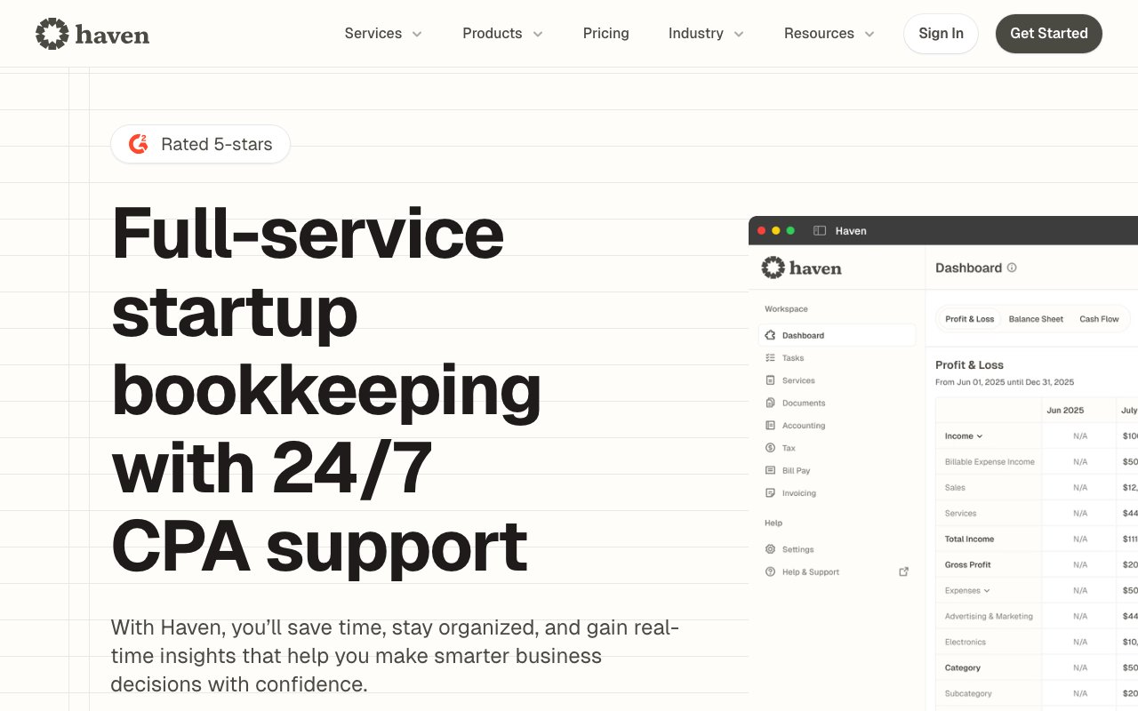
Haven looks more like a fintech app than an accounting firm. The homepage leads with a product dashboard mockup instead of a value proposition paragraph. A G2 five-star badge and 1,000+ client logos do the trust-building work, and a consultation CTA sits above the fold. Support runs through Slack, avoiding the need for clients to adopt new tools.
Where it falls short is people. There’s no team page at all. No founder photos, no individual bios, just a vague claim of Big Four experience with zero names or faces.
Lutz and Carr
Ballet photography that says "entertainment industry" without a word
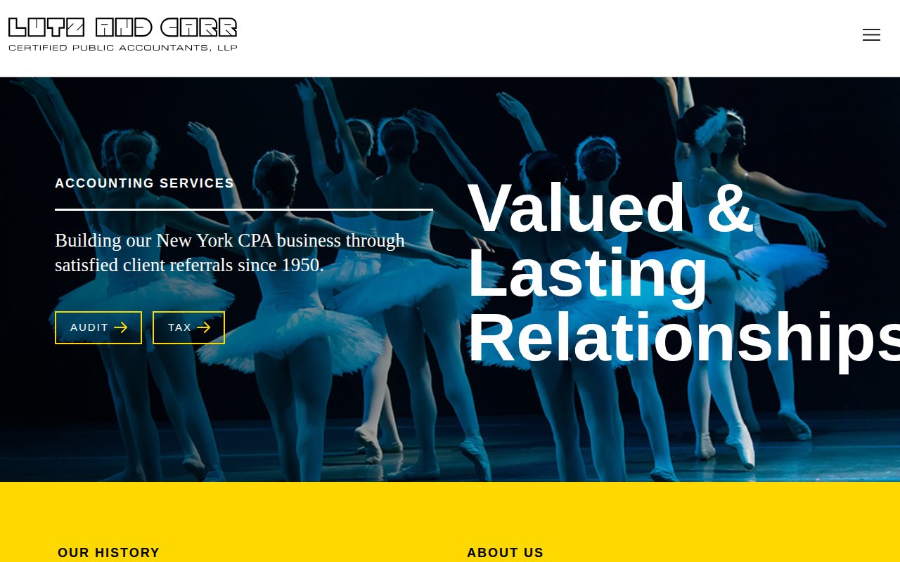
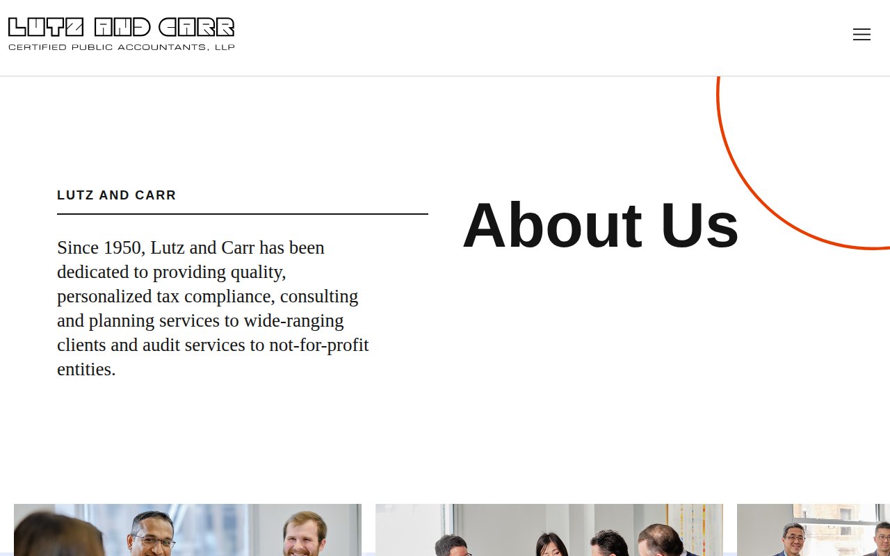

Lutz and Carr uses full-bleed ballet photography as its hero image, so you know who this firm serves before reading a word. This NYC firm was founded in 1950 specializing in entertainment, film, TV, and talent, and the custom design is clearly built for the arts community.
They’ve been at this since the 1950s with 9 partners and 50 staff. Partner Frederick J. Martens is named on the homepage.
Conversion is the biggest miss. Phone number and address are buried in the footer, there’s no above-fold consultation CTA, and the hero buttons link to service pages rather than conversion actions. For a 70+ year firm, the lack of a “talk to us” button is surprising.
Pilot
$99/month AI bookkeeping as a gateway to full service
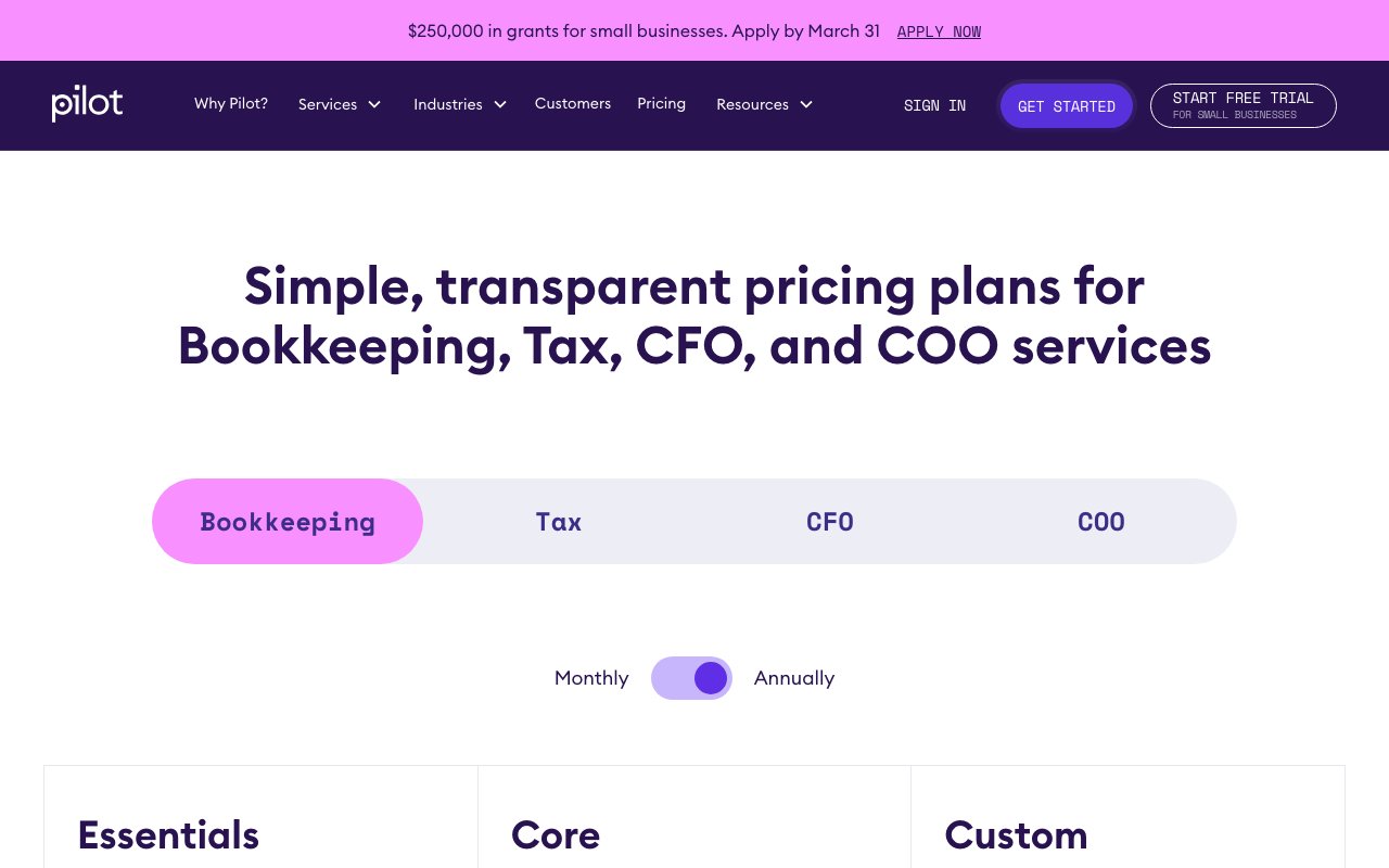
Pilot is backed by Sequoia, Index Ventures, Stripe, and Bezos Expeditions. Real team photography and triple CTAs above the fold. The $99/month self-serve Essentials tier with AI-powered bookkeeping creates a low-friction entry point that undercuts traditional firms on price and commitment.
The content library is large: free tools (burn rate calculator, founder salary report) that work as lead magnets alongside deep service and industry coverage. Three named advisory team members appear with real photos, including a former Fortune 500 Finance Director who has guided 75+ startups from seed to exit.
Social proof is the weak spot. They claim 2,500+ startups and link to case studies, but there’s no Google or G2 review widget, no star ratings, and no specific client outcome metrics.
CPA MOMS
Pain-point navigation that speaks to problems, not services
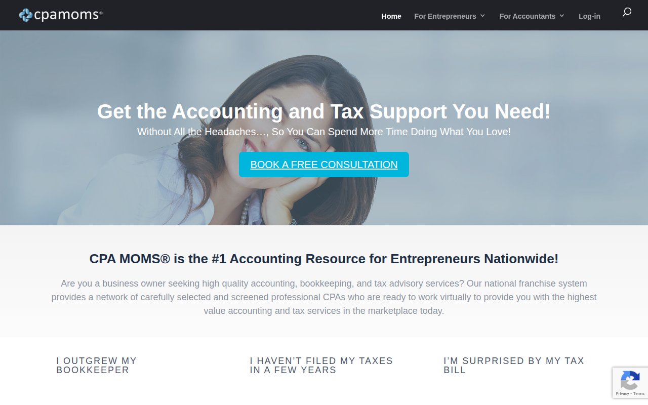

CPA MOMS labels its navigation as client problems (“I outgrew my bookkeeper,” “I haven’t filed my taxes”) rather than service categories. Prospects think in problems, not deliverables, so the menu matches their mental model.
The business model is unique: a franchise connecting entrepreneurs with vetted CPA moms nationwide. Video testimonials from named clients and a founder intro video carry more weight than written quotes, especially for a franchise model where prospects need to trust the system, not just one CPA. A free consultation CTA appears above the fold and is repeated mid-page.
SEO coverage is limited. The homepage, services, and about pages show nearly identical content (possibly a single-page scrolling design). No blog, FAQ, or location pages are visible, capping organic search reach.
Shay CPA
SaaS-style subscription pricing for startup accounting
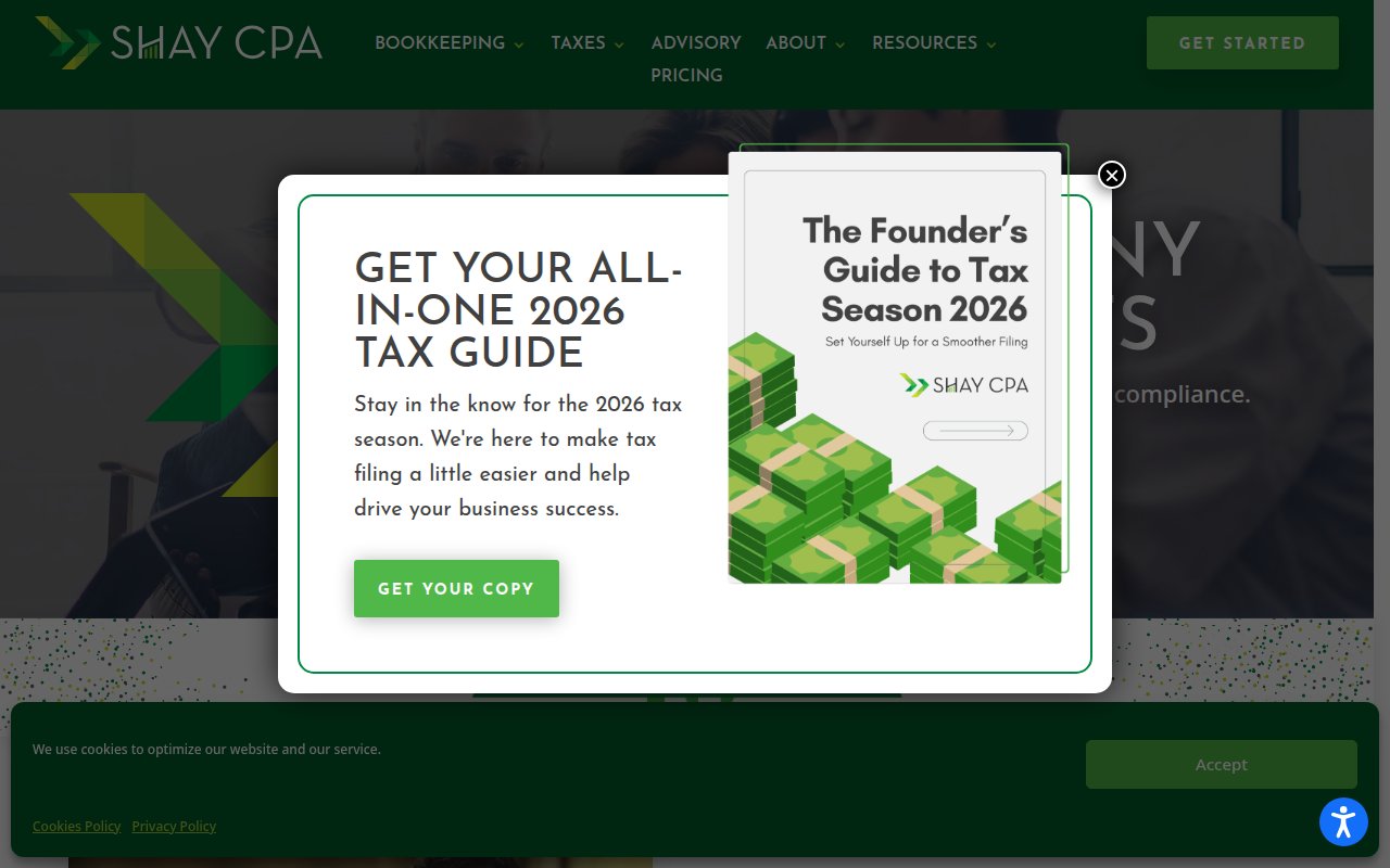
Shay CPA prices like a SaaS product: Starter at $600/mo, Seed at $1,500/mo, custom for Series A. Startup founders already think in monthly subscription terms, so the model fits.
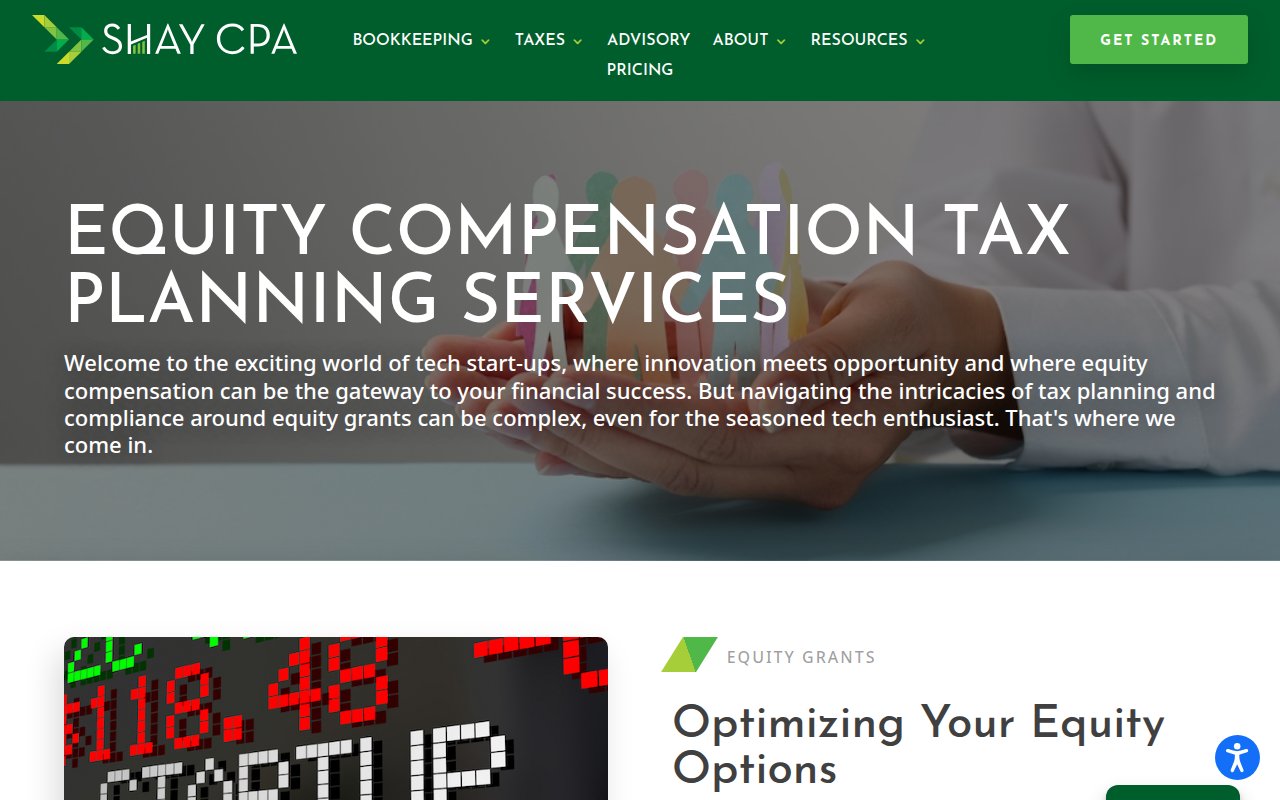
Social proof is ecosystem-targeted: named testimonials from startup founders, plus Y Combinator and other top accelerator clients. Service sub-pages cover equity compensation and R&D tax credits. There’s also a $1,000/year “Founding Year” package covering founder stock, SAFE notes, and Section 195 compliance.
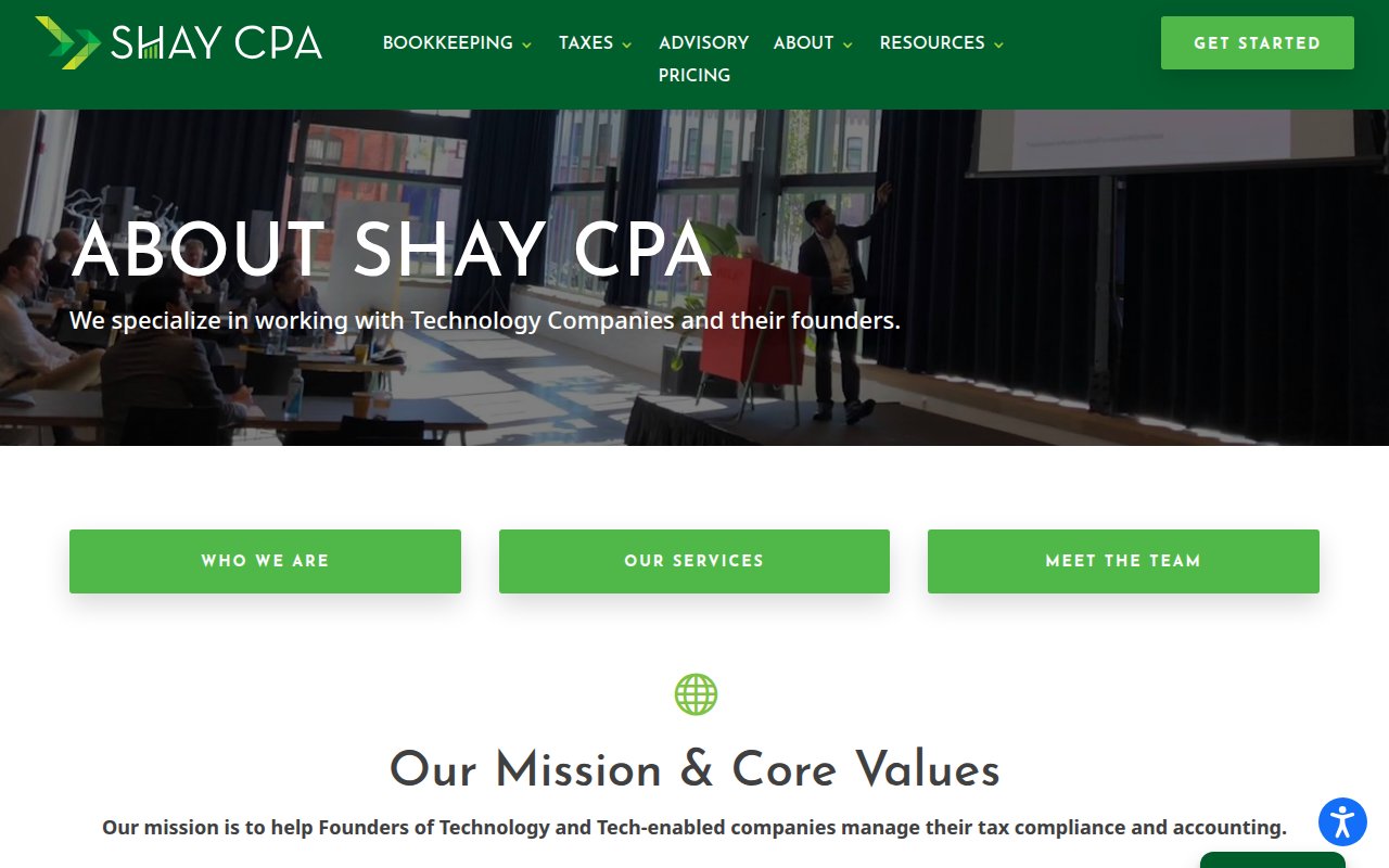
First impressions take a hit. The homepage popup (Tax Guide lead magnet) combined with a cookie banner creates visual clutter above the fold. Individual team bios and photos aren’t surfaced on the about page.
Probooks NY
28-year NYC bookkeeper with modern automation chops


Probooks NY pairs a 28-year track record with tech-forward positioning most traditional bookkeepers lack. Founder William Lee started Probooks in 1994, and four named team members with real photos round out the about page. Conversion is well-covered at every level, from a phone number in the top bar to booking links on individual service pages. The homepage claims over 10,000 monthly completed books. Service pages cover CFO advisory, bookkeeping, and workflow automations, with industry pages for several verticals.
Social proof is nearly absent. A reviews counter appears but no actual testimonials, and the homepage claims dozens of NYC small-business clients without naming any. For 28 years of history, the silence from past clients is conspicuous.
US Tax Help
Solo practitioner whose personal brand is the conversion engine

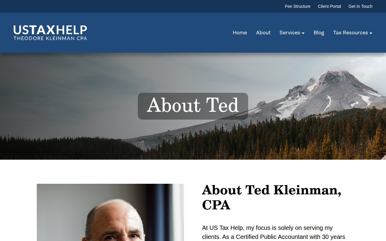
US Tax Help is a solo-practitioner expat tax site run by Ted Kleinman. Ted’s photo is the homepage hero, and his first-person copy positions him as a client advocate against the IRS. His bio: 30 years of experience, AICPA and OSCPA memberships, and personal history of living in Saudi Arabia, Korea, and Japan.
Google Reviews from named reviewers back him up, specifically praising his responsiveness and tax-treaty expertise. His service pledge is unusually direct: if he makes an error that results in penalties, he pays them himself.
The design is a modest-budget WordPress site. No chat, no scheduling tool, and the contact form gates submissions behind a fee-structure acknowledgment, which adds friction.
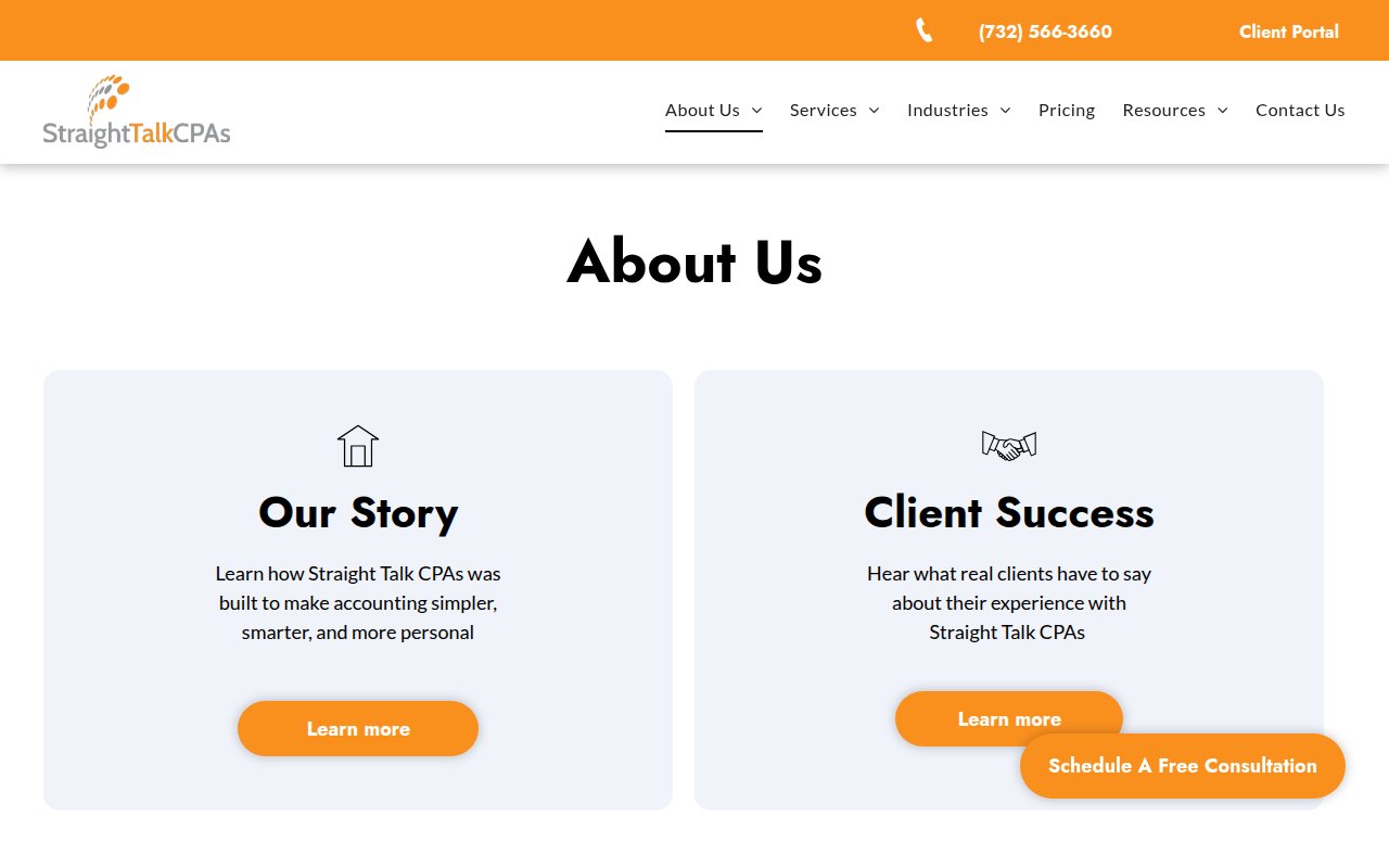
Straight Talk CPAs
Branded methodology that turns generic CPA into a system
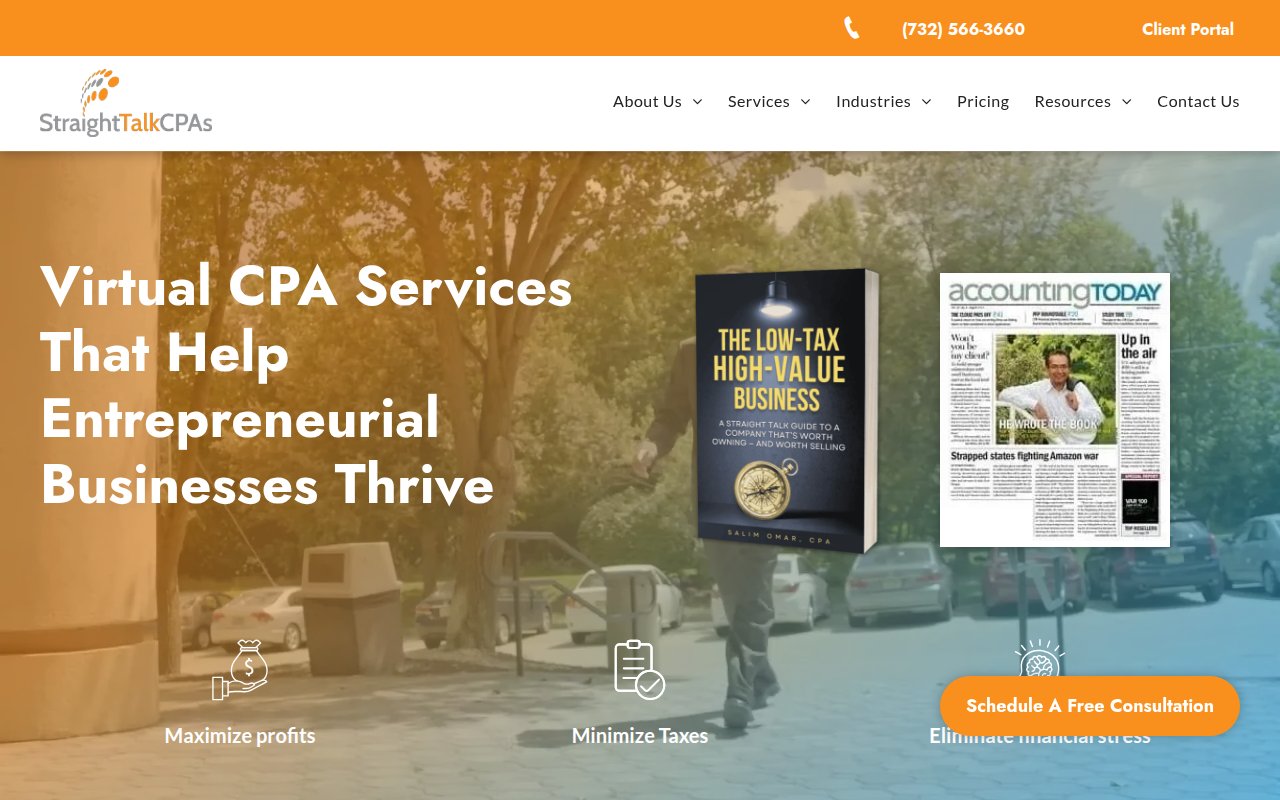
Straight Talk CPAs brands its methodology as the “Straight Talk Trifecta,” turning a generic three-step process into something prospects can remember. Founder Salim Omar’s book cover sits in the hero alongside media badges. A dedicated client-success page uses a challenge/action/result case study format.
Conversion is strong. A sticky phone number and floating consultation CTA follow you down the page, and an eBook lead magnet captures visitors who aren’t ready to call. The firm targets everyone from first-time founders to mid-eight-figure CEOs with fixed pricing, no hourly billing. SEO coverage is extensive enough to compete on multiple long-tail terms.
The rough edge is visual hierarchy. The hero is visually busy with overlapping images competing for attention, and the about page links to subpages rather than surfacing team bios directly. No actual team members are visible.
What the best accounting firm websites have in common
Niche specialization over generalist messaging
Nearly every top-performing site in our review serves a specific audience (startups, expats, HNW, entertainment) rather than "individuals and businesses." Specialization lets the visitor self-identify in seconds.
Transparent pricing visible before first contact
Most of the strongest sites publish pricing pages or calculators. Prospects comparing accountants have multiple tabs open and will skip any firm that requires a call just to learn what it costs.
Real team photos with names and credentials
The sites that scored highest on trust show named individuals with real photos, personal bios, and professional credentials. Stock photos and anonymous "our team" sections consistently correlated with lower scores.
Third-party review widgets, not just self-curated quotes
Trustpilot badges, Google review widgets, and G2 ratings carry more weight than testimonials you select yourself. The strongest sites embed these directly in the hero section where they're impossible to miss.
Multiple conversion paths at different commitment levels
The best sites offer phone, form, chat, booking, and self-serve options simultaneously. Different visitors have different comfort levels, and the firms that provide more entry points capture more leads. One CTA is never enough.
How to build your accounting firm website
-
Pick your niche and make it the first thing visitors see. The sites that score highest serve a specific audience and say so above the fold. “CPA for VC-backed startups” converts better than “accounting services for individuals and businesses” because the visitor immediately knows the firm understands their world.
-
Publish your pricing or build a calculator. Greenback’s cost calculator and Shay CPA’s tiered subscription pricing both reduce the biggest source of prospect anxiety. You don’t need to list every engagement to the dollar, but tiered packages with ranges show you’re not hiding anything.
-
Get real team photos taken. Hire a photographer for half a day. Shoot candid team moments, individual headshots with natural light, and your actual workspace. Avalon, Lewis CPA, and Little Fish all demonstrate that real photography is the single biggest visual differentiator between a site that builds trust and one that doesn’t.
-
Add a third-party review widget above the fold. Trustpilot, Google Reviews, or G2. Embed it in the hero or immediately below. Taxes for Expats puts their 2,629-review Trustpilot widget right in the hero.
-
Create service pages that match how your clients think. CPA MOMS labels navigation by client problems (“I outgrew my bookkeeper”) instead of service categories. Even if you keep traditional labels, each service page should open with the client’s problem, not your deliverable.
-
Offer more than one way to make contact. Phone number in the header, contact form, chat widget, and a booking link. The sites with the highest conversion scores provide 3-4 contact methods simultaneously. Every missing channel is a prospect who preferred that channel and left.
Key Takeaways
- Niche specialization beats generalist messaging. The strongest accounting sites serve a specific audience (startups, expats, HNW) and make that clear above the fold.
- Transparent pricing reduces the biggest friction point. Publish tiers, ranges, or a calculator so prospects don't bounce because they can't find what it costs.
- Real team photos with names and credentials build more trust than any copy. Stock photos and anonymous teams consistently correlated with lower scores in our review.
- Third-party review widgets (Trustpilot, Google, G2) in the hero section are more persuasive than self-curated testimonials buried in a subpage.
- Multiple conversion paths capture more leads. The top-scoring sites offer phone, form, chat, booking, and self-serve options simultaneously.
- Your visual design should match your target client. Dark and premium for wealth advisory, bright and approachable for startups, industry-specific imagery for niche practices.
How we picked these sites
We started with a broad scan of hundreds of accounting firm websites, filtering for companies with strong third-party signals: high Google Business Profile ratings, verified reviews on platforms like Trustpilot and Clutch, meaningful organic search traffic, and recent site updates. We also reviewed industry publications like Journal of Accountancy, Accounting Today, and CPA Practice Advisor to find firms worth evaluating that don’t necessarily rank on page one.
From that pool, we selected dozens of the top sites and scored each on five criteria: UX quality, conversion optimization, social proof integration, team authenticity, and SEO coverage. Every site got a multi-page review covering the homepage, services page, about page, and any standout pages.
The sites featured here earned the highest overall scores. Each one made the cut because it does something specific well, not because it’s the “best” at everything. The goal is a collection where every site teaches a different lesson.
Frequently Asked Questions
What makes an accounting firm website convert visitors into clients?
The accounting firm sites that convert best do three things: they signal specialization immediately (startups, expats, HNW, entertainment), they show transparent pricing or a calculator so visitors don't have to call just to learn cost, and they offer multiple contact paths (phone, form, chat, booking). The sites that scored highest in our review also featured named team members with real photos and credentials, which matters more in accounting than almost any other industry because you're trusting someone with your financial data.
How much does an accounting firm website cost to build?
Based on the sites in our review, range is wide. Multiple firms built polished sites on Squarespace (Little Fish Accounting, David French CPA, Founder's CPA) for under $5,000. WordPress builds with custom design run $5,000-$15,000. The venture-backed firms like Pilot have custom-built sites that cost $50,000+, but their results come from content and conversion strategy, not the tech stack. A Squarespace site with real team photos, transparent pricing, and specific service pages will outperform a $20,000 custom build with stock imagery.
Should an accounting firm website show pricing?
Yes. Nearly every high-performing site in our review publishes pricing or pricing tiers. Prospects comparing accountants have multiple tabs open, and they'll skip any firm that makes them schedule a call just to learn what it costs. At minimum, show tiered packages with monthly ranges. Kruze, Shay CPA, and Avalon all publish pricing pages and scored among the highest overall.
 12 Virtual Assistant Website Examples That Win Clients and Build Trust (2026)