What converts a visitor into a paying member is the feeling that this gym is for someone like them. The best sites answer that question (“will I fit in here?”) before they ever mention a membership price.
We reviewed dozens of gym websites across six criteria to find the ones doing this well. Here are the 12 worth studying.
Nosotros
Zero-risk trial stacked with money-back guarantee
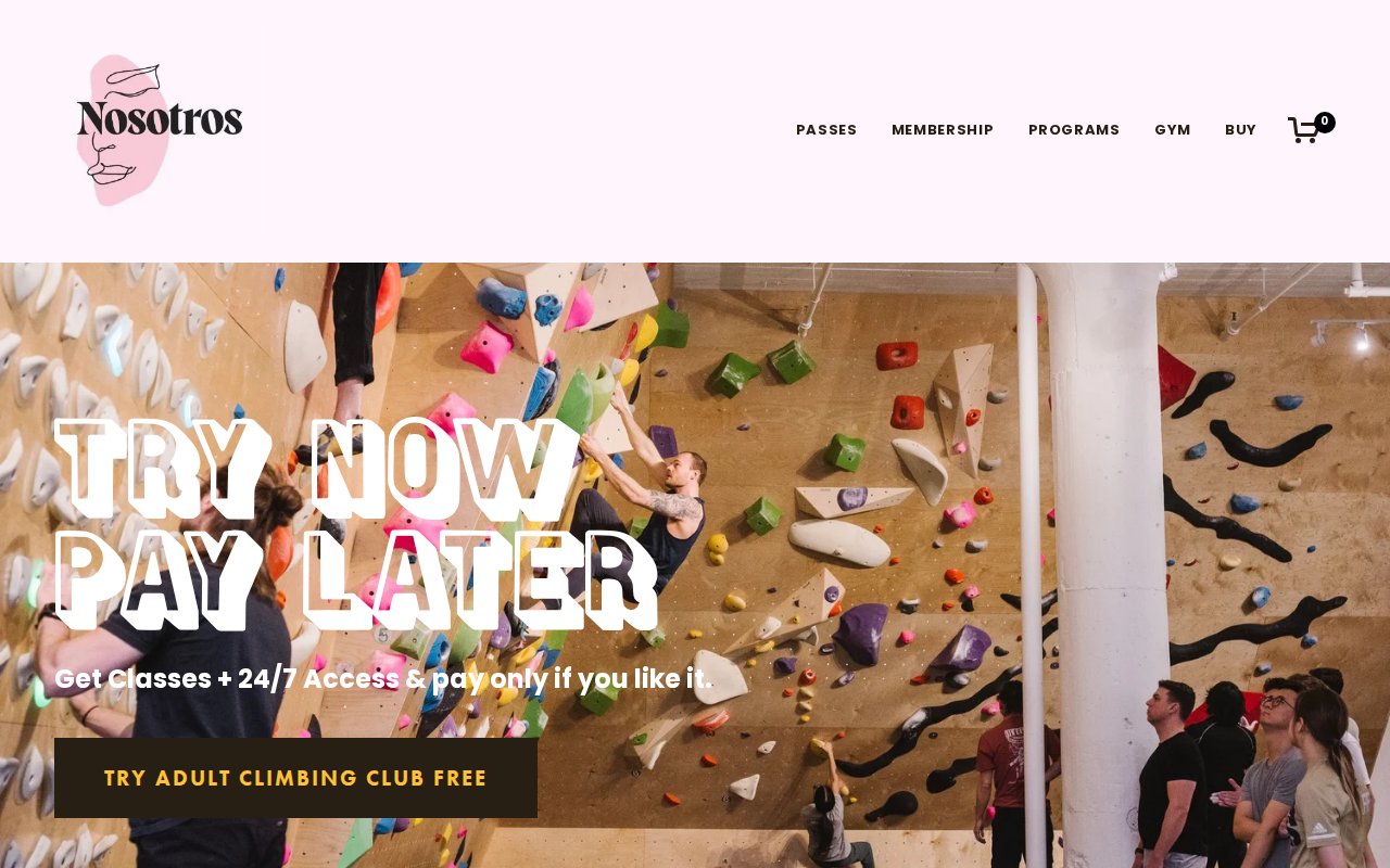

Nosotros opens with “Try Now Pay Later” as its hero headline. For a climbing gym in Cleveland where most visitors have never touched a climbing wall, removing the financial risk upfront is the right move. A free climbing club trial and 30-day money-back guarantee stack on top, and the barrier to walking in the door is basically zero.
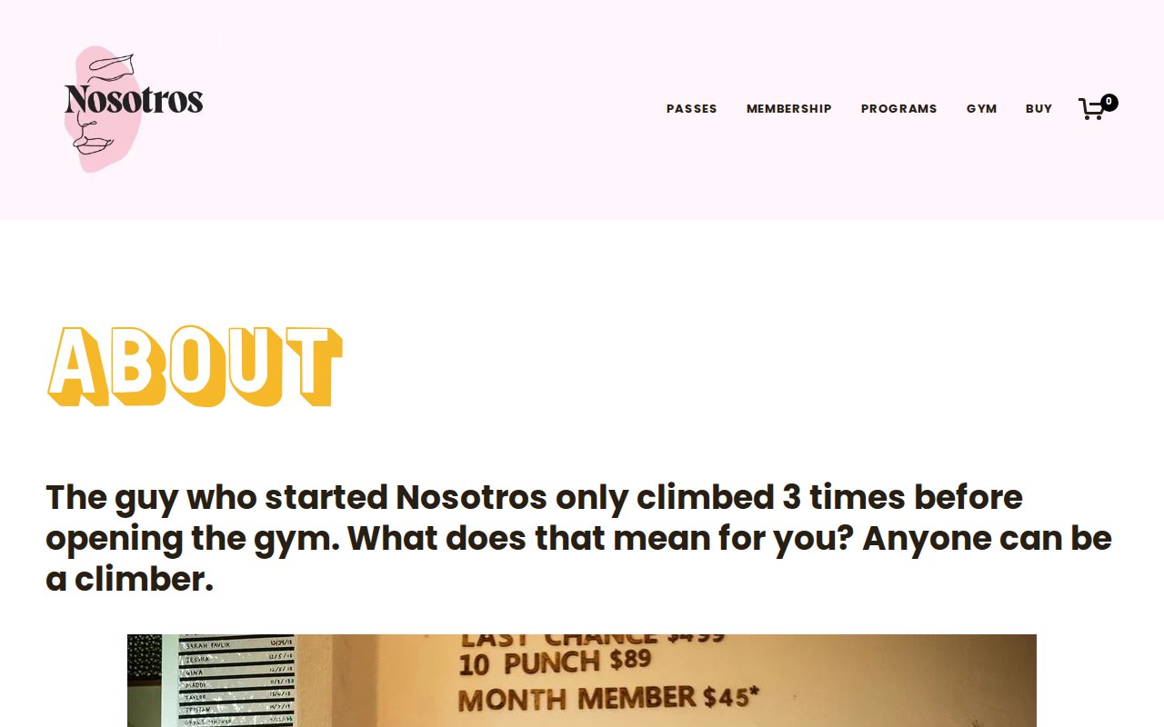
The about page tells the founder’s story of starting the gym after only climbing 3 times, and pricing is transparent ($79/month for 24/7 access, no “contact us for pricing” games). It’s a Squarespace site, and it holds up against competitors with custom builds.
The tradeoff is clarity. Some copy leans so hard into quirky that a visitor scanning fast might not immediately understand what Nosotros is.
Ethos Athletic Club
Best-in-class team page with categorized staff
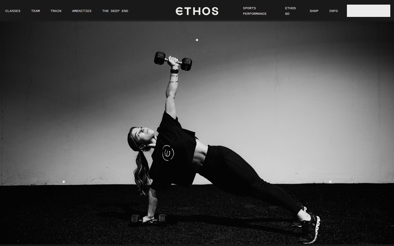
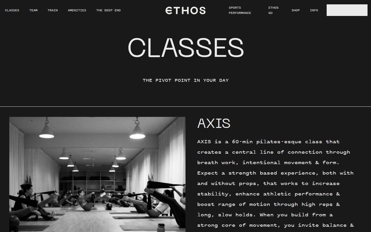
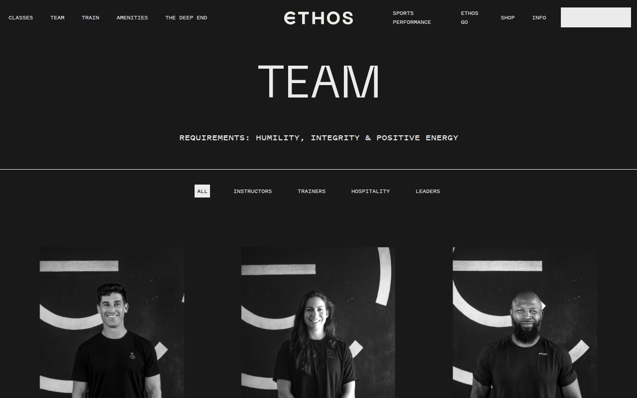
The team page on Ethos Athletic Club is the best we found in this research. Staff are grouped by role with real photos and expandable bios, so a visitor looking for a trainer isn’t scrolling past the front desk team to find one.
“Born From Resolve” as a tagline sets a serious tone without feeling exclusive. A sports performance sub-brand and their own booking app give a single-location gym the search footprint of a chain.
Where Ethos falls short is social proof. No testimonials or member reviews anywhere, which is a missed opportunity for a site that already invests so heavily in its team page.
EVERYBODY
Radically inclusive identity built from founder story
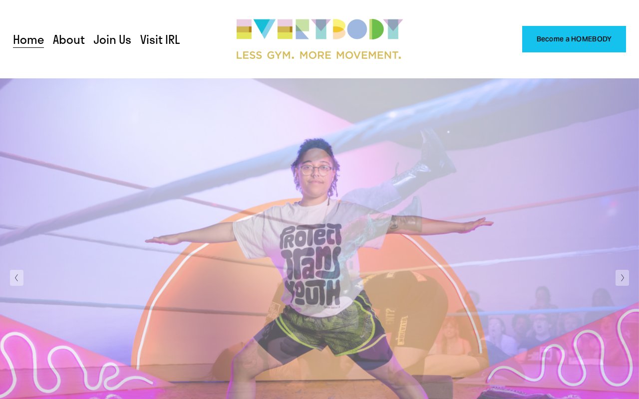
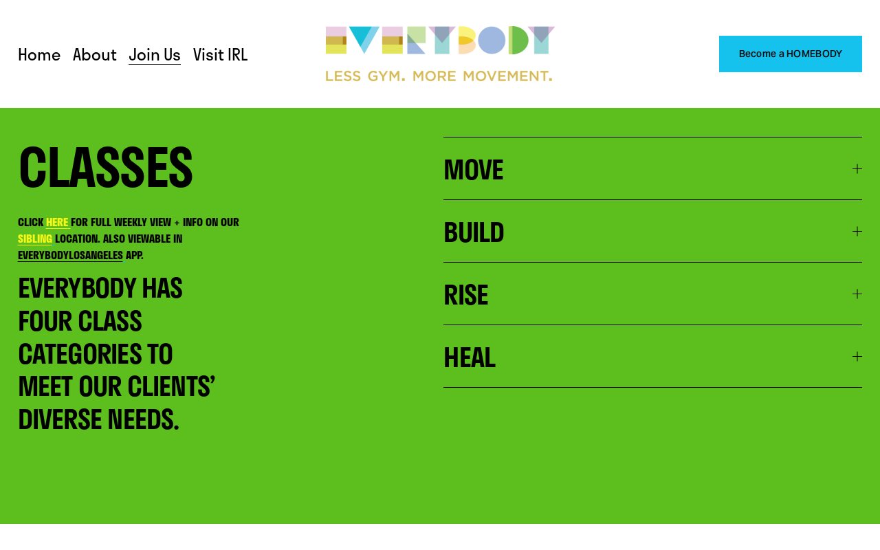
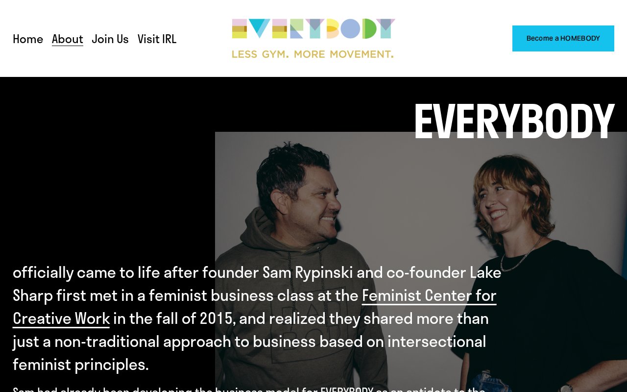
EVERYBODY’s homepage leads with identity. Founded by Sam Rypinski and Lake Sharp after meeting in a feminist business class, the gym was built as a direct response to oppressive gym culture Sam experienced before and after transitioning. The messaging makes the target audience clear from the first scroll.
Classes are named by outcome, not format (no intimidating jargon), and $14 drop-in pricing means a new visitor can try one without committing. The site runs on Squarespace with strong brand consistency, but the conversion mechanics are basic: no chat, no phone number, and the path from “I’m interested” to “I’m booked” takes more clicks than it should.
Equinox
Dual conversion CTAs for browsers and buyers
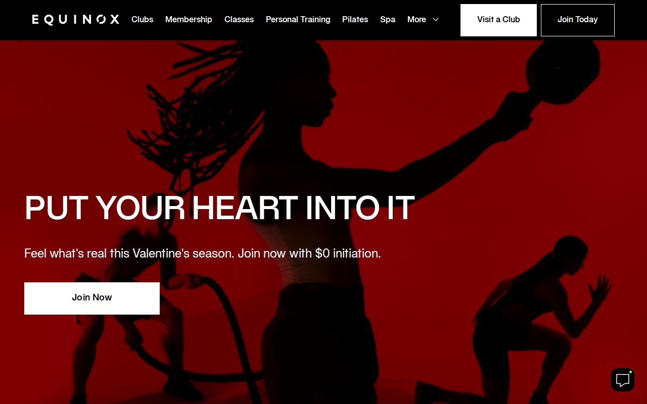
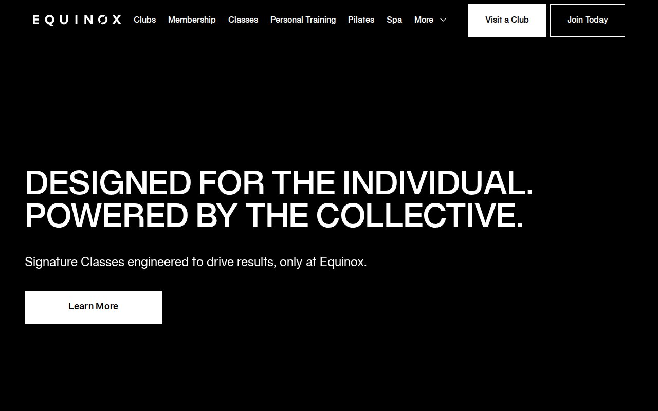
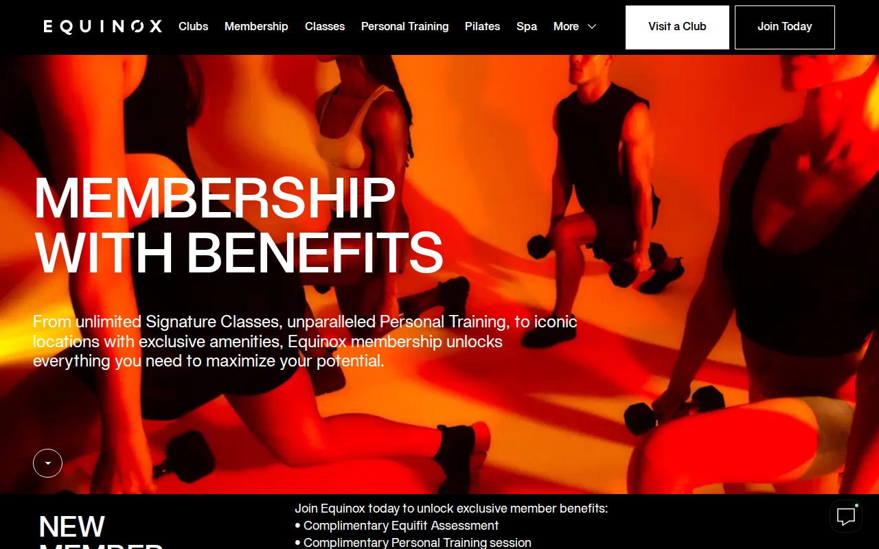
Equinox runs dual CTAs above the fold: “Visit a Club” for browsers and “Join Today” for buyers. The hero imagery looks more like a fashion campaign than a gym ad. The member benefits page explains what each perk actually feels like to use, not just that it exists. Optimizely for A/B testing and a Salesforce chat widget round out the conversion stack.
The obvious weakness: no team page, no testimonials, no real human faces. Equinox can get away with this because the brand itself is the trust signal. An independent gym trying this approach would feel anonymous.
Solace New York
Single-discipline niche for search authority
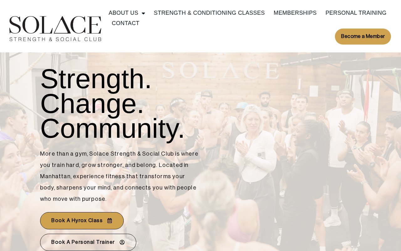
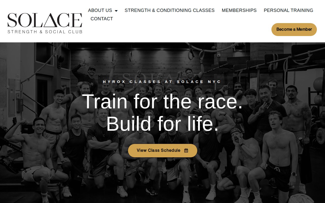
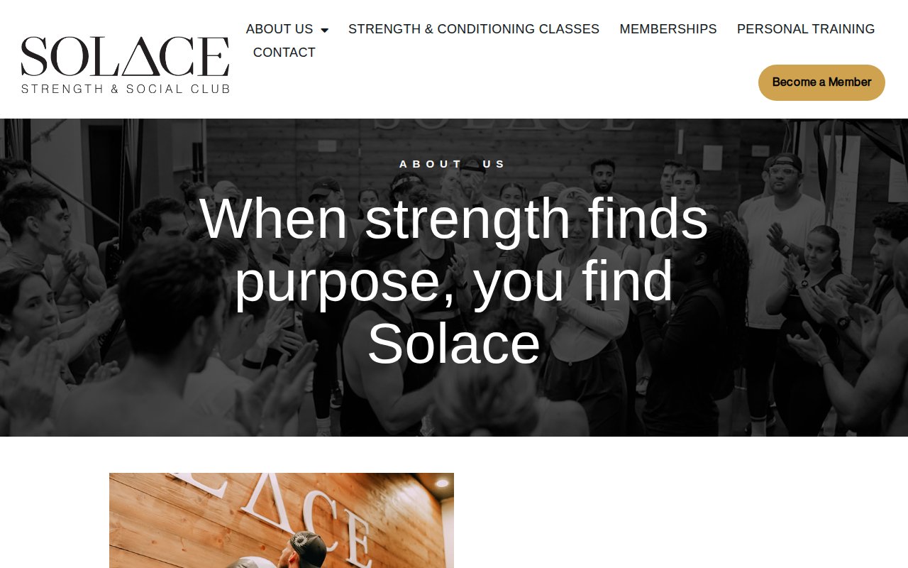
Solace picked HYROX and built their entire brand around it. Above-fold CTAs split by intent so no visitor type has to hunt. Someone searching “HYROX training NYC” lands on a site entirely about that thing, not a generic gym with a HYROX class buried in a dropdown. The about page frames fitness as empowerment, not pressure.
The missed opportunity is content. No blog, which is surprising given the niche positioning. A few HYROX training or race prep articles would compound that SEO advantage.
Dogpound
Scarcity and trainer personality as the pitch
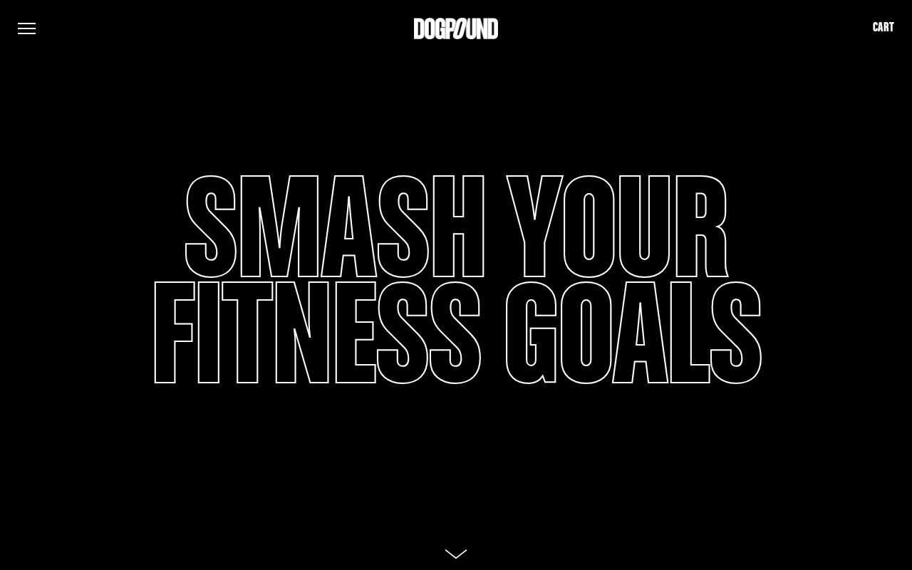

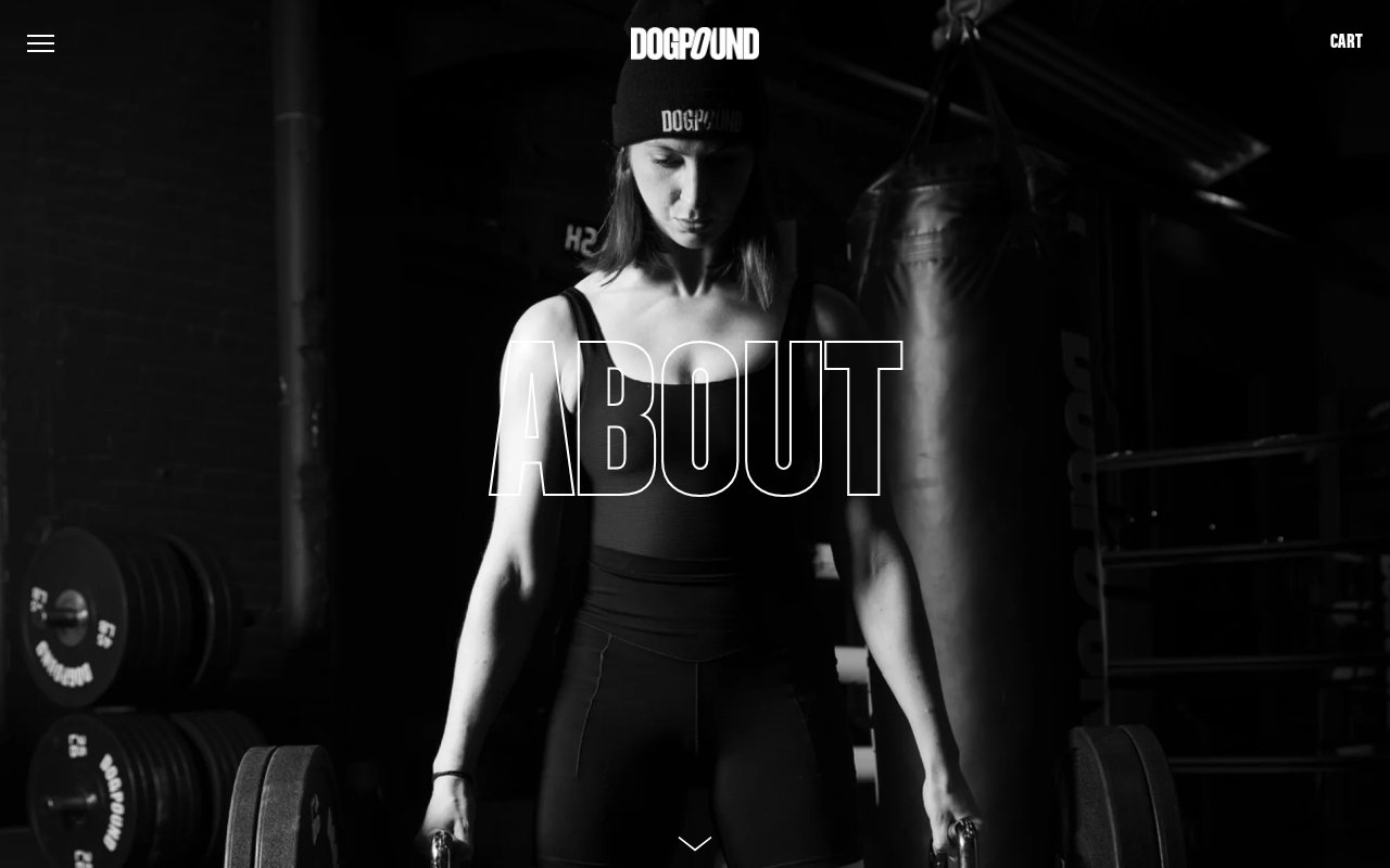
Dogpound has a 100-person waitlist and requires a referral to join, so the website doesn’t need to sell hard. What it does do well is the team page: every trainer gets a photo and a personal motivational quote, which gives each profile something worth reading beyond a list of certifications.
What’s absent is everything else: no pricing, no testimonials, no chat. For an oversubscribed gym, that’s deliberate. If you’re not Dogpound, hiding all pricing and social proof would cost you signups.
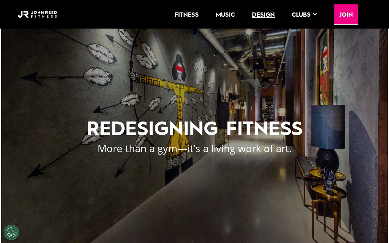
JOHN REED Fitness
Music-driven identity that breaks gym conventions
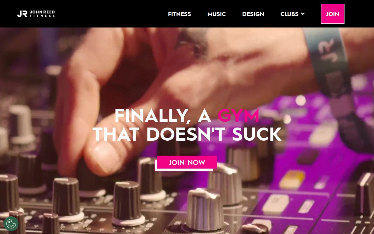
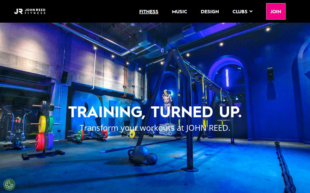
JOHN REED’s homepage headline is “FINALLY, A GYM THAT DOESN’T SUCK,” and the video hero leads with music and nightlife energy, not someone doing bicep curls.
The Design page treats each club’s interior as its own project rather than a chain template, which gives every location a reason to have its own landing page. No team bios, no testimonials, no member stories. The brand carries the personality, but the site feels more like an ad campaign than a community.
TMPL Fitness
Neighborhood-specific club pages
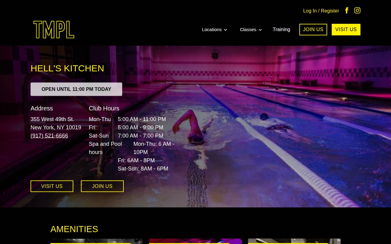
TMPL Clubs has six NYC locations, and each location page is built to rank for its own neighborhood rather than funnel everyone through a generic “Locations” page.
The weakness is social proof. No testimonials, no reviews, no member stories on any page. For a gym charging premium rates across six locations, even a handful of named member quotes per location would help justify the price point.
Tomo Bouldering Club
Brand voice doing the heavy lifting on a minimal site

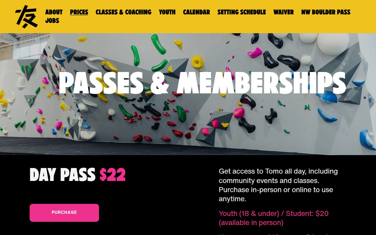
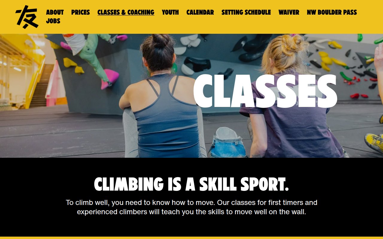
Tomo Bouldering Club in downtown Portland gets its homepage down to seven words: “Fun boulders. Good vibes.” A full-bleed action shot fills the rest. When your brand voice is that strong, you don’t need a hero paragraph.
The classes page frames climbing as a skill instead of a workout, which positions instruction as value rather than upsell. Pricing is transparent ($22 day pass), and the brand consistency carries through every page. The tradeoff is depth. No testimonials, no coach bios, nothing for the comparison shopper. If you’re Tomo, your walk-in crowd probably doesn’t need convincing. If you’re not, you do.
No Judgment Fitness
Class names as the conversion mechanism
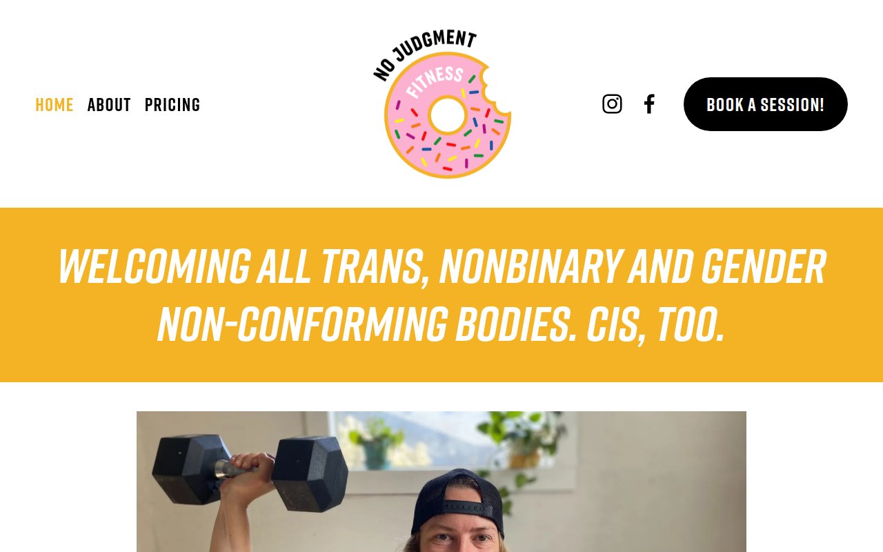
No Judgment Fitness is a queer woman-owned gym in Seattle’s White Center neighborhood, and the site leads with identity from the first pixel. The hero headline makes the target audience unmistakable within two seconds.
What makes the site worth studying is the class naming. “Lesbian Arms” and “Oh My God Why?!” communicate personality and expected intensity better than any format label could. Classes are capped at 6 people, and the booking CTA is on every page. The about page feels like an afterthought given how strong the homepage voice is. The founder story deserves more space.
Renegade Athletics
Dual-brand strategy that doubles the search footprint
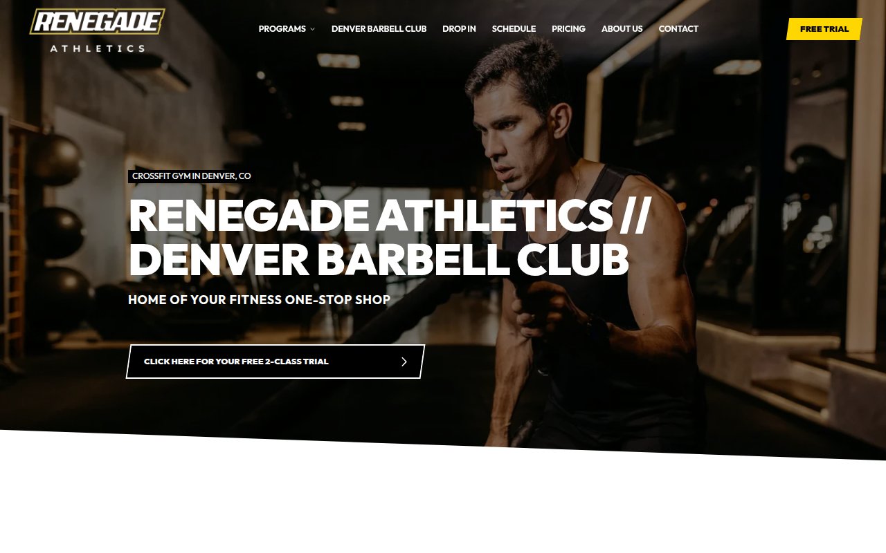
Renegade Athletics in Denver runs two brands under one roof: Renegade Athletics (CrossFit affiliate) and Denver Barbell Club (strength). A visitor searching “CrossFit Denver” lands here. So does someone searching “barbell club Denver.” The dual-brand play earns twice the search surface area most independent gyms get.
Each training modality gets its own landing page, so six program pages are doing SEO work instead of one generic “Classes” page. A free trial CTA stays visible in the nav across every page. The about page is generic given a decade of community building and the Denver Barbell Club heritage. There’s a founder story here that isn’t being told.
Knockout Fitness Nashville
Founder credentials used as the primary trust signal
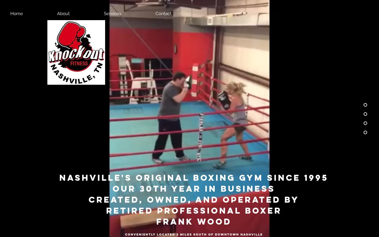
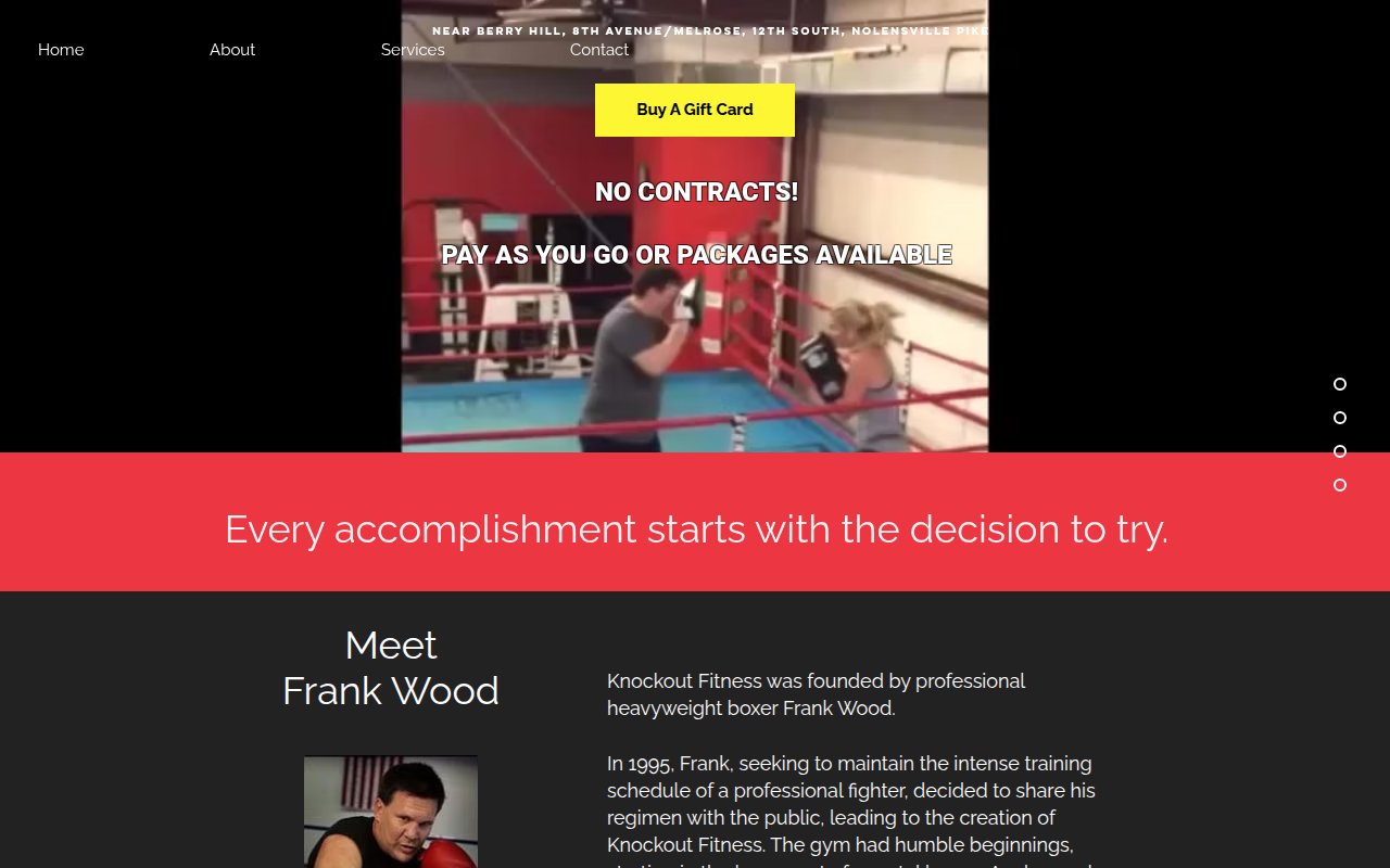
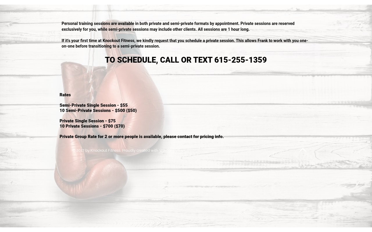
Knockout Fitness leads with founder Frank Wood’s professional boxing record (26-4, 18 KOs) and 30 years in business. That’s the entire credibility argument in one paragraph, and it works better than any testimonial could.
Pricing is transparent ($55-$75 per session), sessions are non-contact by default, and there are no contracts. Every objection a boxing-curious newcomer might have gets addressed on the page. The site is built on Wix and looks it, but the content and story do work the design can’t. Most gyms have the opposite problem.
What the best gym websites have in common
Culture-first messaging
The strongest gym sites lead with identity and vibe, not equipment or class times. Nosotros says "Try Now Pay Later." JOHN REED says "Finally, a gym that doesn't suck." EVERYBODY says "your body is the boss." Equipment lists live on interior pages.
A low-barrier first step
Most sites we reviewed offer a free trial, guest pass, or discounted intro before asking for a membership commitment. Nosotros stacks three risk-reducers (free trial, 30-day guarantee, transparent pricing). Sites that jump straight to "Join Now" leave money on the table.
Real photography over stock images
The sites that feel authentic use photos of their actual space, members, and trainers. Ethos, Solace, and Nosotros all use original photography that could only have been taken at their specific gym. Stock fitness photos are an instant credibility killer.
Team or founder visibility
The highest-rated sites for trust show you who runs the gym. Ethos has the most thorough team page we found. EVERYBODY leads with a detailed founder story. Dogpound gives every trainer a personal quote. Sites that hide their people behind brand photography can only afford to because their brand does the trust-building.
Niche specificity
The sites that perform best in search pick a lane. Solace owns HYROX. Nosotros owns climbing in Cleveland. JOHN REED owns music-driven fitness. Generalist gym sites compete with Planet Fitness and Gold's Gym for the same keywords, which is a fight most independents lose.
How to build your gym website
-
Lead with your culture, not your equipment. Your homepage headline should tell a visitor what kind of gym this is and who it’s for. “Born From Resolve” (Ethos) and “your body is the boss” (EVERYBODY) say more than an amenity list.
-
Offer a free trial above the fold. A “Book a Free Class” or “Try Us Free” CTA should be one of the first things a visitor sees. The sites with the strongest conversion paths all reduce the financial risk of the first visit. If you don’t offer a free trial, a discounted week pass or money-back guarantee works too.
-
Show your team with real photos and bios. If you’re an independent gym, your trainers are your biggest competitive advantage over chains. Categorize staff by role, include a photo of each person, and write a real bio (not just certifications). If your gym has a founding story, tell it on the about page.
-
Pick a niche and build content around it. Whether it’s HYROX, climbing, powerlifting, or inclusive fitness, owning a specific category gives you search authority that a generalist site never will. Create dedicated pages for your specialty rather than burying it in a dropdown.
-
Make pricing findable. You don’t have to show pricing on the homepage, but a visitor should be able to find it within two clicks. Transparent pricing (like Nosotros) builds trust. If you choose to gate pricing, make sure the path to getting it is obvious (a “Get Pricing” CTA, not a buried contact form).
-
If you have multiple locations, give each one a unique page. TMPL’s neighborhood-specific location pages with individual hours, amenities, and phone numbers outperform a generic “Locations” page with pins on a map. Each location page is also a separate SEO entry point.
If you’re still in the naming phase, our gym business name guide has 500+ ideas organized by positioning strategy, or browse women’s gym names for women-only facilities.
Key Takeaways
- Lead with culture and identity on your homepage, not equipment specs or class lists. The visitor's first question is "is this gym for someone like me?"
- Put a free trial, guest pass, or money-back guarantee above the fold. The best-converting gym sites like Nosotros reduce the financial risk of the first visit to zero.
- Show your actual staff with real photos, roles, and bios. Ethos Athletic Club's categorized team page is a good model for building trust before a prospect walks in.
- Pick a niche (HYROX, climbing, inclusive fitness, music-driven workouts) and build your site content around it. Generalist gym sites get buried by chains in search results.
- Pair named member testimonials with your sign-up CTA. Specific member results next to a free trial offer reinforce each other.
How we picked these sites
We started with a broad scan of hundreds of gym and fitness club websites, filtering for companies with strong third-party signals: high Google Business Profile ratings, verified reviews on Yelp and Google, meaningful organic search traffic, and recent site updates. We also reviewed coverage from Club Industry, Athletic Business, and IHRSA (Health & Fitness Association) to find independent gyms and boutique concepts worth evaluating that don’t dominate search results.
From that pool, we selected dozens of the top sites and scored each on five criteria: UX quality, conversion optimization, social proof integration, team authenticity, and SEO coverage. Every site got a multi-page review covering the homepage, classes or services page, about page, and any standout pages like team directories or location-specific pages.
The sites featured here earned the highest overall scores. Each one made the cut because it does something specific well, not because it’s the “best” at everything. The goal is a collection where every site teaches a different lesson about what works for gym websites.
Frequently Asked Questions
What should a gym website include to convert visitors into members?
The most effective gym websites we reviewed all share a few things: a free trial or low-barrier first step above the fold, real photos of the actual space and staff (not stock images), transparent pricing or a clear path to get it, and a class schedule that's easy to find. The sites that scored highest on conversion offered multiple CTAs for different visitor intents, like 'Book a Free Class' for browsers and 'Join Now' for buyers.
How much does a gym website cost to build?
Based on the sites we reviewed, you can build a strong gym website on Squarespace or WordPress for $2,000-$5,000 with a designer, or under $500 if you do it yourself. Nosotros and EVERYBODY both run on Squarespace. Custom builds like Equinox cost $20,000-$100,000+, but those are luxury brands with A/B testing infrastructure and custom booking flows. For most independent gyms, a well-configured Squarespace or WordPress site with Mindbody or a similar booking integration gets the job done.
Should my gym website show membership pricing?
The gyms in our research split roughly in half on this. Nosotros shows exact pricing ($79/month for 24/7 access) and uses a 30-day money-back guarantee to reduce risk. Equinox hides pricing entirely, using exclusivity as a conversion tool. The right answer depends on your positioning: if you compete on value or transparency, show prices. If you compete on experience and your price point is high, gating pricing behind a consultation or visit can actually increase conversions by getting prospects through the door first.
 14 Cleaning Company Website Examples Built to Book Jobs (2026)