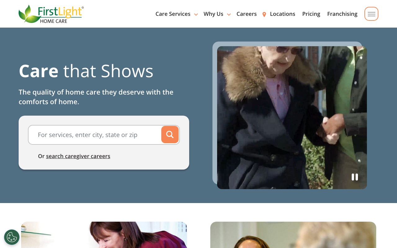
The person visiting a home care website isn’t shopping for a service. They’re deciding whether to trust a stranger with their parent’s safety. The sites that convert best answer that trust question in the first five seconds, with faces, credentials, and specifics.
We reviewed dozens of home care websites to find the ones that do this well.
Each of the sites below was selected because it scored high across six criteria: UX quality, conversion optimization, social proof, team authenticity, SEO coverage, and mobile responsiveness.
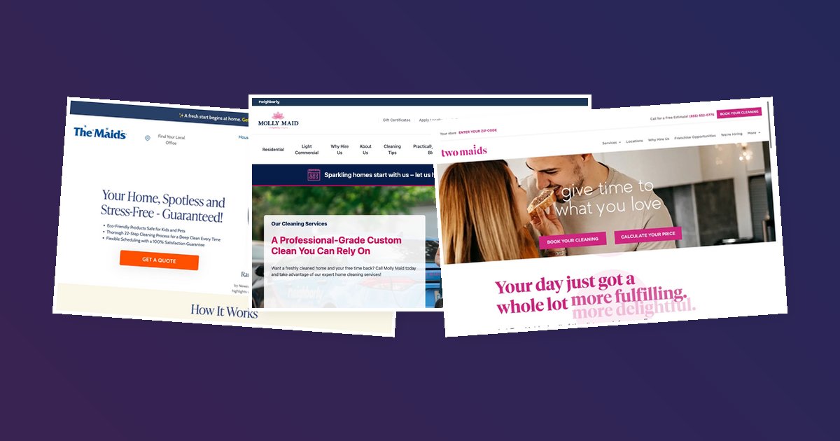
24 Hour Caregivers
W-2 caregivers and LTC insurance handling as trust anchors
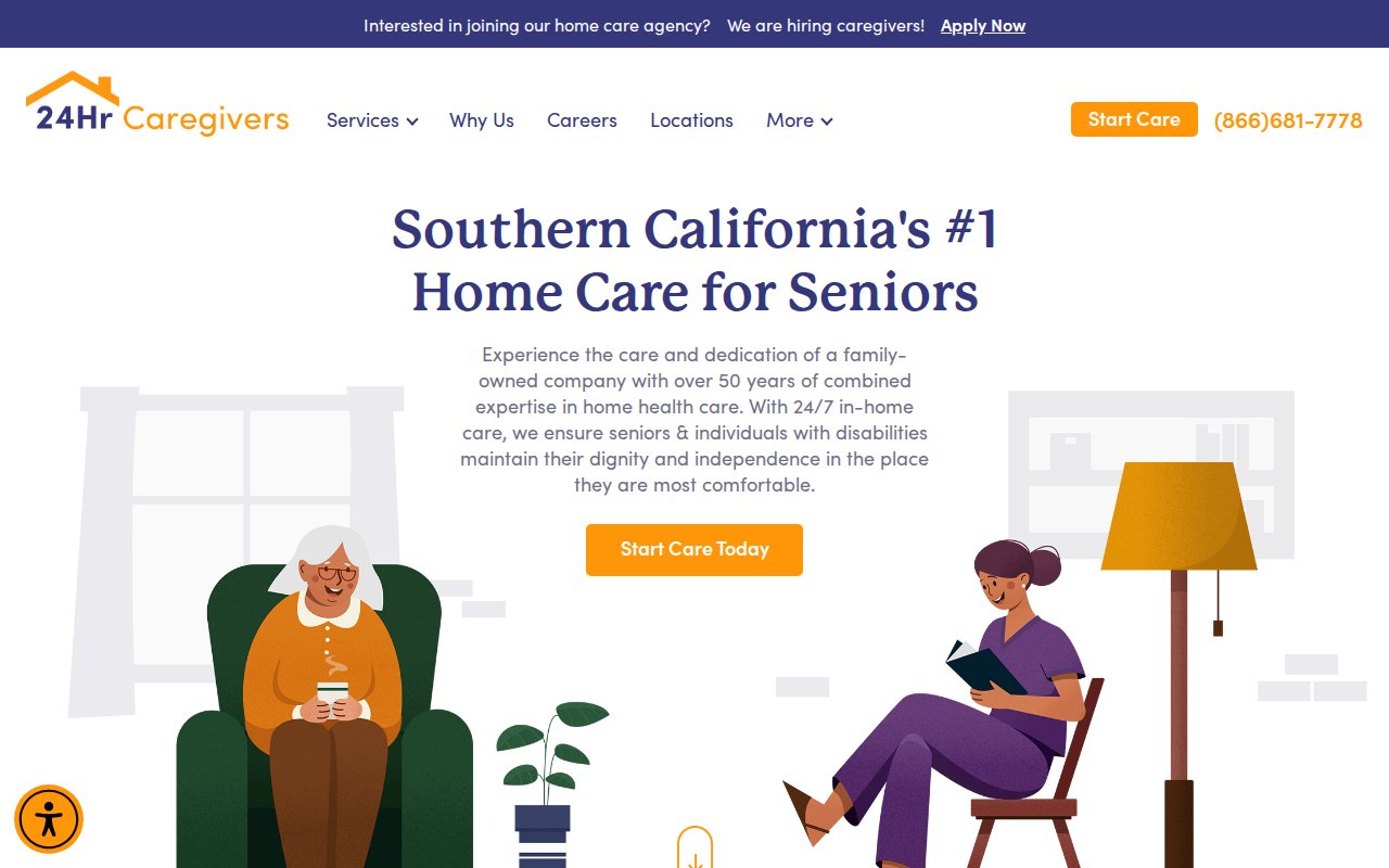
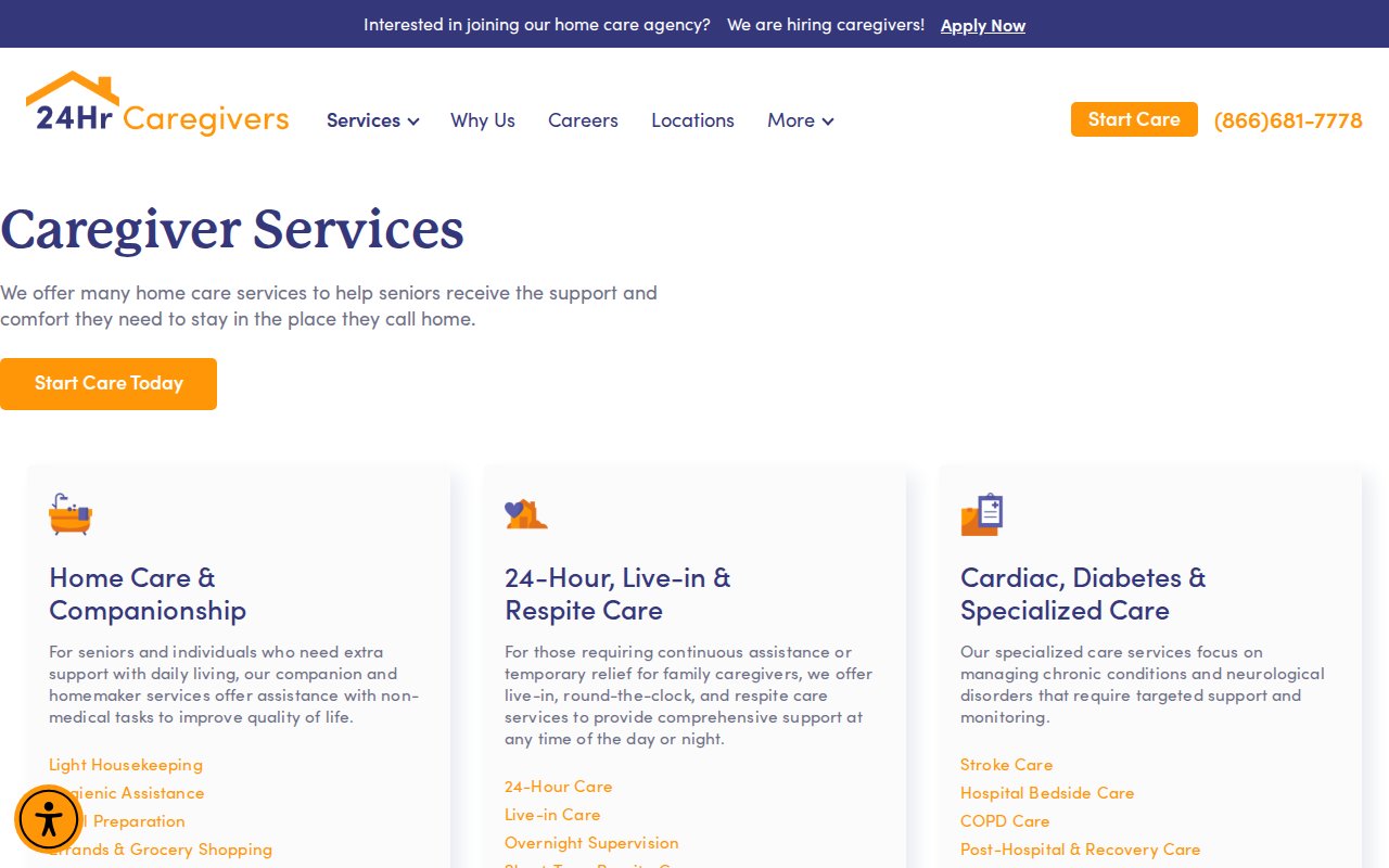
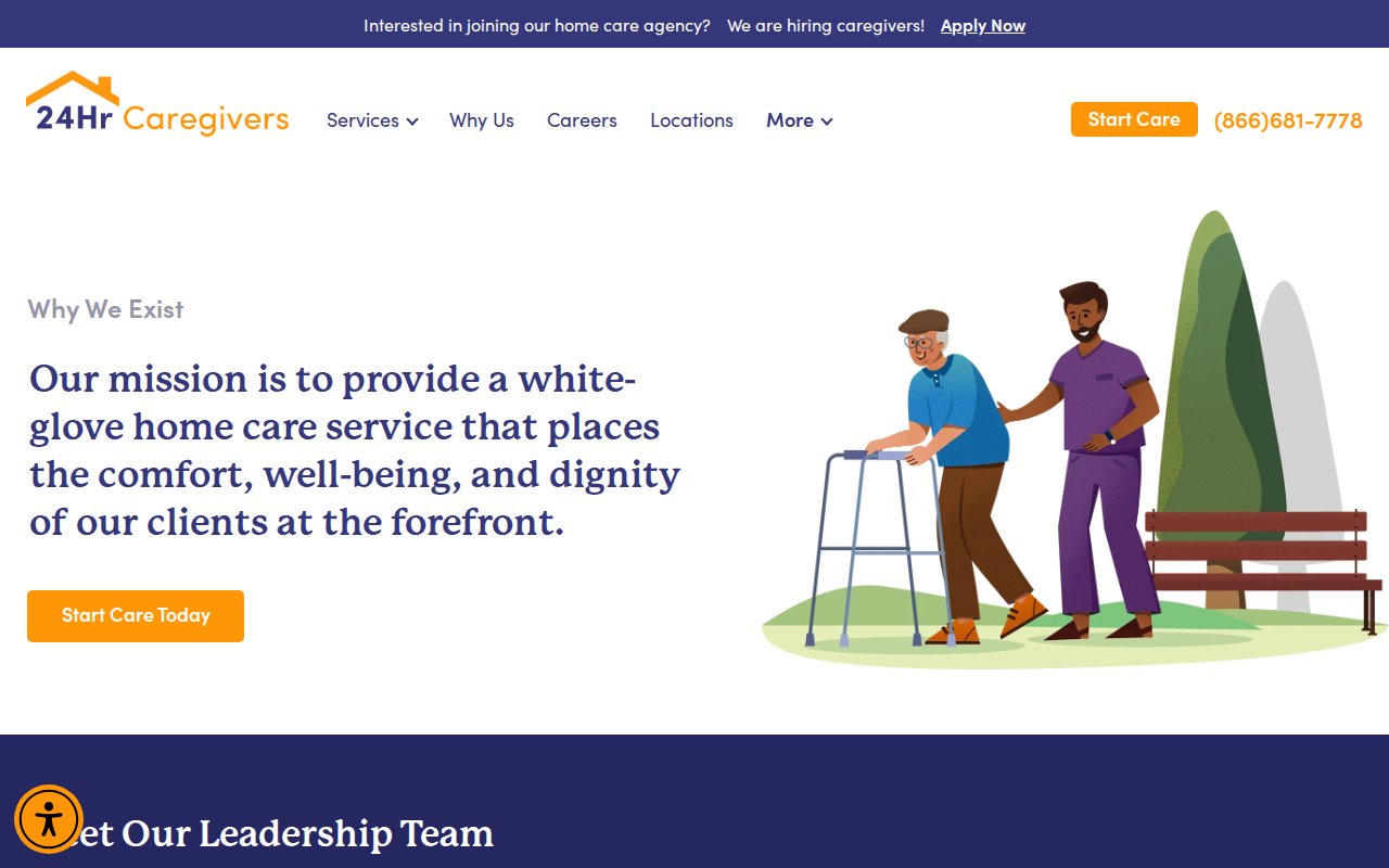
24 Hour Caregivers leads with two differentiators that most home care sites bury or ignore entirely: their caregivers are W-2 employees (not independent contractors), and the company handles long-term care insurance billing directly. The W-2 distinction matters because it signals that the agency carries workers’ comp, runs background checks, and takes legal responsibility for the people it sends into your home. Naming specific LTC insurance partners turns a vague “we accept insurance” into something a family can verify before calling.
The site backs this up with a named founder, an RN as COO, and a leadership team that’s visible rather than hidden behind a generic “About Us.” For a regional independent competing against national franchises in Southern California, the SEO investment is notable: dedicated pages for specific conditions and service areas give Google something to rank beyond a single homepage.
What you can steal: If your caregivers are W-2 employees, make that distinction prominent and explain why it matters. Most families don’t know the difference until you tell them, and once they understand the liability and accountability gap, it becomes a deciding factor.
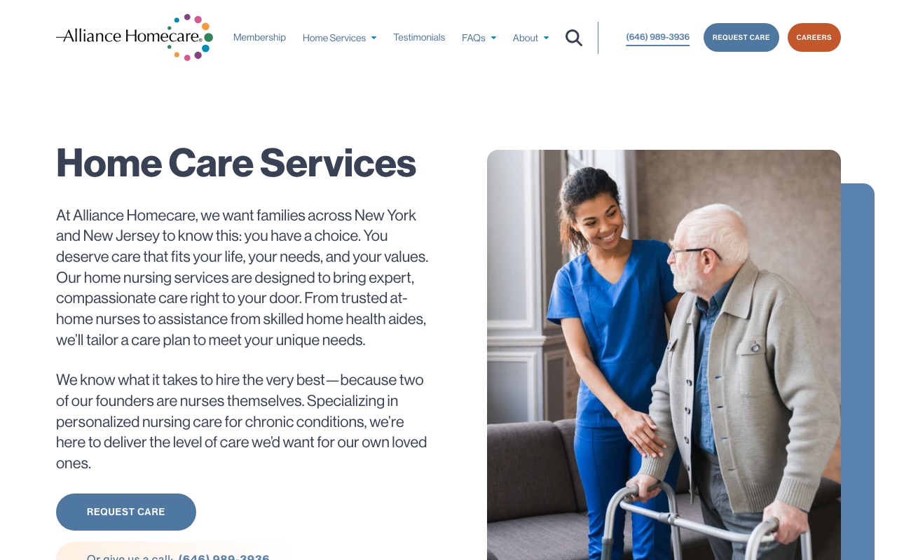
Alliance Homecare
Trademarked hiring standard as brand narrative
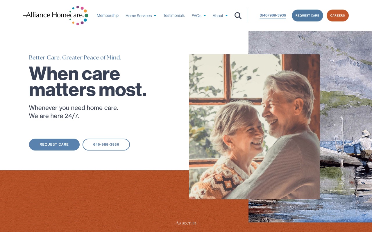
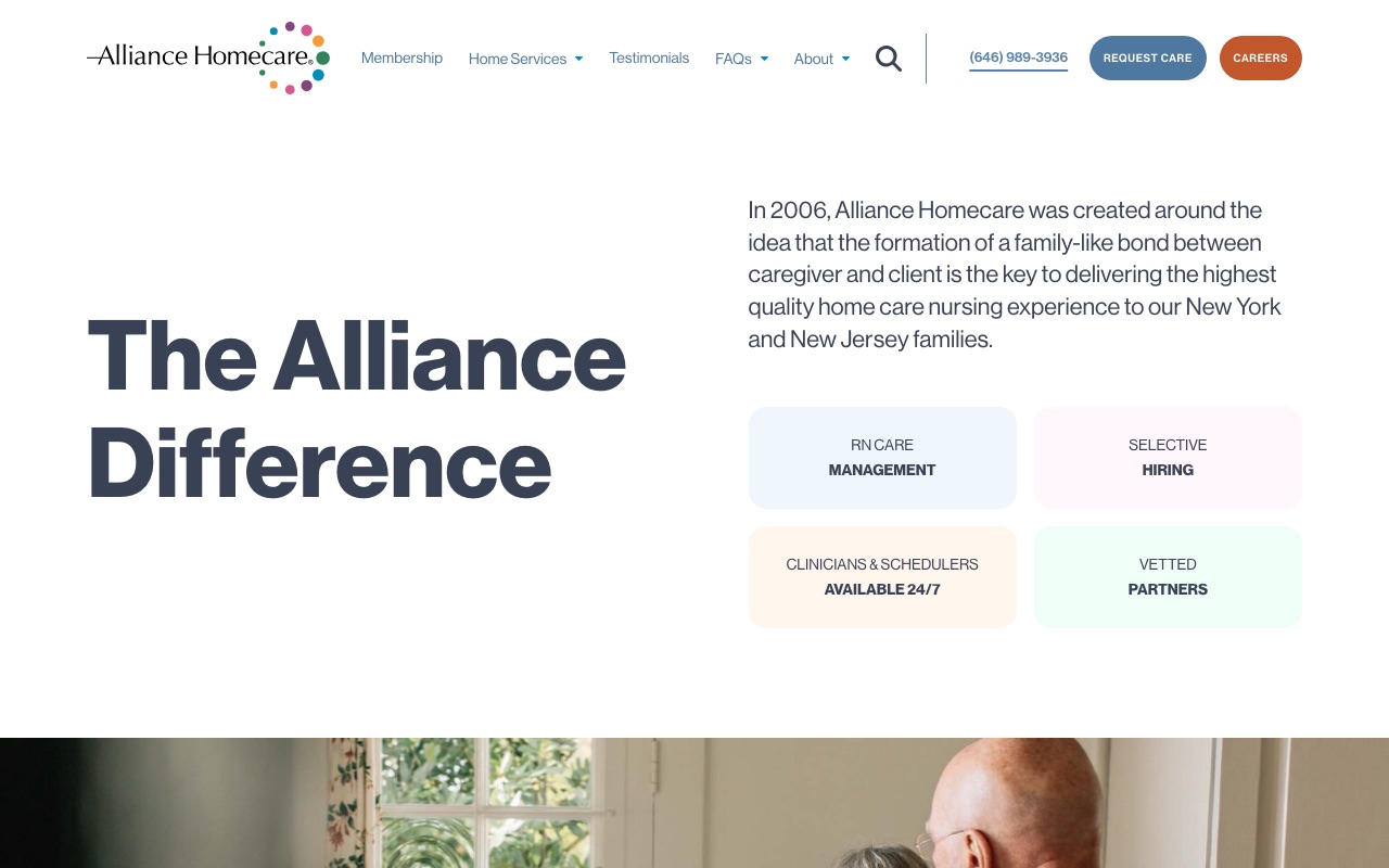
Alliance Homecare’s trademarked hiring standard is The Grandma Rule: would you trust this caregiver with your grandmother? The site backs it up with 16+ real staff headshots, C-suite bios with LinkedIn links, and a founding story by three registered nurses. A Michael J. Fox testimonial and media logos sit above the fold.
The 28 dedicated service pages cover specialized medical conditions. The custom design (Neue Haas Grotesk typography, cohesive blue-teal palette) rivals enterprise-level franchises, which is remarkable for a single-market independent agency in New York.
This level of polish requires real investment. A custom site like this runs $15,000-$40,000+, not $3,000 on a WordPress theme. But the brand identity is free to develop.
What you can steal: Create a named, trademarked hiring standard and build your site around it. The Grandma Rule costs nothing to implement but gives families a concrete way to evaluate your screening process.
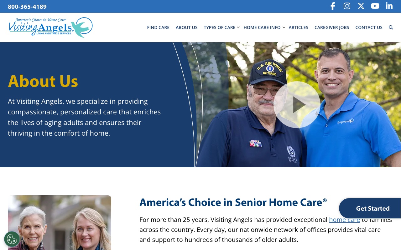
Visiting Angels
Location finder as the entire homepage CTA
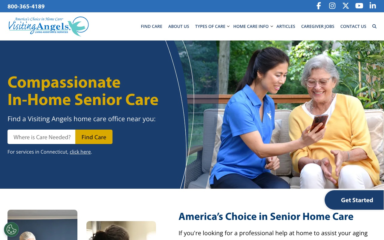
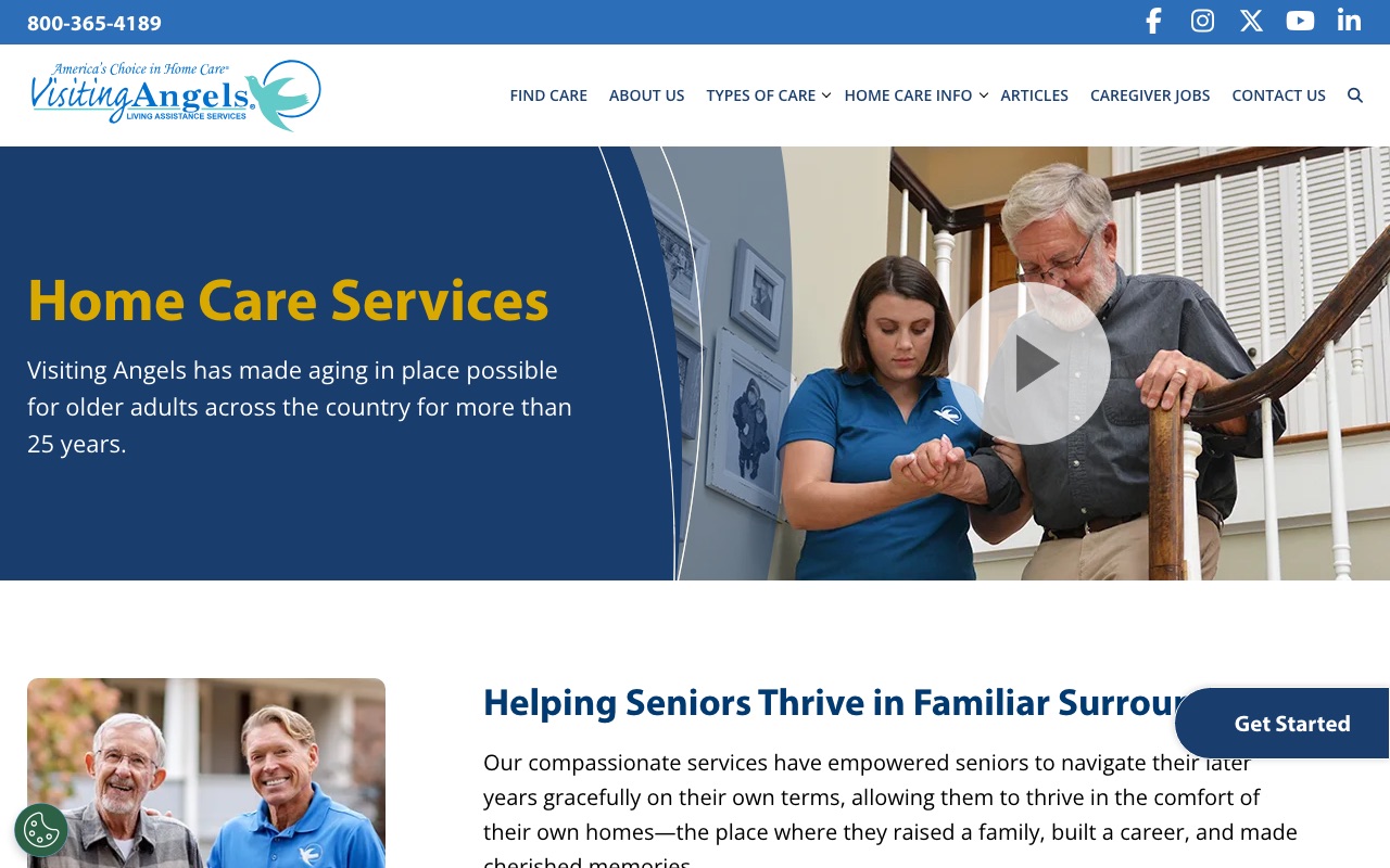
Visiting Angels built their entire homepage around the location finder. It dominates the page, pushing visitors to connect with their nearest franchise immediately. The hero is “Find Your Local Visiting Angels” with a prominent search field, not a mission statement or stock photo carousel.
The services pages use warm, candid photography that looks real rather than staged. Their About page tells a genuine founder story with dates, milestones, and specific numbers (the kind of details that are hard to fake). Every page funnels the visitor toward a local connection.
The gap is team authenticity beyond the founder. No individual caregiver bios, no named local staff on the corporate site. For a franchise model this is partly structural (each location has different people), but it means the national site feels generic at the individual level.
What you can steal: Make your service area the first thing visitors interact with, not your mission statement. If you serve multiple locations, the location finder should be your homepage’s primary CTA.
ComForCare
Eight branded specialty programs with dedicated pages
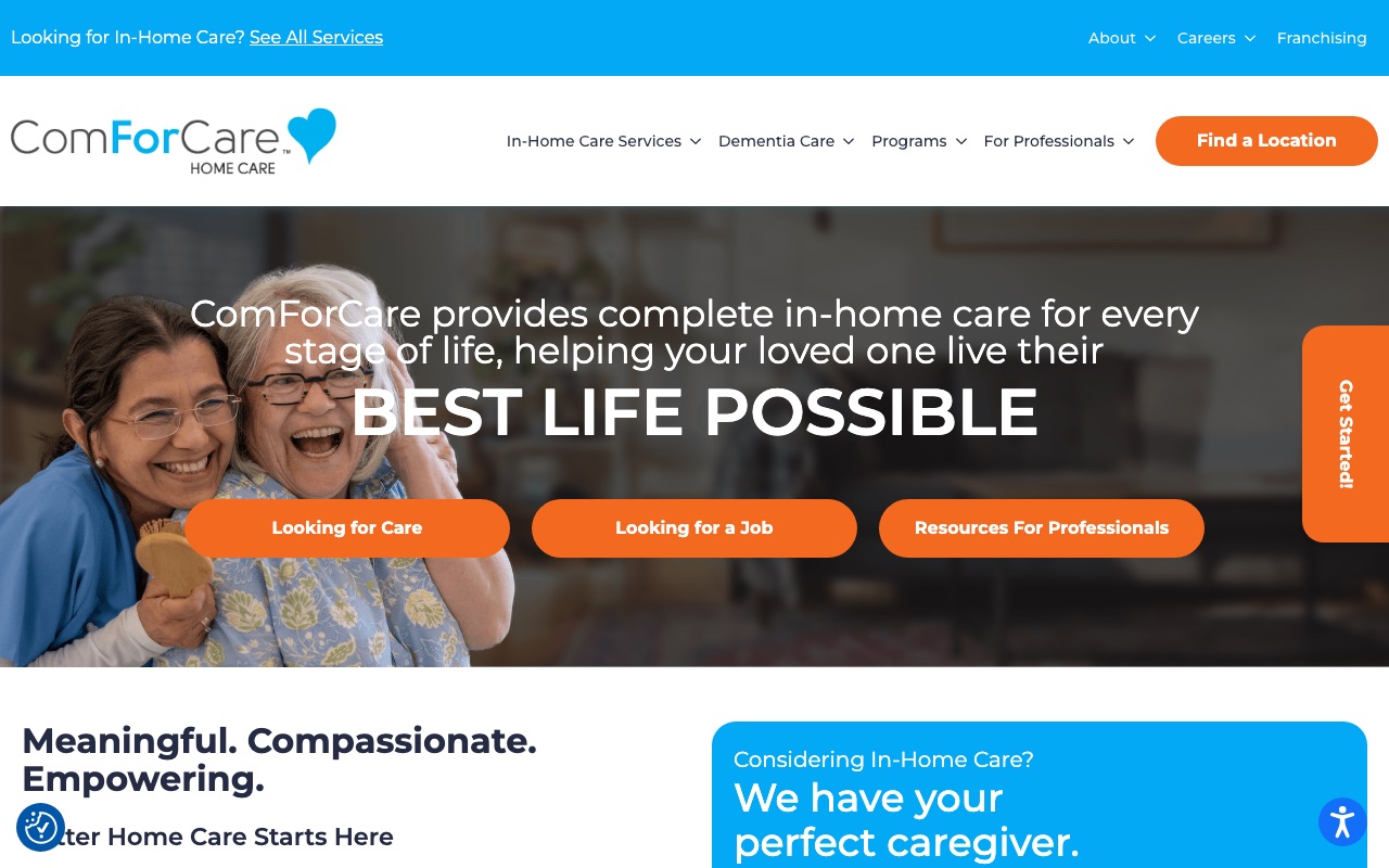
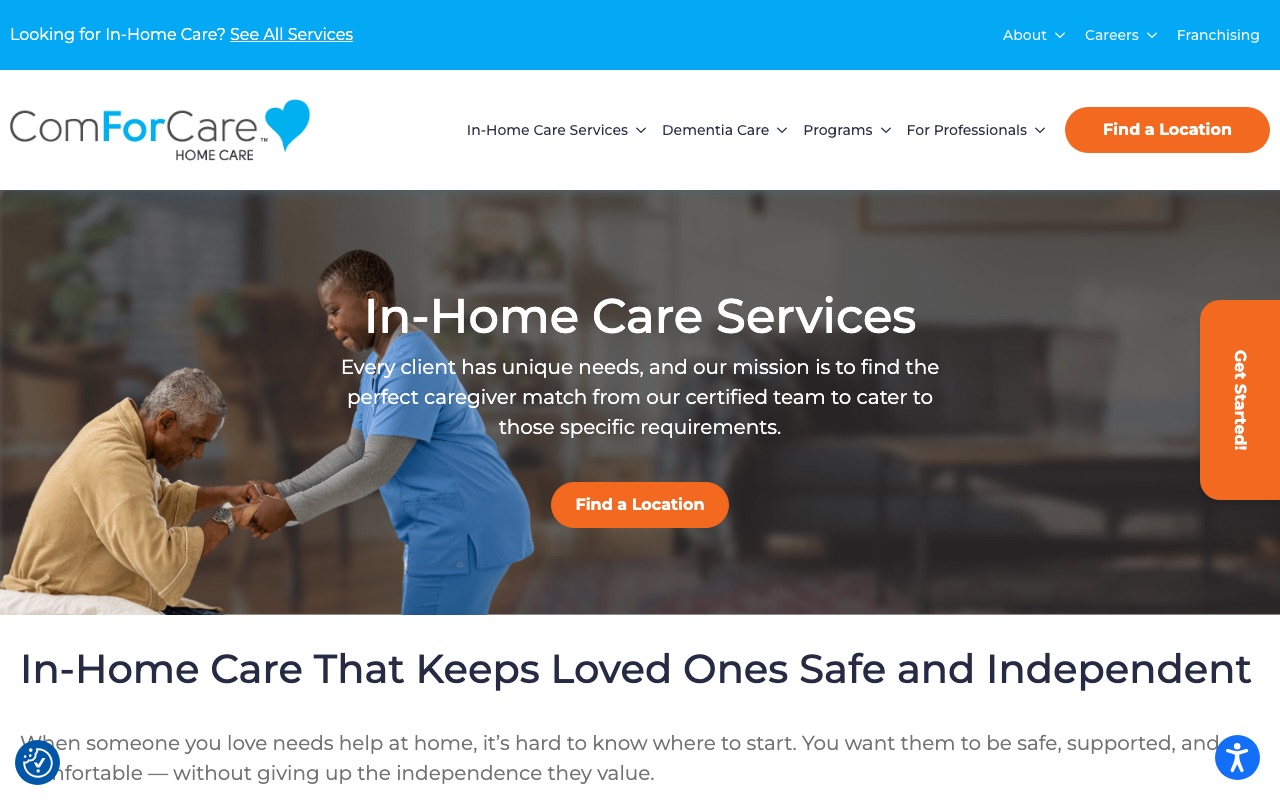
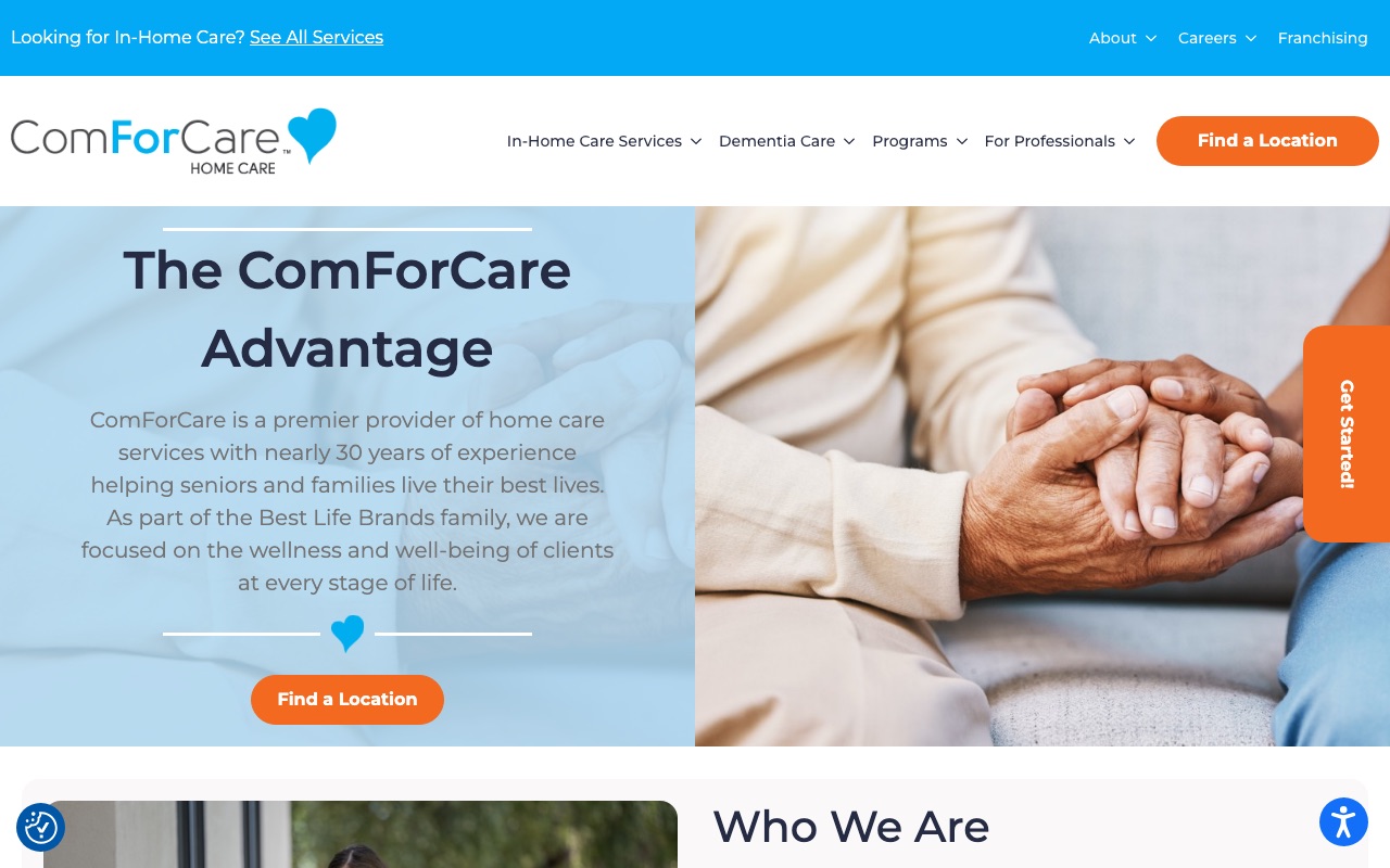
ComForCare has 8 branded specialty programs (including DementiaWise), each with a dedicated page. The pages do two things: they tell families exactly what kind of care is available, and they rank in Google when someone searches “dementia care near me” or “fall prevention home care.”
The homepage splits visitors into three paths (care seekers, job seekers, professionals) so nobody has to wade through content that isn’t for them. The about page features C-suite leaders with headshots and a genuine 1996 founding story from Michigan. Listen360-verified reviews add third-party credibility that self-published testimonials can’t match.
The 285+ blog posts represent serious content marketing investment, though the volume raises the question of whether quality holds up across all of them.
What you can steal: Create a dedicated page for each specialty service you offer. Name your programs specifically (not just “Dementia Care” but your own branded approach like “DementiaWise”). Each page is a new landing page for search traffic and a clear answer for families asking “do you handle this?”
Home Instead
Copy written for the adult child, not the senior
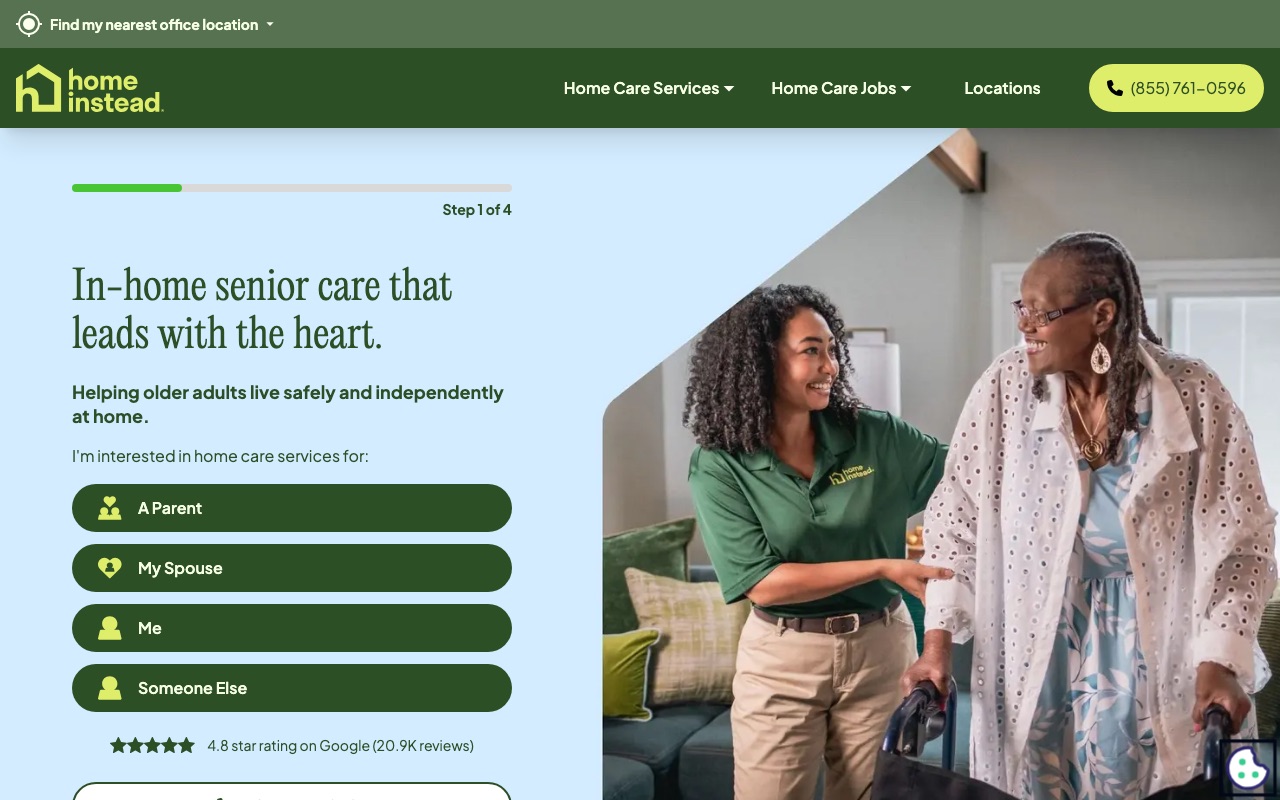
Home Instead solved the fundamental targeting question: the person visiting a home care website usually isn’t the person receiving care. It’s the adult child. Their hero imagery consistently shows multi-generational families, and the copy speaks directly to the family member making the decision.
The care services section avoids medical jargon entirely. Instead of clinical terms, you get “help after a hospital stay” and “support for daily activities,” which is better for an anxious audience that may not know what level of care they need. Their careers page doubles as a trust signal by showing hiring standards and caregiver screening processes.
The weakness is on-site social proof. Home Instead has massive brand recognition, but the site itself relies on that reputation rather than stacking testimonials and review widgets the way Alliance or ComForCare do. Newer or smaller companies can’t afford to leave that space empty.
What you can steal: Write your homepage copy for the person making the decision, not the person receiving care. If adult children are your buyers, speak to their fears and questions first.
FirstLight Home Care
Scenario-based pricing with named client profiles
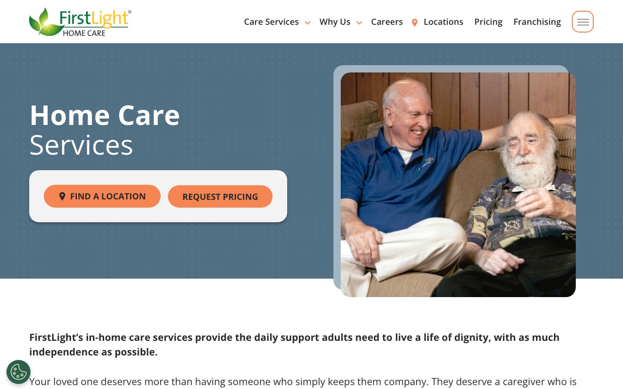
FirstLight Home Care does something almost none of the sites we reviewed attempt: it addresses pricing head-on. Their pricing page uses four named client scenarios ranging from part-time companion care to 24/7 support, illustrating what drives cost up or down. Each scenario educates visitors on pricing factors while pushing them toward a form submission for a custom quote.
The services section splits care into primary and specialty tiers, which helps families who don’t know the difference between companion care and skilled nursing. The Newsweek “America’s Best Customer Service 2026” badge provides strong third-party validation. With 200+ location pages carrying local phone numbers, the SEO infrastructure runs deep.
The gap is leadership visibility. Caregiver-of-the-year photos going back to 2011 show longevity, but the founding team and executive leadership are mostly invisible on primary pages.
What you can steal: Create a pricing page with 3-4 named scenarios showing what drives cost up or down. This answers the pricing question honestly without committing to flat rates, and it generates form submissions.
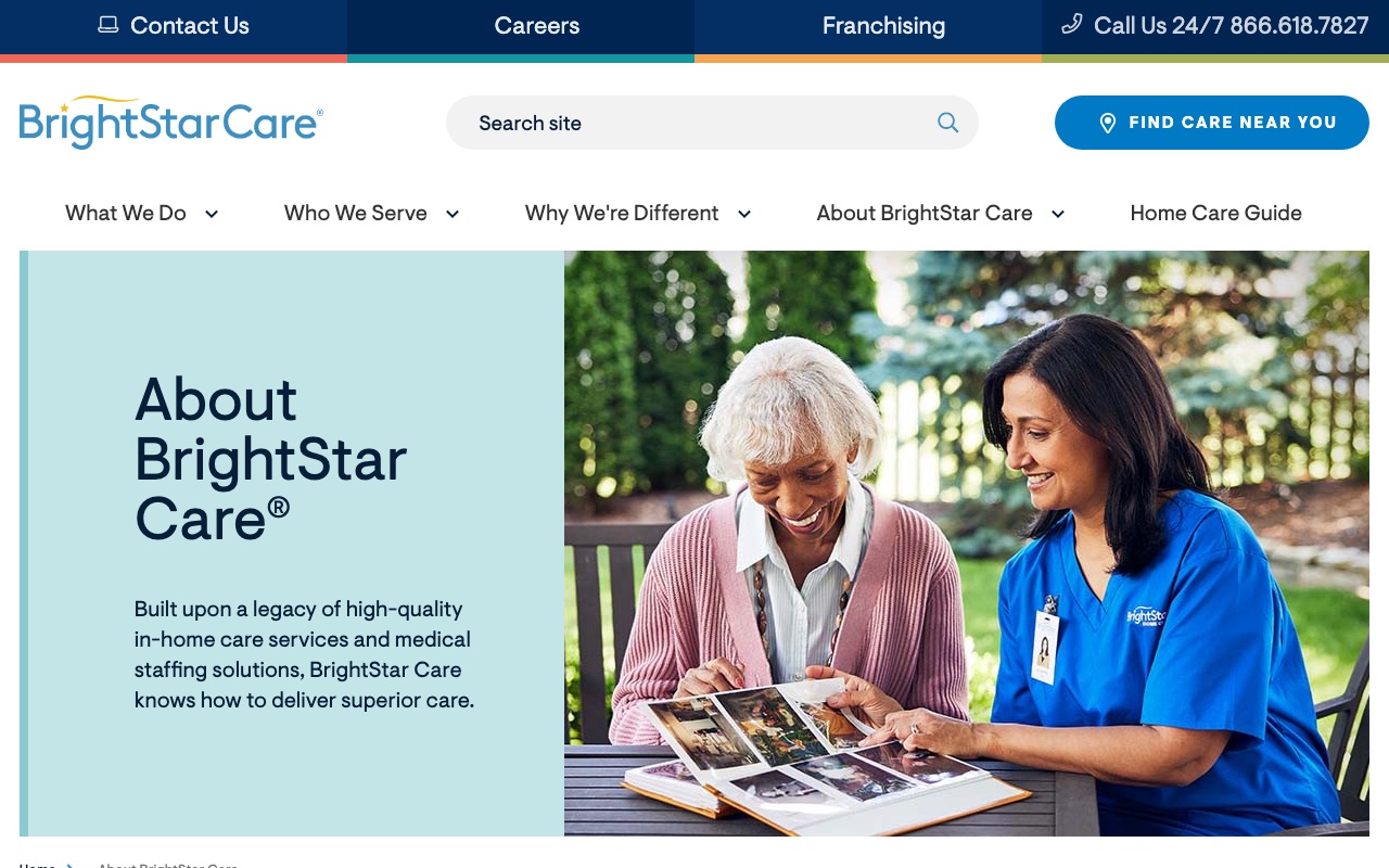
BrightStar Care
Joint Commission badge above the fold
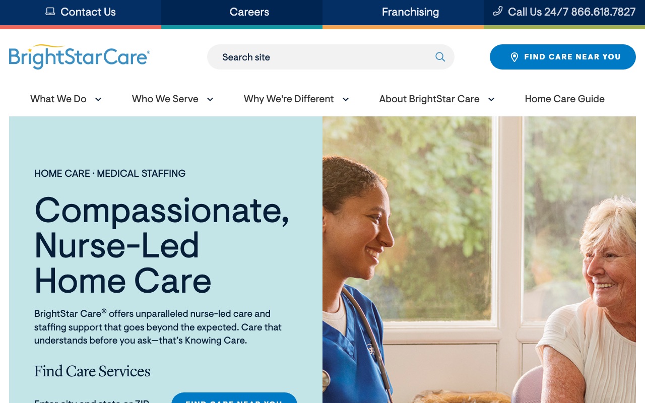
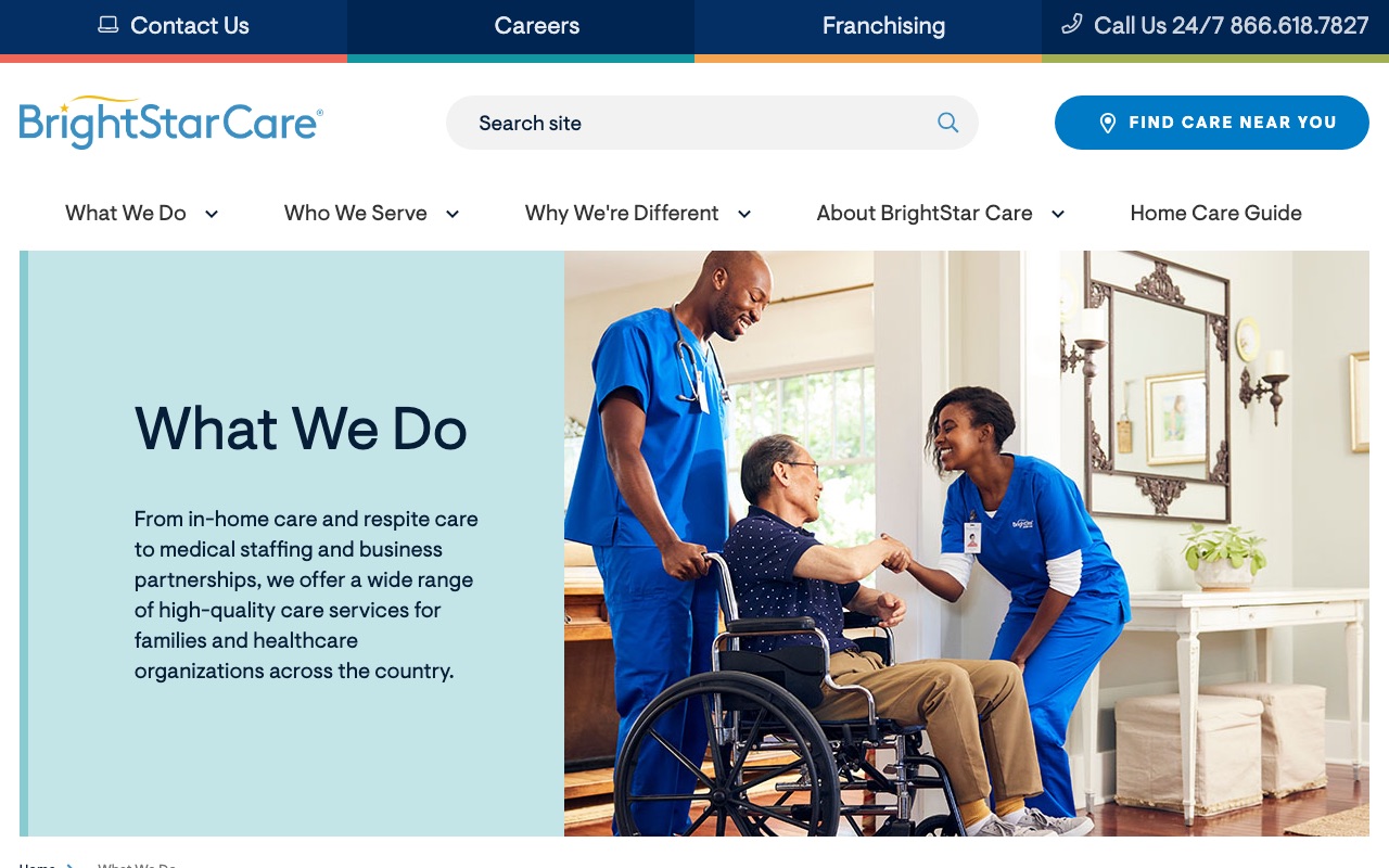
BrightStar Care puts their Joint Commission certification badge above the fold on the homepage. That’s the same accreditation hospitals carry. For families comparing home care options across multiple browser tabs, this immediately separates BrightStar from uncertified competitors.
The testimonials pair real client photos with quotes, which is more than most franchise sites bother with.
Where BrightStar falls short is team authenticity. The team section is generic with no individual caregiver bios or named staff on the corporate site. For a company that sends people into your home, faces matter.
What you can steal: Put your strongest credential above the fold on your homepage. Joint Commission, state licensing, industry certification. Lead with it. Don’t bury it on a subpage.
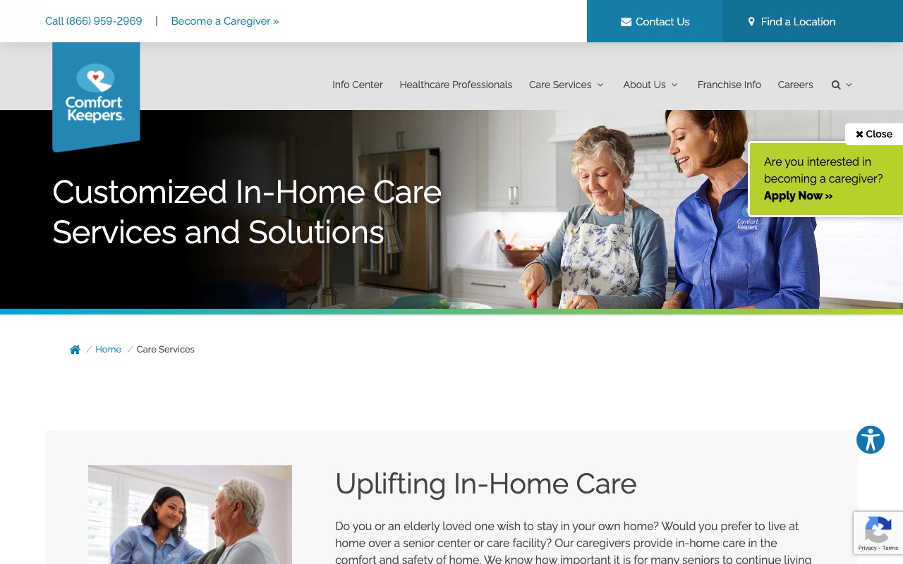
Comfort Keepers
276-article resource center plus PBS partnership
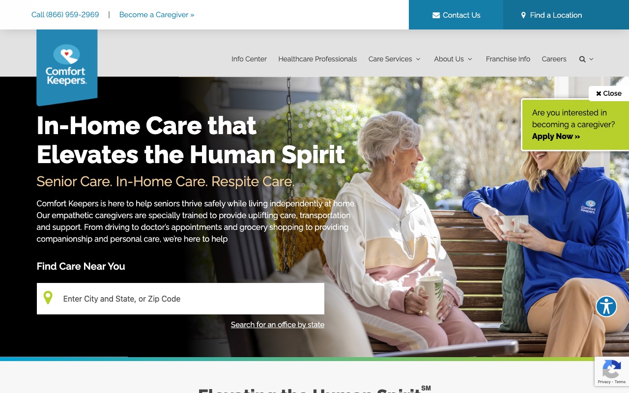
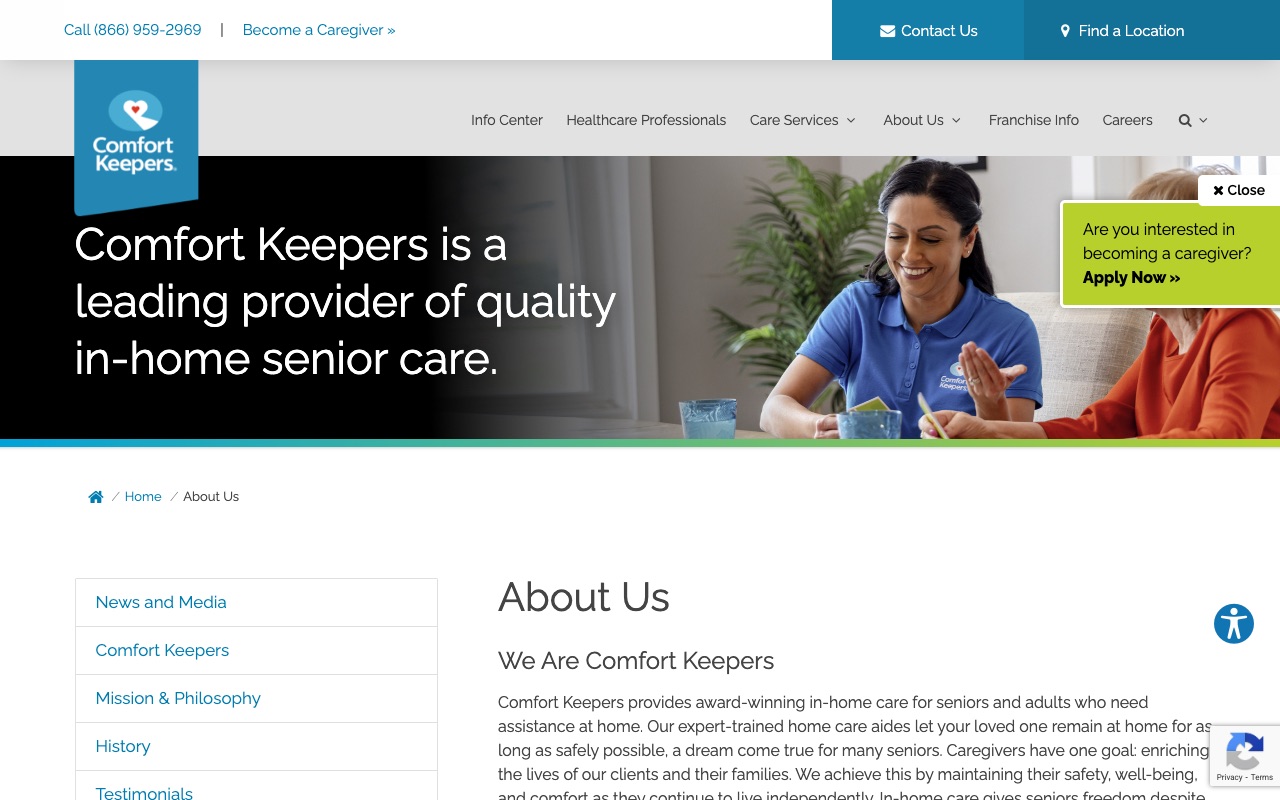
Comfort Keepers has 276 articles across 9 categories and a PBS documentary partnership. They’ve invested more in content marketing than any other site we reviewed (ComForCare’s 285+ posts edge them on raw volume, but Comfort Keepers’ content is more structured).
Their Info Center organizes articles into topical categories (caregiving, senior health, family support), making it a genuine research resource rather than a reverse-chronological blog feed. The trust badge density is impressive: Great Place to Work, Newsweek, and others, plus the PBS affiliation. The ZIP code finder sits front and center on the homepage.
The tradeoff is local personality. Franchise location pages feel template-driven with no local staff photos, no local stories. A visitor in Denver sees essentially the same page as a visitor in Tampa.
What you can steal: Build a resource center organized by topic, not just a blog feed. Families researching home care spend hours reading. Give them a structured place to learn, and they’ll remember who helped them.
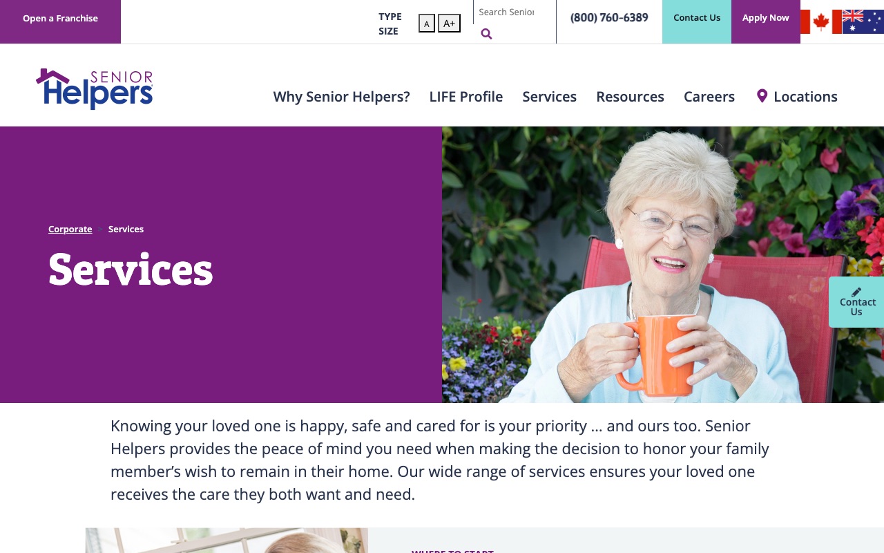
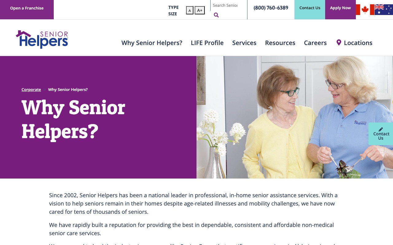
Senior Helpers
Proprietary assessment tool reframes the first call
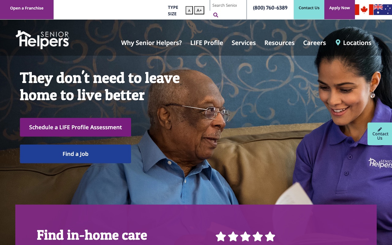
Senior Helpers created a proprietary intake tool called the LIFE Profile Assessment. Instead of “call us for a free quote,” the CTA is “take your free assessment,” which positions the company as the expert rather than the salesperson.
The homepage copy addresses the fear that a nursing home is the only option. Between the live chat, location search, and the assessment CTA, visitors have four ways to start a conversation without scrolling. With 800+ indexed pages and localized blog content per market, the SEO infrastructure is among the deepest we reviewed.
The gap is team authenticity. No staff photos anywhere on the main about page. No leadership bios. For a company that sends caregivers into people’s homes, this is a missed opportunity. Would you trust a company that won’t show you who they’re sending?
What you can steal: Create a proprietary assessment tool and name it. Framing your first interaction as an “assessment” rather than a “consultation” or “free quote” positions you as the expert in the room.
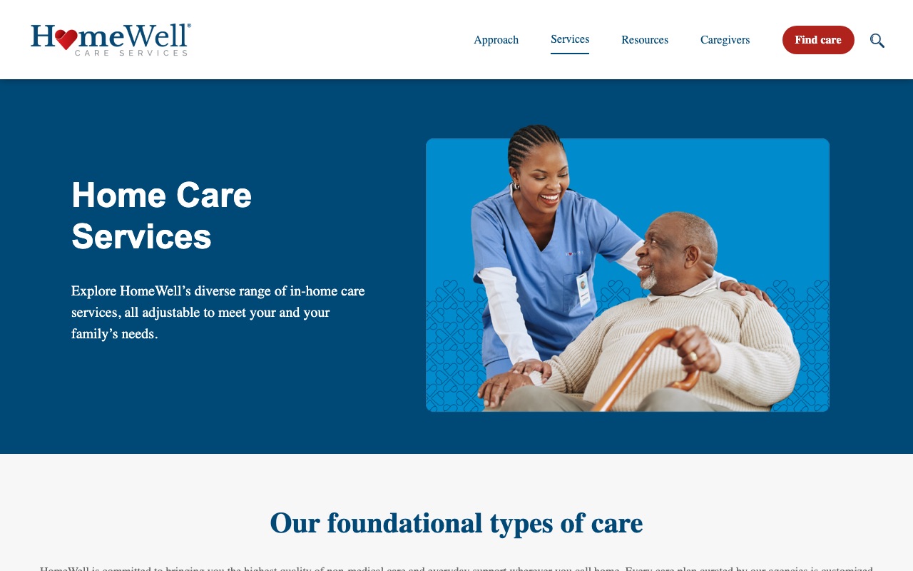
HomeWell Care Services
Google Places autocomplete as UX advantage
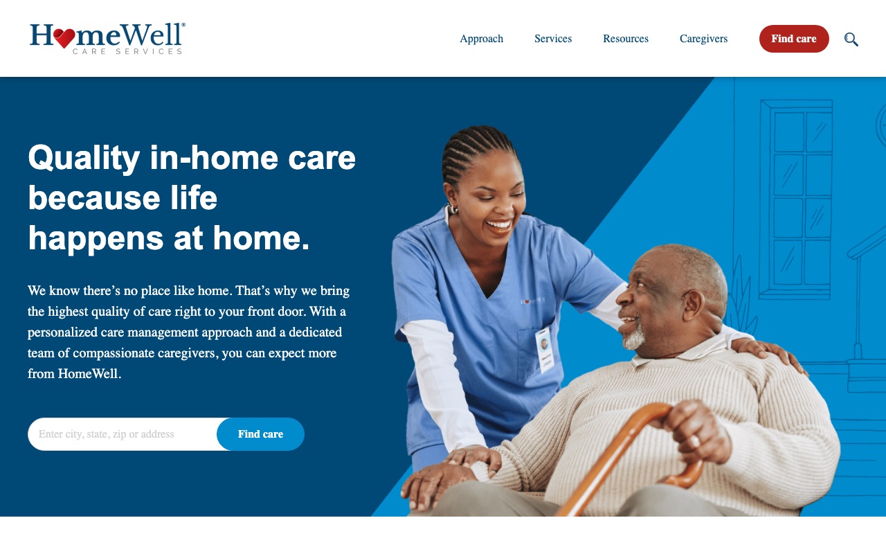
Type your address into HomeWell’s homepage and Google Places autocomplete finishes the rest. It’s a small UX detail that makes a real difference: fewer keystrokes, fewer errors, faster path to a local office. Most franchise sites use simple ZIP code inputs. HomeWell’s implementation is a step ahead.
Their signature programs give them something to sell beyond “we do home care,” and named testimonials with city attribution make the social proof feel local. With 150+ franchise location pages, the SEO footprint is substantial.
The weakness is the same one that shows up across several franchise sites in this list: no founder story, no leadership bios, no staff photos on the corporate site. HomeWell’s “Quality in-home care because life happens at home” tagline is warm and direct, but the site behind it feels corporate and anonymous.
What you can steal: Add Google Places autocomplete to your location finder. It’s a free Google API that reduces friction and makes your site feel more polished than a basic ZIP code input box.
What the best home care websites have in common
Phone number in the header on every page
Nearly every site we reviewed does this. Home care decisions move fast once a family commits, and many clients (especially seniors' spouses) still prefer to call. Making the number visible at all times removes a step.
A location or ZIP finder as the primary homepage CTA
Most sites we reviewed use this pattern prominently. Home care is local. The visitor's first question is "do you serve my area?" not "tell me about your company."
Real staff photos separate the leaders from the pack
Alliance Homecare shows 16+ headshots with LinkedIn links and has the strongest trust signals of any site we reviewed. Senior Helpers and HomeWell show zero staff photos and have the weakest. The difference is visible in five seconds.
Dedicated service pages for each care type
The top-performing sites have 15-28 individual service pages. Beyond search rankings, individual service pages match the way families actually search. "Home care" is too broad. "24-hour live-in care" is what they're actually searching for.
Third-party trust badges above the fold
Joint Commission, Newsweek Best Customer Service, Great Place to Work. The strongest sites lead with external validation, not self-written marketing claims.
Content depth correlates with overall quality
ComForCare publishes 285+ blog posts. Comfort Keepers maintains 276 structured articles. Alliance has 231. The lower-scoring sites have 34 or fewer. Families researching home care read extensively before they call.
How to build your home care website
If you’re building a home care website (or rebuilding one that isn’t converting), here’s where to start, ordered by impact:
-
Show real people. Hire a photographer for team headshots. Put names and brief bios next to every face. The single biggest trust gap we found across all 10 sites was the difference between companies that show their team and companies that don’t. Alliance Homecare’s 16+ headshots set the standard.
-
Display credentials above the fold. Joint Commission certification, state licenses, industry awards. If you have them, they should be the first thing visitors see. BrightStar Care’s homepage proves how powerful a single accreditation badge can be when it’s positioned front and center.
-
Add a location finder if you serve multiple areas. ZIP code lookup, Google Places autocomplete, or a simple city dropdown. Visiting Angels and HomeWell both build their homepages around this interaction because the visitor’s first question is always “do you serve my area?”
-
Create a page for every service you offer. Companion care, dementia care, post-surgery recovery, 24-hour live-in care. Each gets its own page. This is how families search, and it’s how Google decides who ranks. Alliance has 28. ComForCare has 13 plus 8 branded specialty program pages.
-
Name your approach. Alliance has The Grandma Rule. ComForCare has DementiaWise. Senior Helpers has the LIFE Profile Assessment. A named methodology turns a commodity service into a branded experience. Pick your strongest differentiator and give it a name.
-
Start publishing content. The top sites in our review have 200-285 articles. You don’t need to match that overnight, but a monthly article answering common family questions builds both SEO authority and trust. Comfort Keepers’ topic-organized Info Center is a good model to follow.
If you’re still choosing a name for your home care business, our home care business name guide covers 500+ options organized by the trust signals that matter most to families.
Key Takeaways
- The visitor is usually an adult child, not the senior. Write your site for the decision-maker, not the care recipient.
- Phone number in the header on every page. Nearly every top home care site we reviewed does this because families still prefer to call.
- Real staff photos are the single biggest trust differentiator. The highest-scoring site shows 16+ headshots with bios. The lowest-scoring sites show zero.
- A named methodology (The Grandma Rule, DementiaWise, LIFE Profile) turns a commodity service into a brand. Pick your differentiator and trademark it.
- Build individual pages for each service type and each location you serve. This is how families search and how Google ranks you.
- Third-party certifications above the fold beat any amount of self-written marketing copy. If you have credentials, lead with them.
Frequently Asked Questions
What should a home care website include to build trust?
The strongest home care sites we reviewed share three elements: real staff photos with names and credentials, third-party certifications displayed above the fold (Joint Commission, Great Place to Work), and named client testimonials. Nearly every top-performing site puts a phone number in the header on every page. The weakest sites relied on stock photography and anonymous team sections.
How much does a home care website cost to build?
A home care website can range from $2,000-$5,000 using a WordPress theme with customization to $15,000-$40,000+ for a fully custom site. A franchise with 200+ locations will invest significantly more than a single-location independent agency.
Should a home care website show pricing?
The vast majority of home care websites avoid stating pricing outright. Scenario-based pricing with named client profiles rather than flat rates is a good approach for those who choose to do so. Publishing ranges is marketing strategy worth considering in 2026 because of the amount of pre-call research prospects do using data-limited AI tools.
 500+ Unique Virtual Assistant Business Name Ideas