We looked at dozens of VA company websites and found that the ones converting best solve a problem unique to this industry: the trust-speed paradox.
Visitors need enough reassurance to hand over sensitive access, but they also need the hiring process to feel fast (because the whole point of a VA is saving time).
The best sites do both: they build trust in under 30 seconds and offer a next step that doesn’t feel like a commitment.
Boldly
Real team-client photo pairings as trust builders
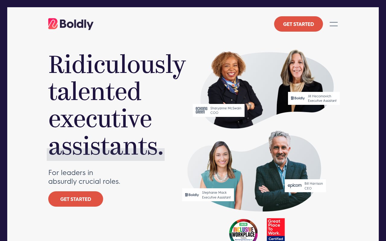
Boldly shows you the actual executive assistant you’d be working with, paired with the actual client they support, names and titles included. Where most VA company websites use stock photos of people wearing headsets, Boldly puts real faces on the page.
The positioning centers on “Ridiculously talented executive assistants,” not virtual assistants, not admin support. That word choice justifies the premium pricing visible on their plans page. Trust badges (Inclusive Workplace, Great Place to Work) reinforce that Boldly treats its people well, which matters to clients who want a long-term relationship, not a revolving door of contractors.
The gap is conversion friction. No phone number, no chat widget. The only path forward is “Get Started,” which feels vague for a premium service.
Wishup
Above-fold lead capture with task qualification
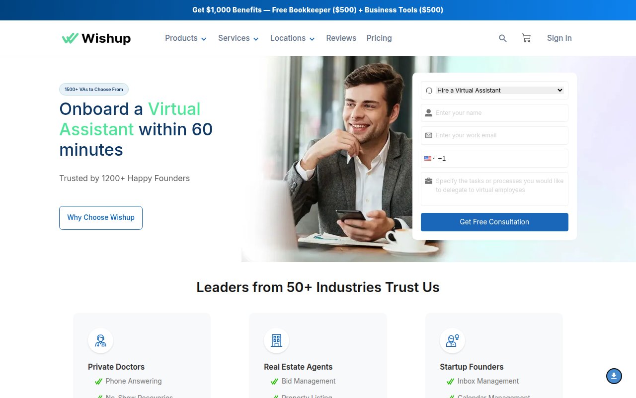
Wishup skips the brand story and opens with a lead capture form promising onboarding within 60 minutes. The form includes a task description field, which qualifies the lead and forces the visitor to articulate what they actually need (which many first-time VA buyers haven’t figured out yet).
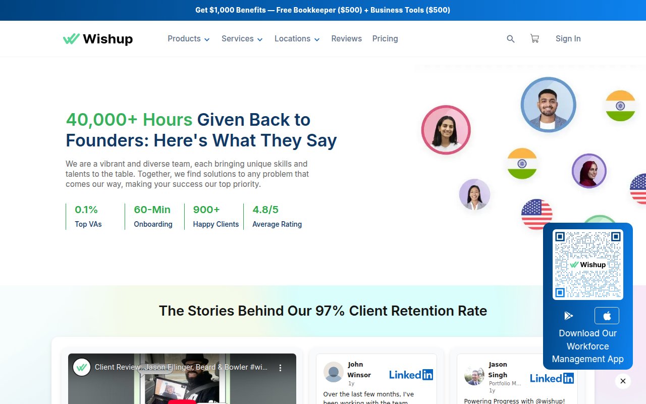
Tool integration pages answer a common buyer question: “Can your VA actually use the software I use?”
The aggressive popup overlay with a $100-off offer fires before you’ve read anything, though. For a service that requires trust, interrupting the evaluation process feels counterproductive.
Prialto
SOC 2 compliance as a trust shortcut
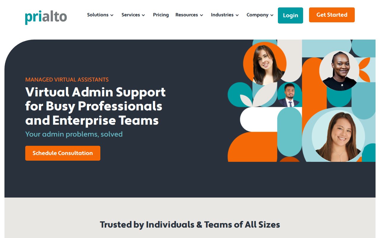
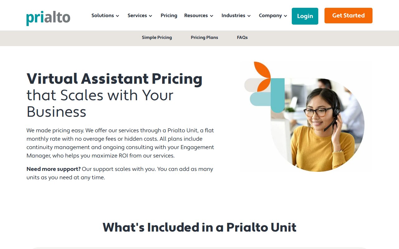
Prialto is the only site in this list that leads with a compliance credential: SOC 2 Type-2 certification. For a company handling executive communications and financial data, that badge answers the security question before you even think to ask it.
The content goes deeper than most competitors. The messaging addresses a common fear in hiring a VA (what happens when your assistant quits or goes on vacation?) by positioning Prialto as a managed team, not a single person. 15+ years of accumulated resources back that up.
The weakness is accessibility. No phone number visible on the homepage, which is a miss for a company targeting enterprise clients.
Time Etc
Value-first CTA instead of sales call
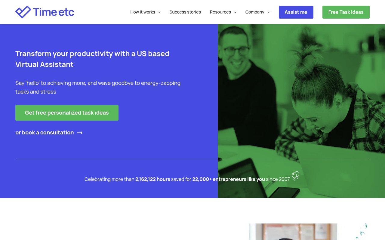
Time Etc leads with a free value offer (personalized task ideas) instead of a sales call CTA, giving the visitor something useful before they spend a dollar. The stats are deliberately precise, down to the exact hour saved across 22,000+ entrepreneurs since 2007. Precise numbers read as more believable than rounded ones.
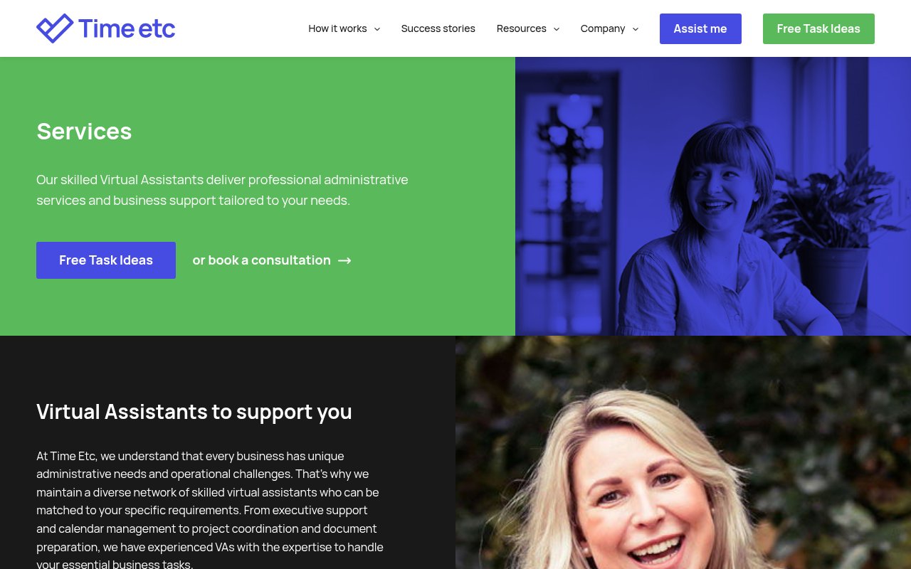
But scroll through the homepage and you won’t find a single named team member. Stock-style photography and no individual bios. There’s a “Meet our assistants” page in the nav, but the homepage itself could belong to any service company.
Belay
Outcome mockups instead of feature lists
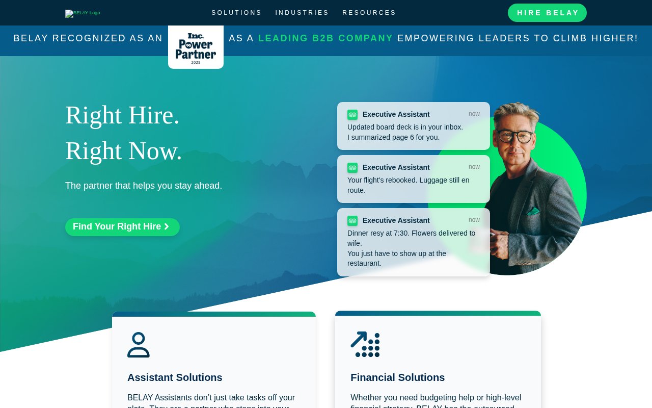
An Inc. Power Partner 2025 badge sits in the announcement bar on every page of Belay’s site. Below the hero, a testimonial from a well-known CEO adds social proof that carries more weight than generic five-star reviews.
The hero shows mockups of completed task notifications (emails answered, meeting notes prepared) instead of team photos.
What’s missing: any sense of who actually works there. No individual team bios on the homepage, and the mountain-themed branding doesn’t tell you anything about the people behind the service.
She's A Given
Founder story as competitive advantage
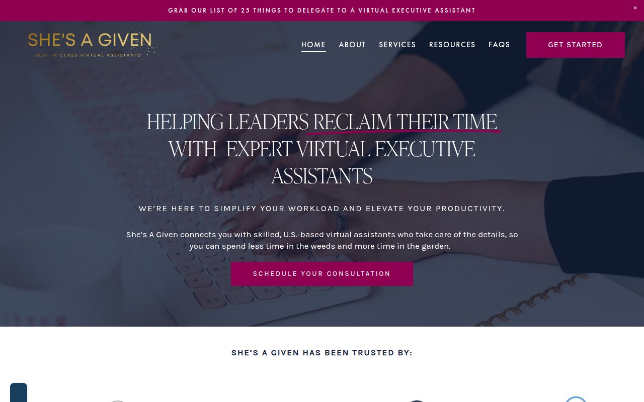
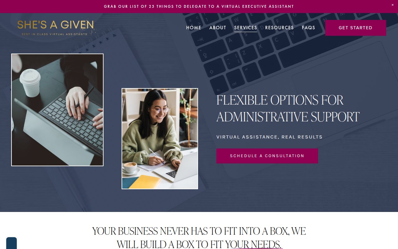
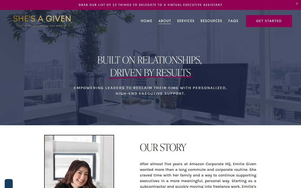
Emilie Given is a former executive assistant who started her own VA agency, and She’s A Given leans into that founder story: Emilie’s background, her reason for starting the company, and individual team member bios with photos. In an industry full of faceless staffing companies, knowing who runs the operation helps.
The gold and magenta color scheme on a dark background creates a boutique feel distinct from every other site here. A lead magnet (“25 Things to Delegate to a Virtual Executive Assistant”) captures emails from visitors who aren’t ready to book. SEO coverage is thinner than the larger competitors, but for a boutique operation, that’s the expected tradeoff.
Wing Assistant
Multi-platform review badges stacked for credibility
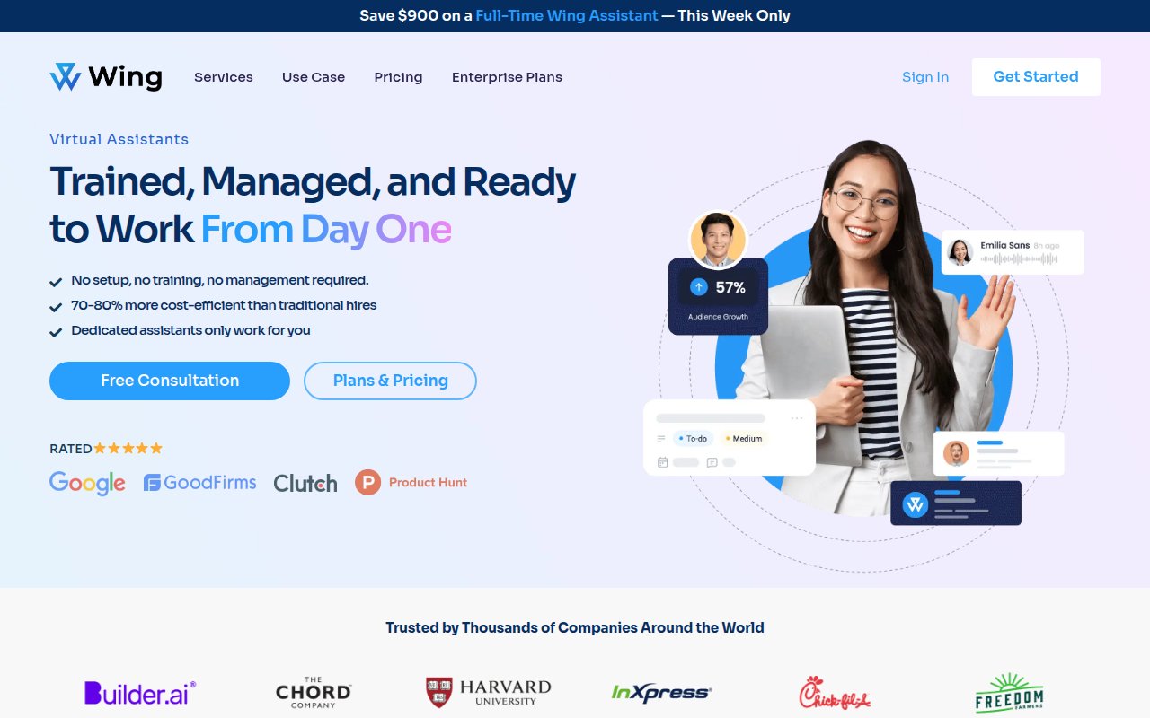
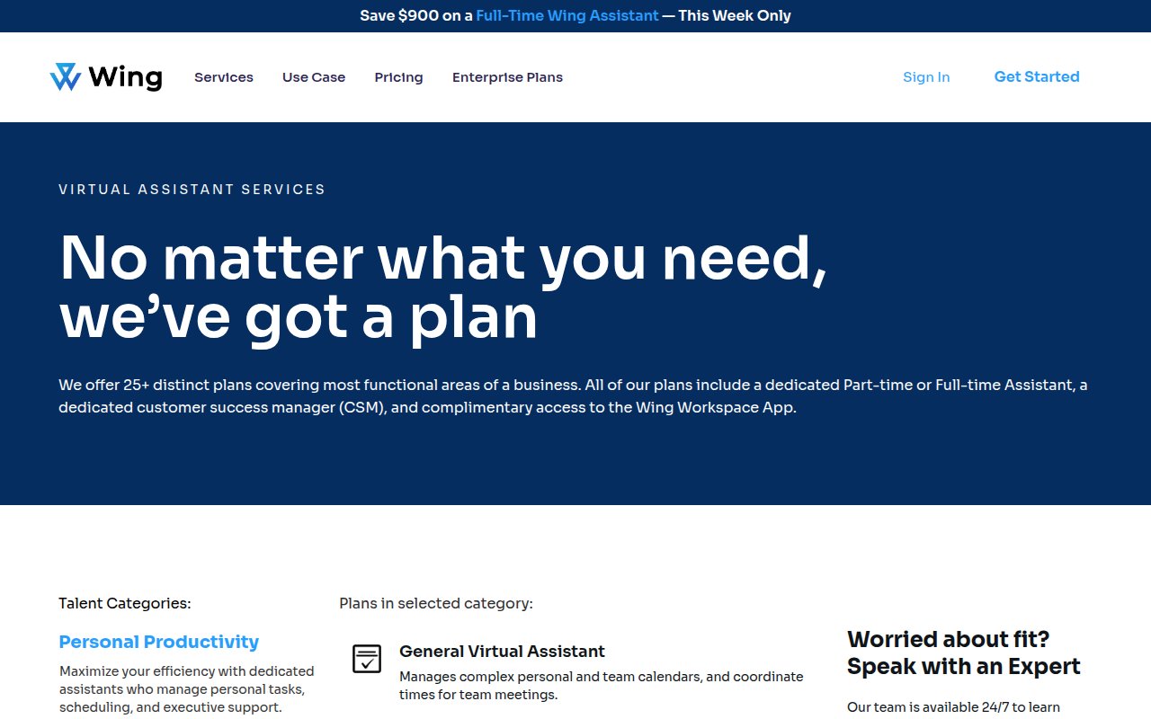
Wing Assistant puts four third-party review platforms showing 5-star ratings above the fold, backed by enterprise client logos. A phone number, live chat, and multiple CTAs give visitors several ways in.
The team is invisible, though. No founder bio, no team member profiles, no photos of actual Wing assistants. For a company with strong third-party validation, adding human faces is the obvious next thing to fix.
20four7VA
Granular performance metrics as conversion tool

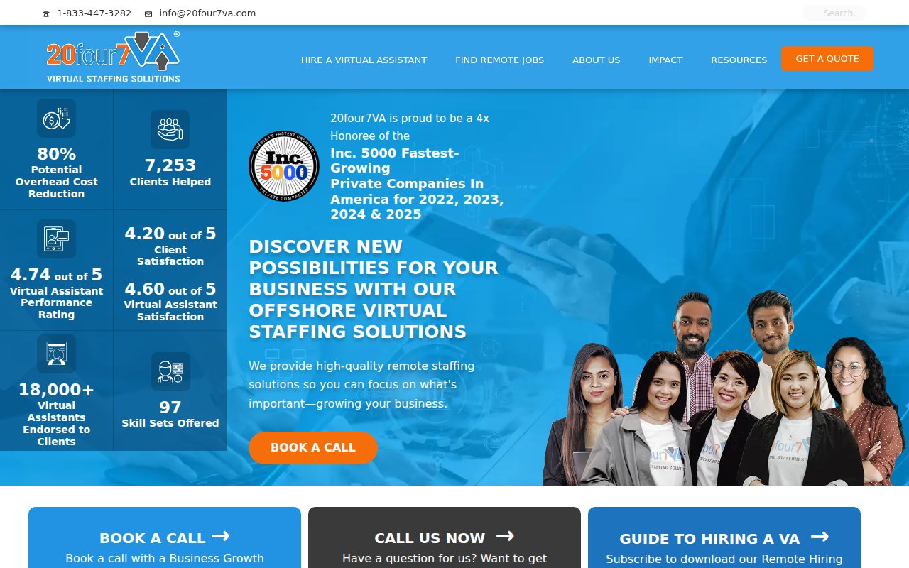
20four7VA leads with more performance data than any other site here, all above the fold: savings percentages, VA ratings, client counts, and an Inc. 5000 badge (4x honoree).
The design is cluttered. Stats overlay the hero image, competing for attention with CTAs and badges. But the conversion elements are strong despite the lack of polish.
Virtual Gurus
Purpose-driven hiring as differentiator
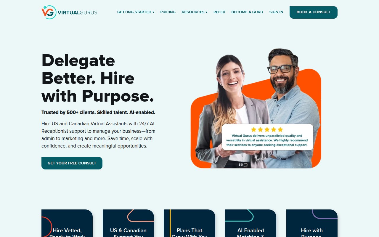
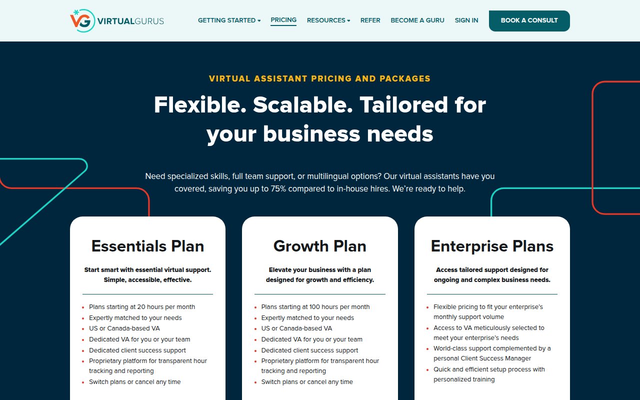
Virtual Gurus is the only site here that leads with a social impact message (“Delegate Better. Hire with Purpose.”) alongside the business value proposition. The mission to connect businesses with diverse, underrepresented talent isn’t buried in an about page; it’s the headline.
The site serves two audiences: clients (Book a Consult) and talent (Become a Guru). That dual-audience approach slightly dilutes the conversion focus for the primary buyer.
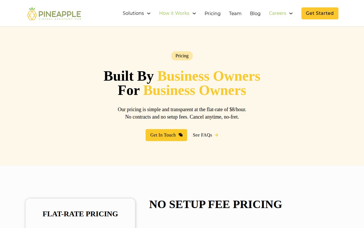
Pineapple
Trademarked VA categories signal specialization
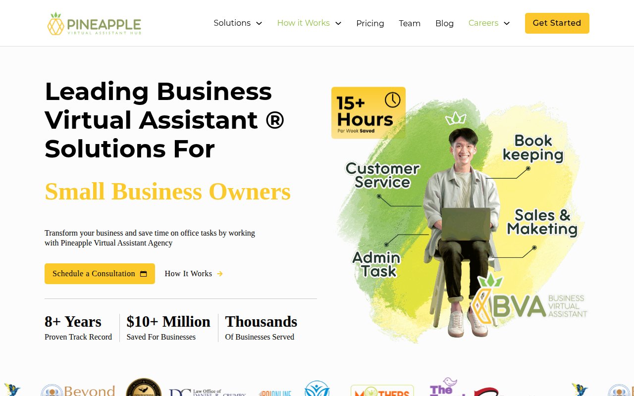
Pineapple sells trademarked role categories (distinct VA types trained for specific professional segments) rather than generic virtual assistants. The homepage splits by profession, so a lawyer sees different copy than a realtor.
The pricing page leads with “founded by business owners, for business owners.” Where it falls short is social proof: limited named testimonials on the homepage and no third-party review badges. Customer evidence beyond stats would strengthen the specialization claim.
Virtudesk
Media logos as mainstream credibility
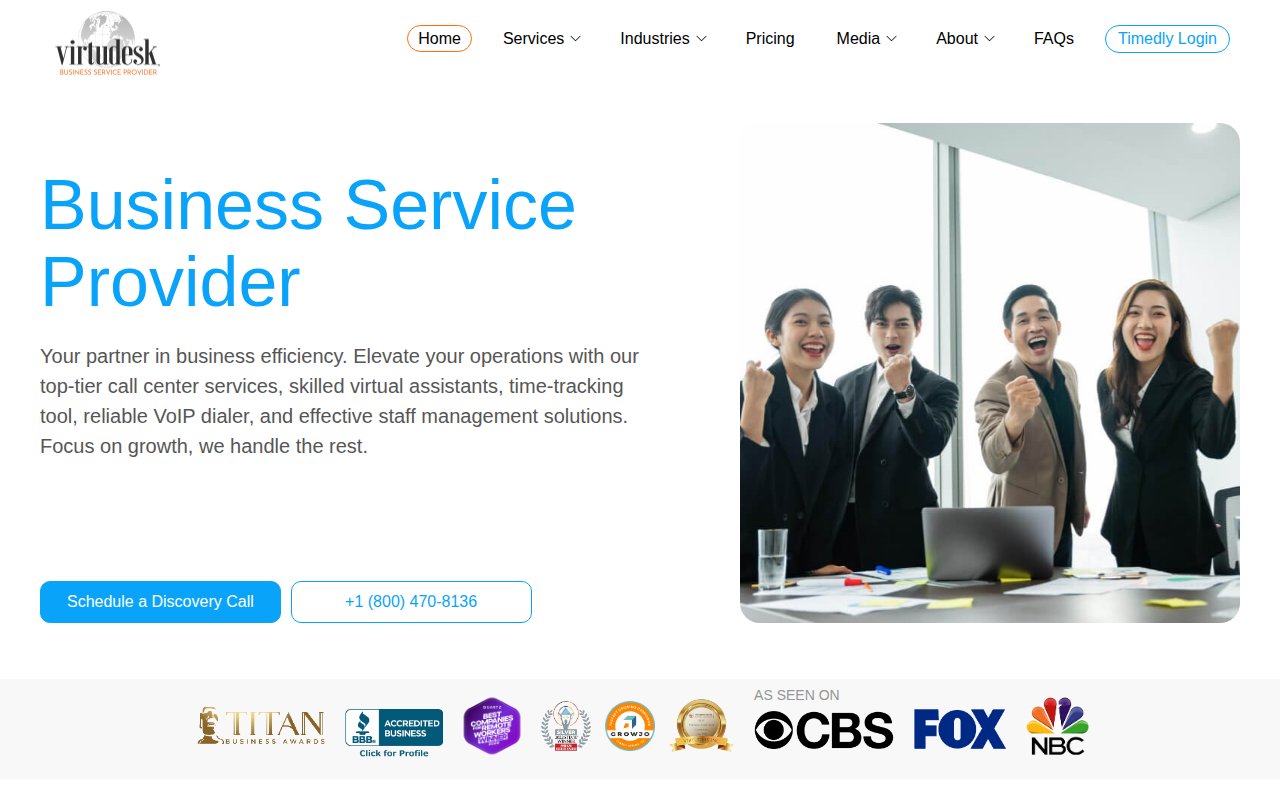
Virtudesk leads with mainstream media logos (CBS, FOX, NBC) and BBB accreditation as its primary trust signal. For a buyer who needs to justify this expense to a boss or partner, media logos carry more weight than online reviews.
The differentiator is product breadth: call center services, a time tracker, and a VoIP dialer alongside the core VA offering.
The design is functional but generic. For a company with media placements and BBB accreditation, the site undersells the brand.
Zirtual
US-based transparency as positioning
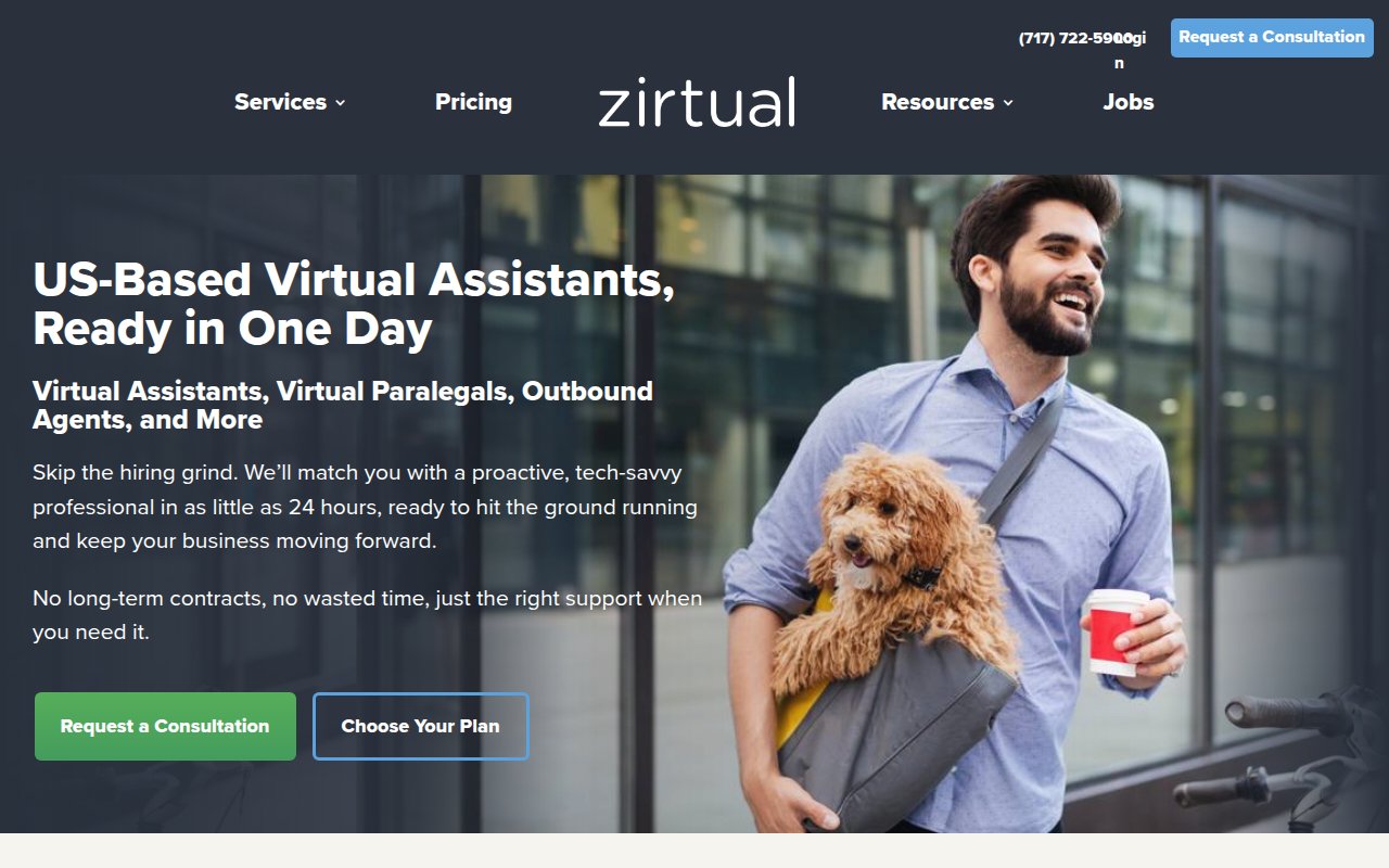
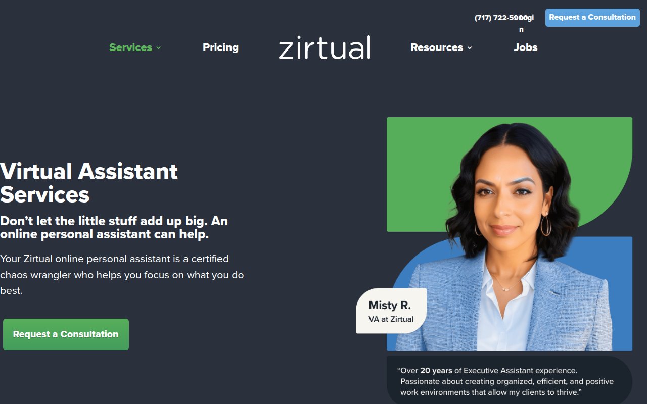
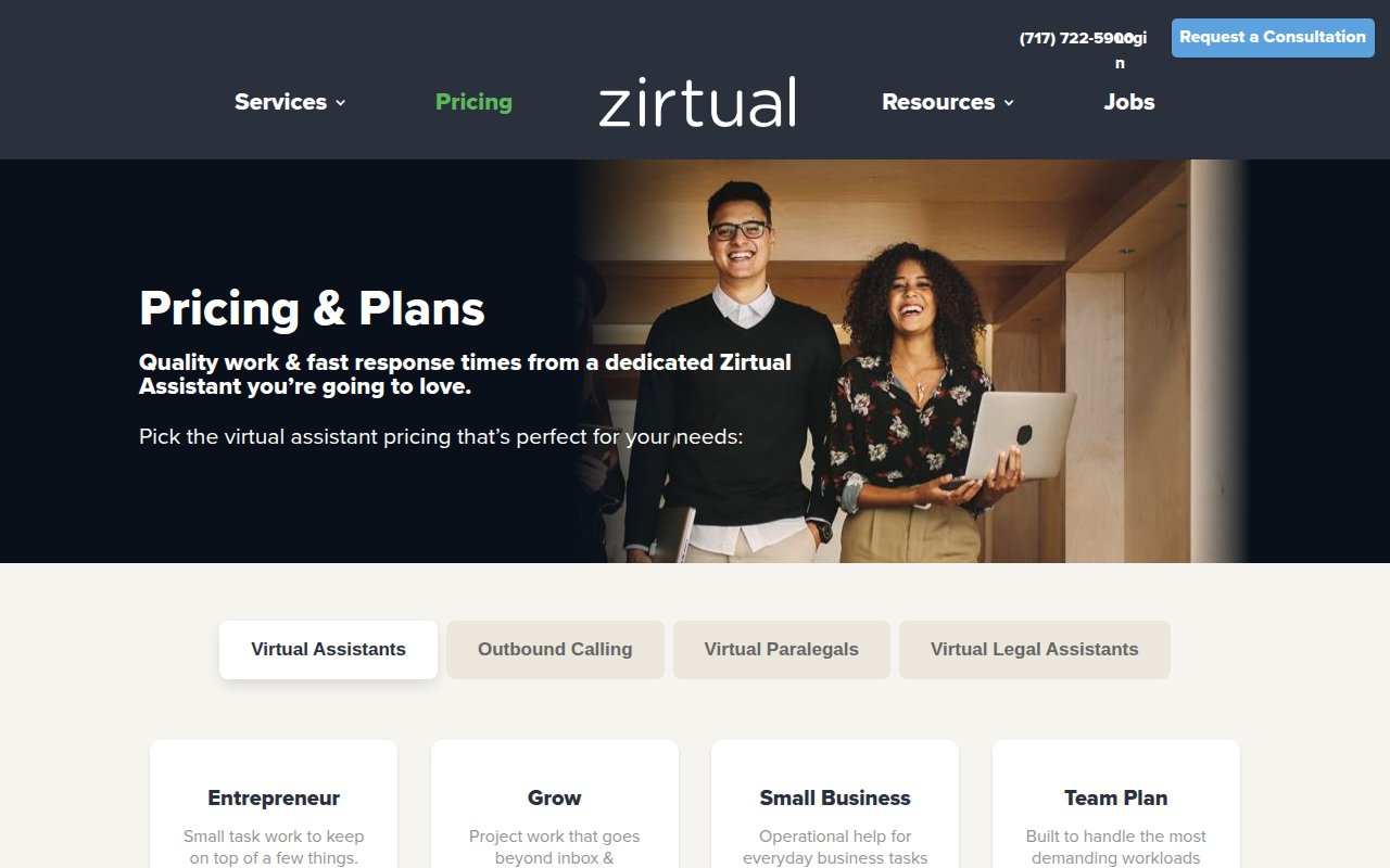
Zirtual leads with US-based assistants and same-day deployment. Every assistant is college-educated, so timezone and communication quality aren’t a concern.
Beyond standard VAs, Zirtual offers specialists (paralegals, bookkeepers, outbound callers), so you can start with admin and add roles as you grow.
The tradeoff is credibility signals. Testimonials lack strong attribution, and no review platform badges appear above the fold.
What the best virtual assistant websites have in common
Trust signals appear before the scroll
Nearly every high-performing site in this review puts its strongest credibility element above the fold: real team photos for Boldly, Inc. Power Partner for Belay, SOC 2 compliance for Prialto, review platform badges for Wing Assistant. Visitors decide whether to keep reading in the first 5 seconds.
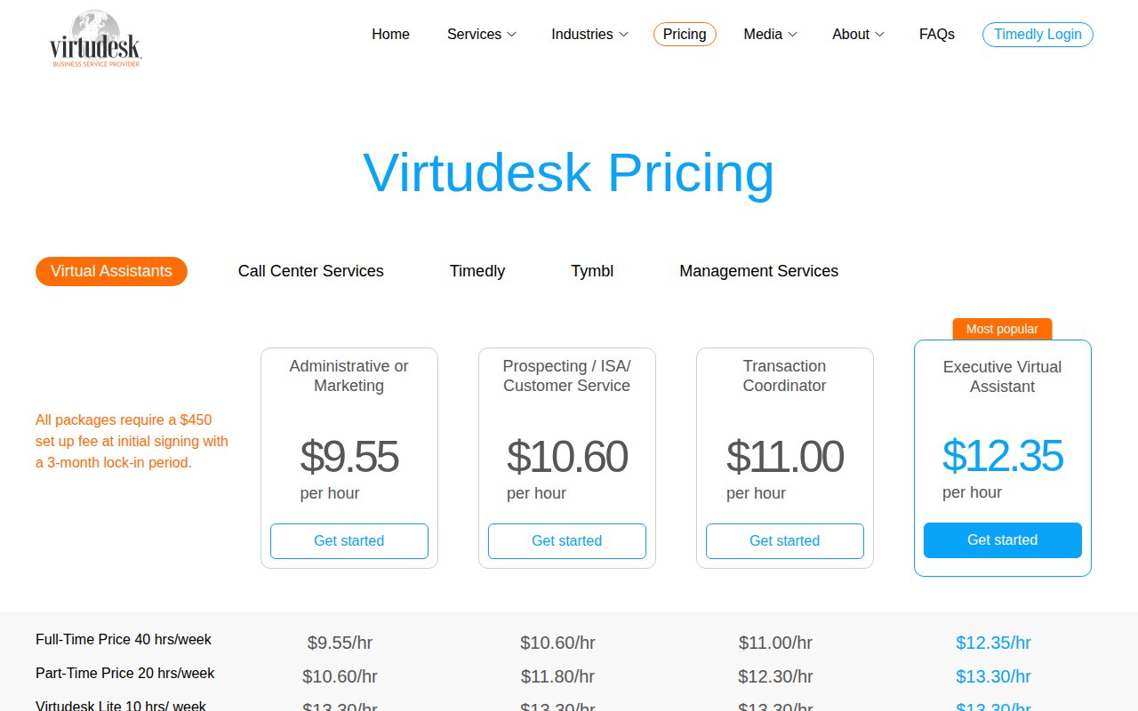
Pricing is visible, not hidden
Most sites we reviewed publish pricing pages with plan tiers, hourly ranges, and included services. The VA industry has enough commoditization that hiding pricing just sends the visitor to a competitor who shows it.
Multiple conversion paths, not one
The strongest sites offer 2-3 ways to take the next step: a consultation form, a phone number, and either a chat widget or a low-commitment alternative (free task ideas, a downloadable guide). Different visitors are at different stages, and a single "Contact Us" page loses the ones who aren't ready for a sales conversation.
Service pages go deep, not wide
Prialto's mega-menu, Wishup's tool integration pages, and 20four7VA's 97 skill categories all demonstrate a pattern: the sites that rank best for SEO don't have one generic "Services" page. They have dozens of specific pages, each targeting a different search query.
The homepage answers "who will I be working with?"
Boldly shows real team-client pairings. She's A Given features the founder's story. Even sites without individual bios (Belay, Time Etc) show professional imagery that suggests real people, not a faceless platform. In an industry where you're trusting someone with your inbox, anonymity is a conversion killer.
How to build your virtual assistant website
-
Lead with your strongest trust signal above the fold. Certifications, team photos, media mentions, review badges. Pick the one that best fits your positioning and make it the first thing visitors see. Everything else is secondary.
-
Publish your pricing. Tiers with hourly ranges and included services. If your pricing is customized, show starting-at ranges with a “Get a Custom Quote” option. The visitor has other tabs open.
-
Create specific service pages for each VA role you offer. “Virtual Assistant Services” as a single page loses to a competitor with separate pages for executive assistant, bookkeeping, social media management, and customer support. Each page targets a different search query and speaks to a different buyer.
-
Offer a low-commitment first step alongside your consultation CTA. A downloadable delegation guide, a free task assessment, or a task ideas tool. Not every visitor is ready to talk to sales, and capturing their email now means you can convert them later.
-
Show your team. Real photos, real names, real bios. If you’re a founder-led agency, your personal story is a competitive advantage against faceless staffing companies. If you’re a larger operation, at least show the people visitors might work with.
-
Build tool and platform integration pages. Wishup has pages for QuickBooks, Zoho, ChatGPT. These pages answer a question competitors miss (“Can your VA use my software?”) and capture long-tail search traffic.
If you’re still choosing a name for your VA company, our virtual assistant business name ideas guide has 500+ options to get you started.
Key Takeaways
- Put your strongest trust signal (team photos, certifications, review badges) above the fold. VA buyers decide whether to keep reading in under 5 seconds.
- Publish your pricing. Nearly every top-performing VA site shows plan tiers. Hiding pricing sends visitors to competitors who don't.
- Offer a low-commitment first step alongside your main CTA. "Get free task ideas" or a delegation guide converts visitors who aren't ready for a sales call.
- Build individual service pages for each VA role, not one generic services page. Specific pages rank better and speak directly to each buyer's problem.
- Show real people. Founder stories, team photos with names, and client pairings build more trust than any stock photo or trust badge.
- Add tool and platform integration pages (QuickBooks, Slack, HubSpot) to capture long-tail search traffic and answer "Can your VA use my software?"
How we picked these sites
We started with a broad scan of hundreds of virtual assistant company websites, filtering for companies with strong third-party signals: high Google Business Profile ratings, verified reviews on Clutch and Trustpilot, meaningful organic search traffic, and recent site updates. We also reviewed coverage from Outsource Accelerator, IAOP (International Association of Outsourcing Professionals), and BPO industry reports to find boutique VA agencies worth evaluating that don’t dominate search results.
From that pool, we selected dozens of the top sites and scored each on five criteria: UX quality, conversion optimization, social proof integration, team authenticity, and SEO coverage. Every site got a multi-page review covering the homepage, services page, pricing page, and any standout pages like team directories or resource libraries.
The sites featured here earned the highest overall scores. Each one made the cut because it does something specific well, not because it’s the “best” at everything. The goal is a collection where every site teaches a different lesson about what works for virtual assistant websites.
Frequently Asked Questions
What makes a virtual assistant website convert visitors into clients?
The VA company sites that convert best share three traits: visible social proof from third-party platforms (not just self-curated testimonials), transparent pricing or a clear path to learn about costs, and a low-friction first step that isn't 'schedule a sales call.' The sites that score highest in our review offer alternatives like free task idea generators, lead magnets, or embedded consultation forms that qualify the visitor before anyone picks up the phone.
How much does a virtual assistant company website cost to build?
A VA company website ranges from near-zero on Squarespace (She's A Given built a polished boutique site on it) to $3,000-$8,000 on WordPress with a page builder like Elementor, to $15,000-$40,000+ for a custom Next.js or HubSpot CMS build. Most sites in our review run on WordPress. The platform matters less than the content: real team photos, transparent pricing, and specific service pages do more for conversion than custom code.
Should a virtual assistant website show pricing?
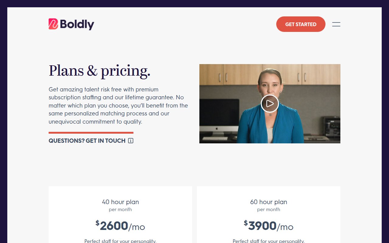
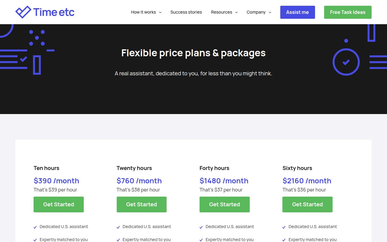
Yes. Nearly every high-performing site in our review shows pricing or pricing tiers. Visitors comparing VA services have multiple tabs open and will bounce from any site that makes them schedule a call just to learn the cost. At minimum, show plan tiers with hourly ranges and what's included. Boldly, Prialto, and Time Etc all publish pricing pages, and they scored among the highest overall.
 12 Gym & Fitness Website Design Examples (2026)