
We reviewed dozens of funeral home sites across six cities and scored each on UX, conversion, social proof, team authenticity, and SEO coverage. The highest-scoring sites weren’t the prettiest. They were the ones that made it obvious a real person would answer when a family called at 2 AM.
These 10 each earned their spot for a different reason.
Speaks Funeral Home
Three-path CTA routes visitors by situation
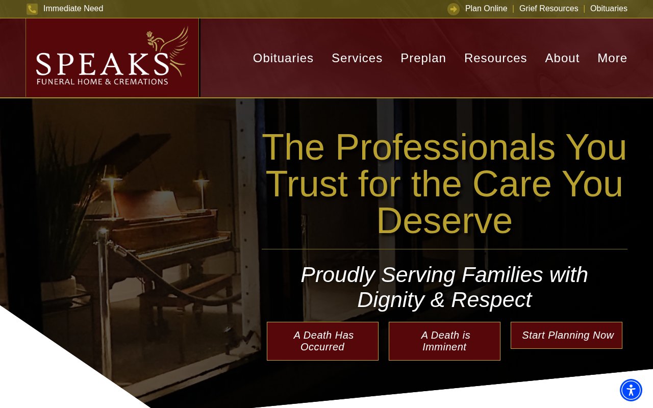
Speaks Funeral Home splits its homepage into three paths based on urgency, routing the family in crisis differently from the family planning ahead. Every visitor feels understood rather than funneled, which is rare in this industry.
An active obituary carousel below the fold proves the business is busy and gives community members a reason to return.
The weakness is team visibility. No founder story, no staff names on the about page. The independent positioning would hit harder with a real person behind it.
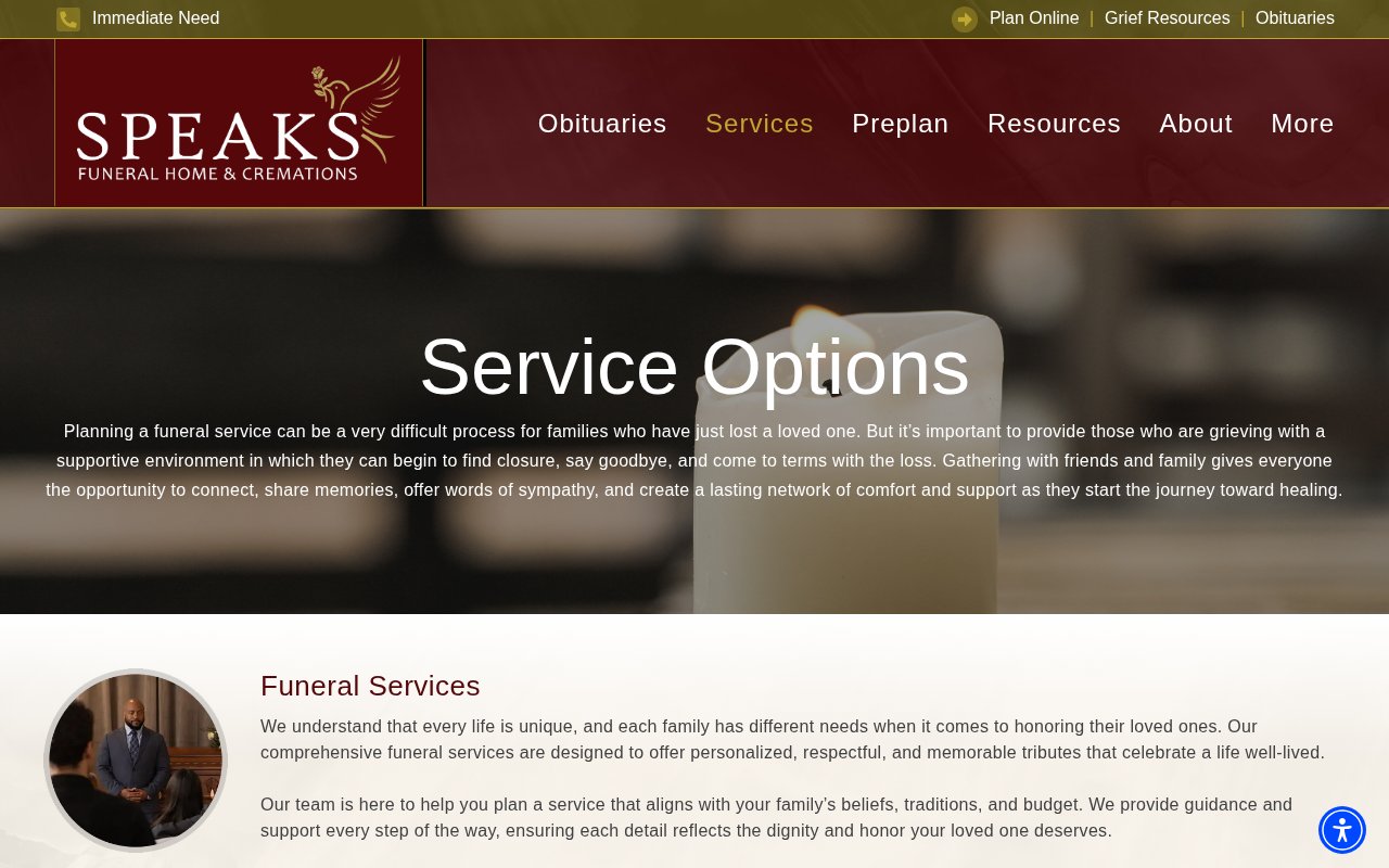
Farrington Mortuary
Online arrangements done in 5 minutes
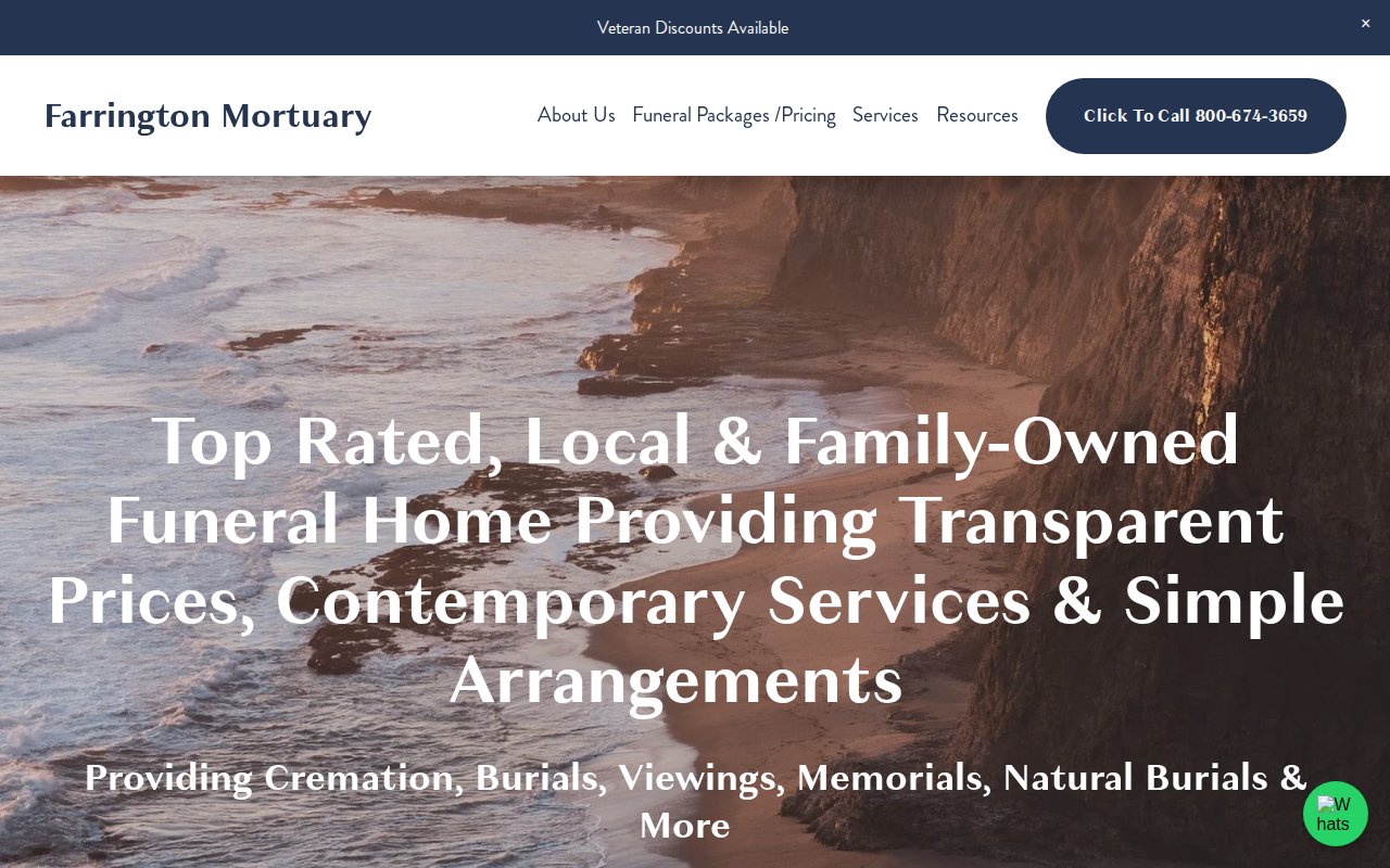
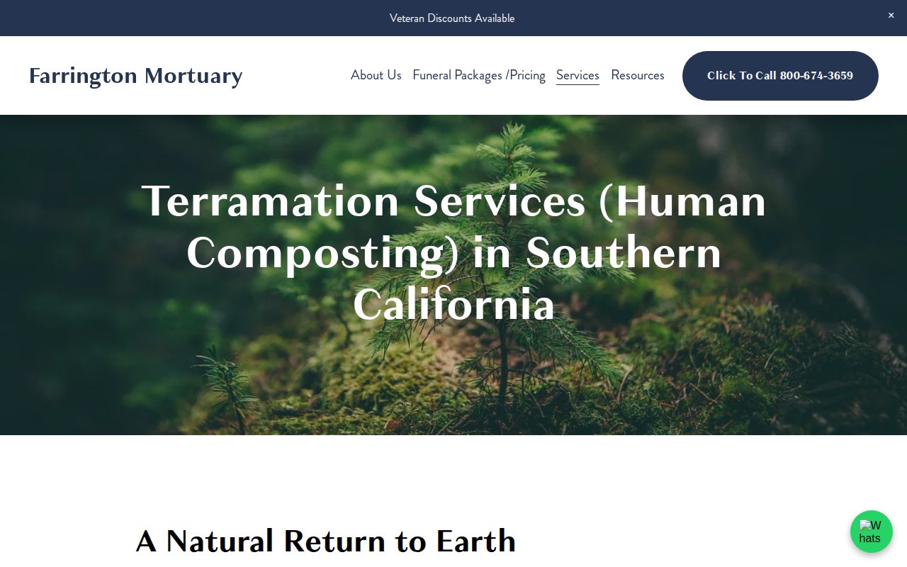
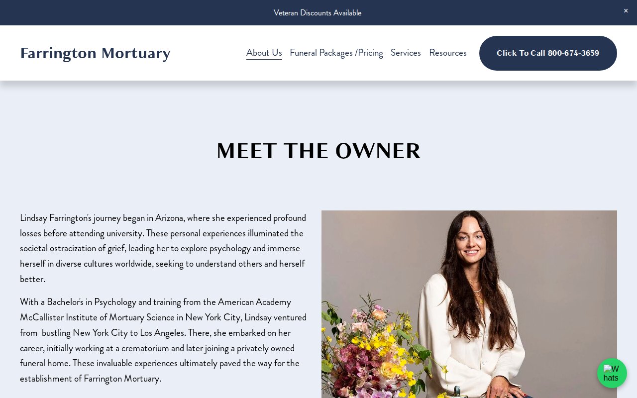
Farrington Mortuary is built around one idea: arrange a funeral online in five minutes. The homepage breaks the process into four steps so families see exactly what happens and when. Transparent pricing and veteran discounts are visible before you pick up the phone.
The Terramation (human composting) page is the strongest part of this Squarespace site. A detailed breakdown of a service legal in only six states captures long-tail search traffic most competitors aren’t targeting.
The missing piece is social proof. No testimonials anywhere, and for a business built on trust during the worst week of someone’s life, that’s a real missed opportunity.
AA Rayner & Sons Funeral Homes
Historical endorsements no competitor can replicate
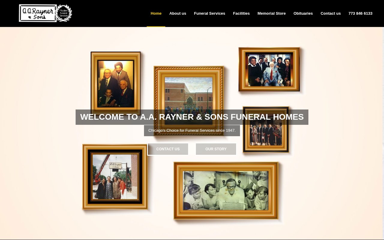
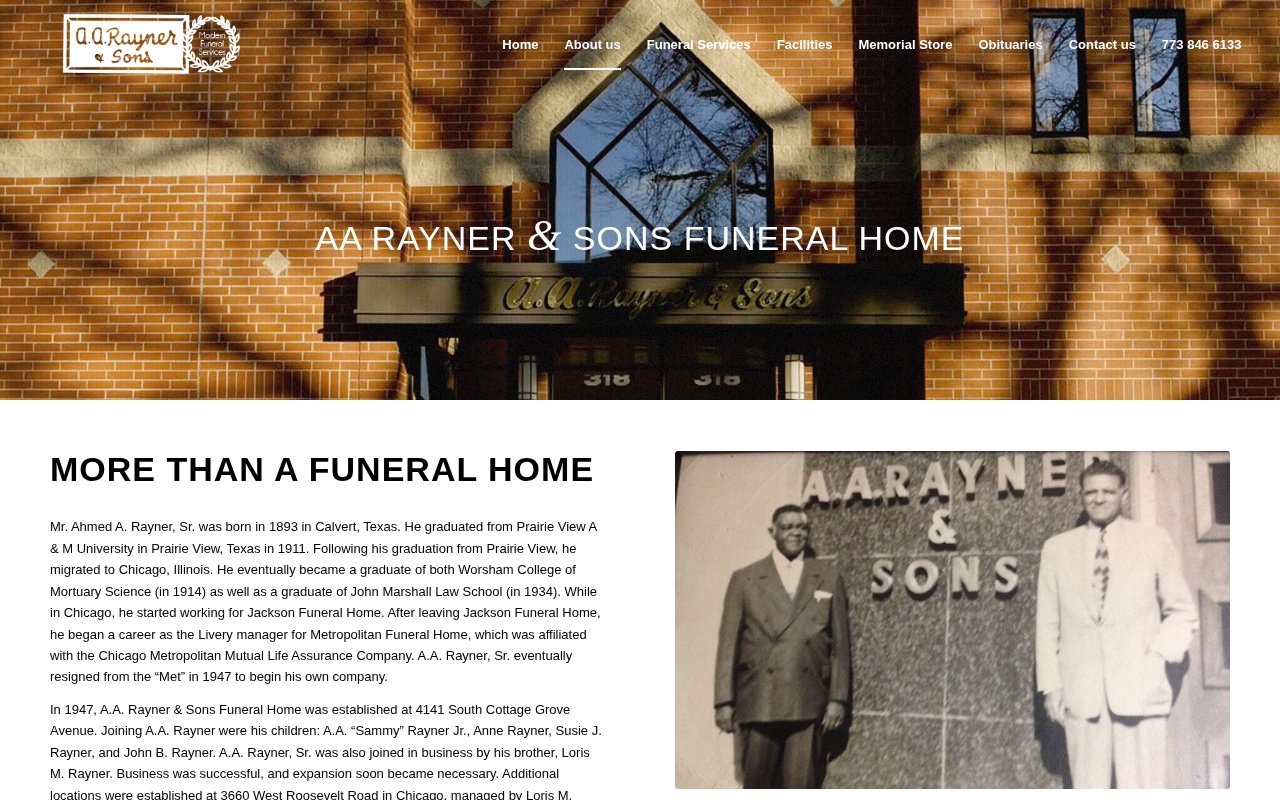
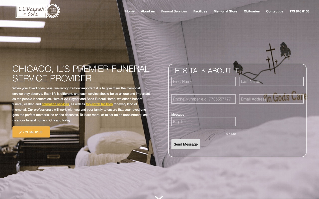
AA Rayner & Sons has a brand story no competitor can replicate. The family handled Emmett Till’s 1955 funeral at his mother’s request, a moment that helped catalyze the Civil Rights Movement. A.A. Rayner Jr. was a Tuskegee Airman and later a Chicago alderman. The about page documents all of it.
The homepage testimonials are from notable public figures with local roots, not anonymous reviews. Three generations of one family endorsing the same funeral home is hard to argue with.
The WordPress site is visually modest. A story this strong deserves a design that matches it.
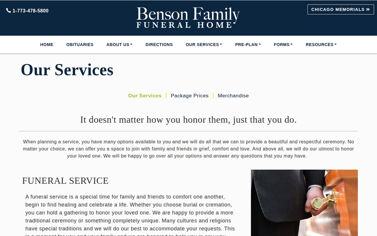
Benson Family Funeral Home
Named director front and center on homepage
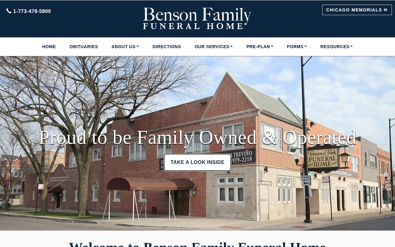
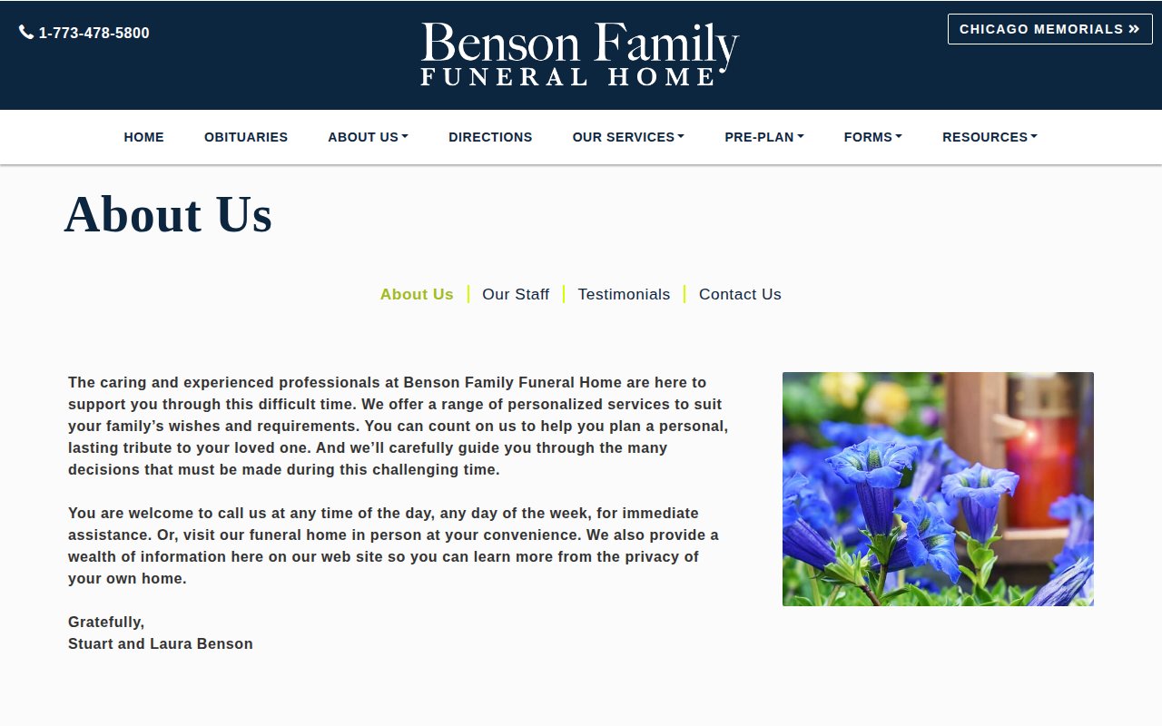
Benson Family Funeral Home puts the director’s real name on the homepage and uses a personal email address as the primary contact. Those details make it feel like an actual family business, not a corporation calling itself one.
Conversion basics are solid, including a virtual tour for first-time visitors who may be nervous about walking through the door.
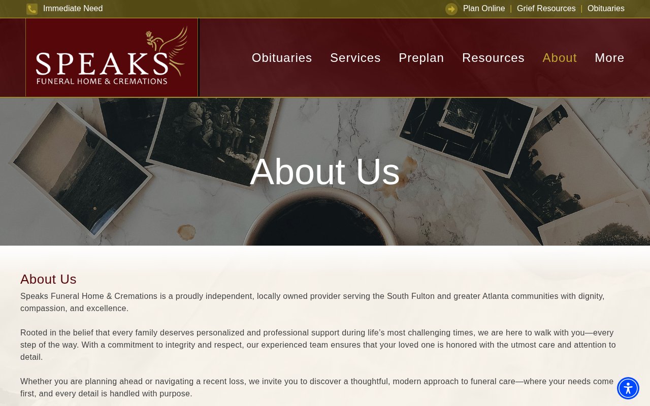
The about page doesn’t go far enough. A funeral home leaning this hard into family identity needs a deeper story to back it up.
Beacon Mortuary
Founder personally reachable day or night
Beacon Mortuary is a sole proprietor who leans all the way into personal accessibility. The founder runs the business from home in Santa Monica, answers the phone himself at any hour, and skips the answering service entirely.
Services and pricing share one transparent page, and a direct Q&A feature lets families ask specific questions without committing to a phone call.
The founder is the whole brand, but the site never tells his story. That’s the obvious next investment.
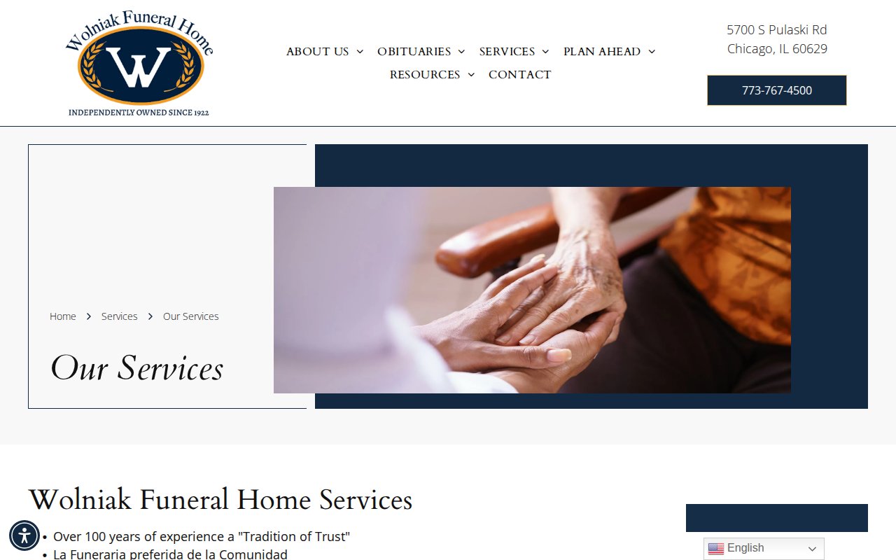
Wolniak Funeral Home
Grief resource library rivals dedicated counseling sites
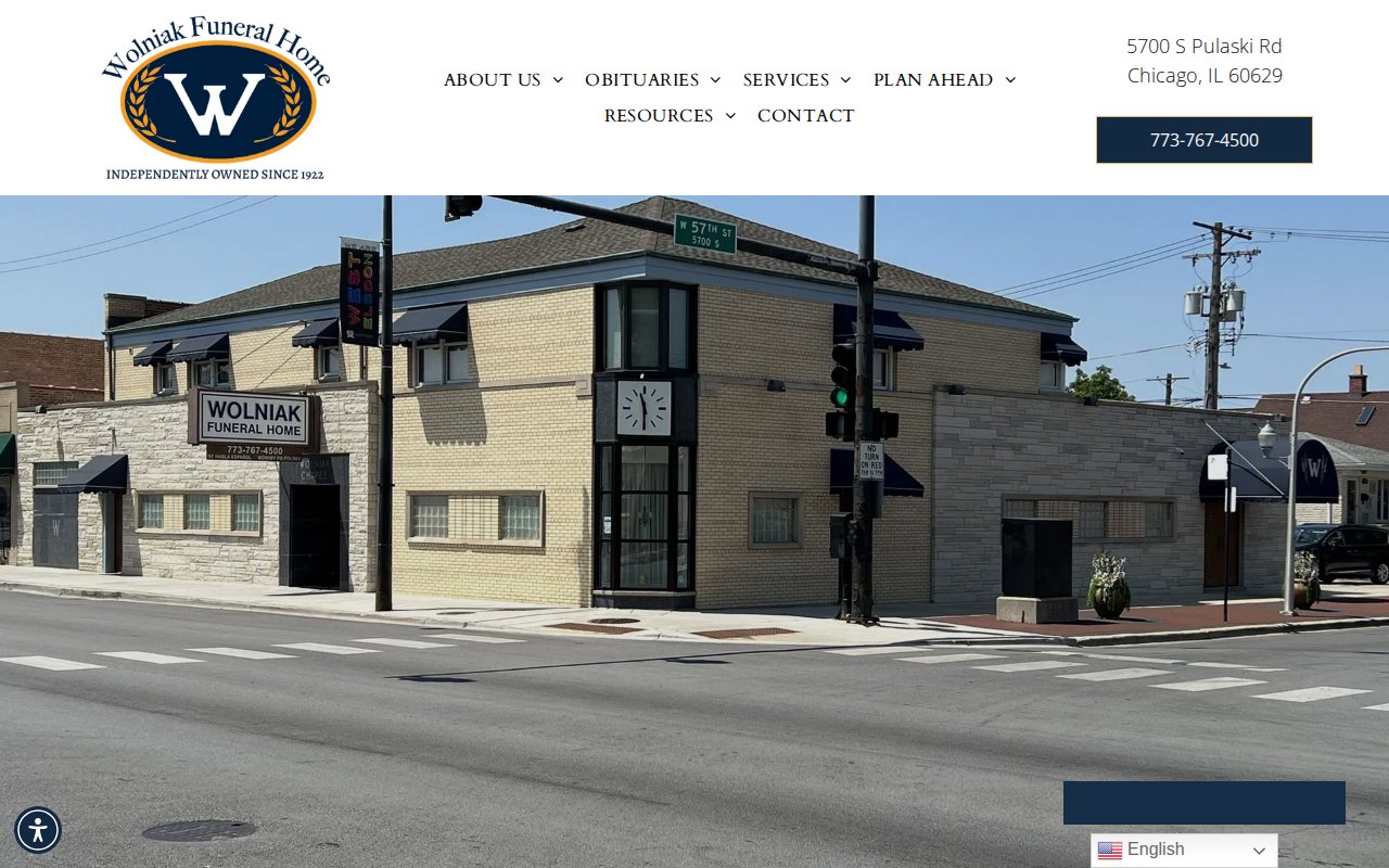
Wolniak Funeral Home has more useful pages than most funeral home sites have total pages: grief guides, veteran benefits, funeral etiquette, social security info, children’s grief resources. Each one matches a search query a grieving family might type at midnight.
Founded in 1922, the site also serves Chicago’s Polish and Spanish-speaking communities with multilingual content and international shipping to Mexico and Poland. Niche specificity like that builds real loyalty.
The design is template-standard, but the content depth more than compensates.
River View Cemetery Funeral Home
140-year heritage meets progressive burial options
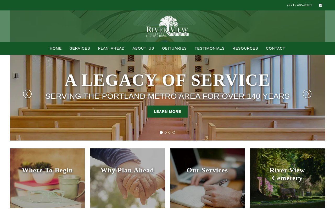
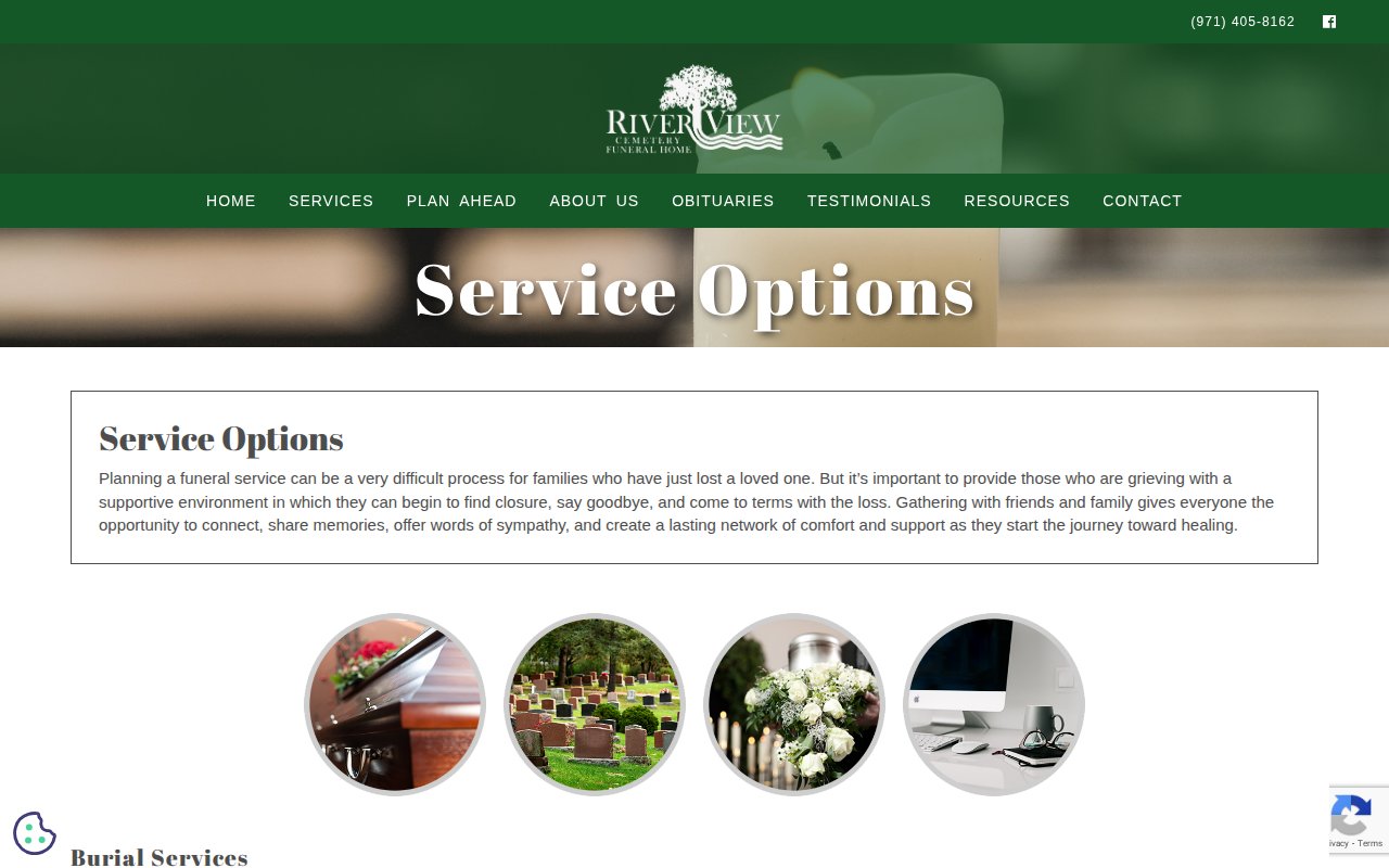
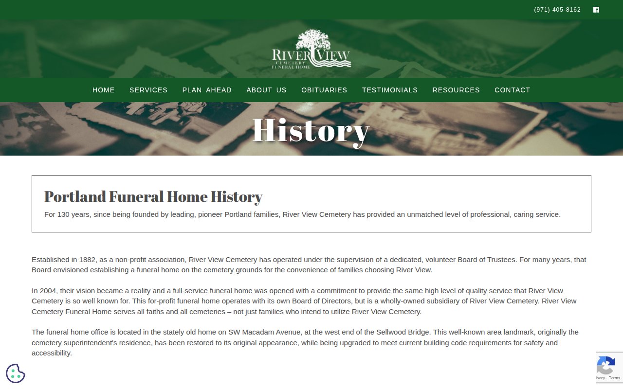
River View Cemetery Funeral Home combines 140+ years of Portland service with natural burial and aquamation. That pairing appeals to the traditionalist grandmother and her environmentally-conscious granddaughter alike.
The combined cemetery and funeral home model also means families handle everything in one place instead of coordinating between separate businesses during an overwhelming week.
Where it falls short is people. No named staff, no individual bios. For a business selling personal care, anonymous is a liability.
Kolbus-John V. May Funeral Home
Grief bookstore signals community-care philosophy
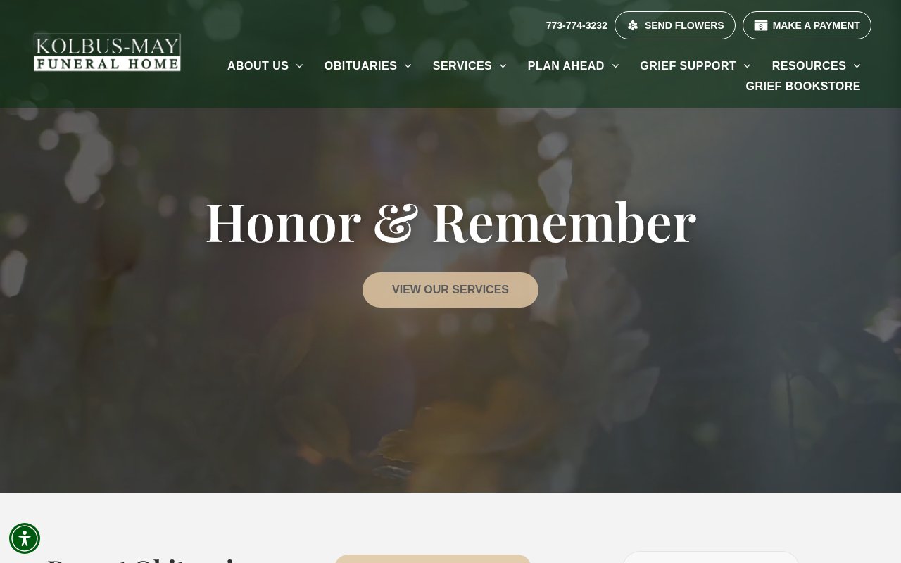
Kolbus-John V. May Funeral Home invests more in post-service care than most competitors invest in their entire web presence. A curated grief bookstore, community event calendar, and year-long weekly email program all reinforce that the relationship continues after the funeral.
Serving Chicago’s Northwest Side for over 100 years, the operational basics are covered. But the aftercare content is what makes this site worth studying.
The visual design doesn’t match the depth of care behind it. These resources deserve a better wrapper.
Lakeview Funeral Home
Obituary subscriptions keep families coming back
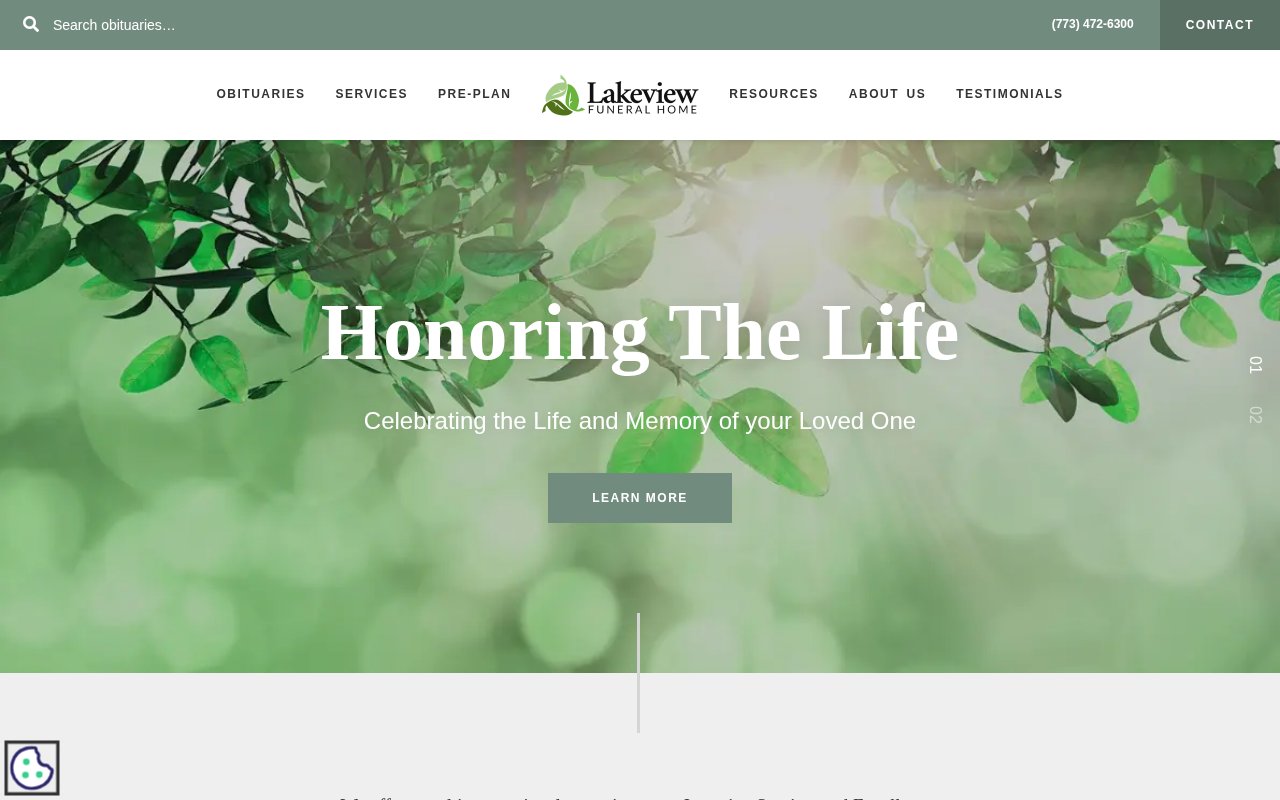
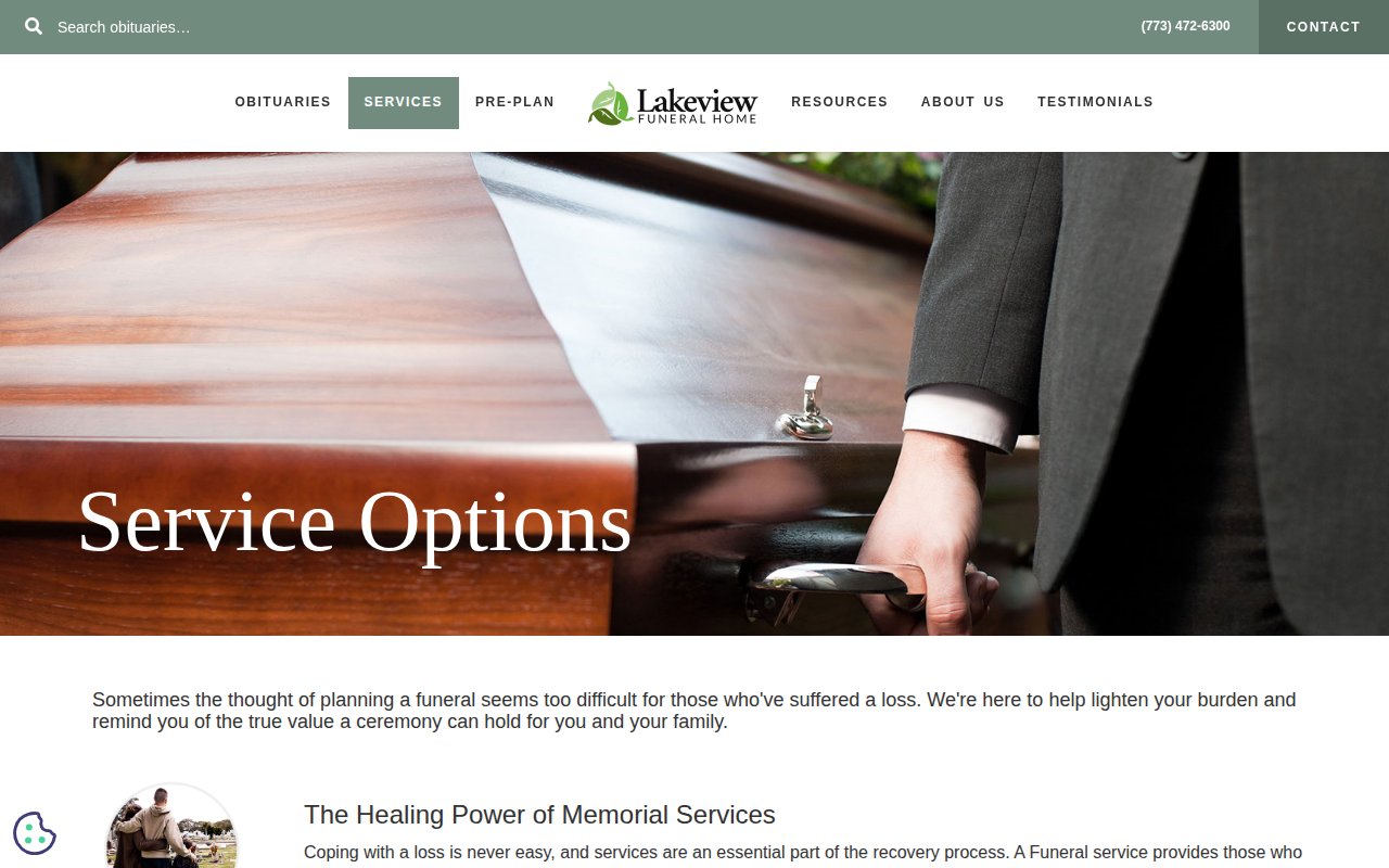
Lakeview Funeral Home treats its obituary section as a traffic engine. An email subscription captures community members who want notifications, and integrated flower links on each listing generate additional revenue.
The rest of the site is clean and covers the expected bases, with Spanish-language support for their Chicago market.
The tradeoff is personality. No named staff, no personal story. A site this polished would convert better with a real human attached to it.
Forest Lawn Memorial-Parks
Multi-location LA institution with full cemetery portfolio
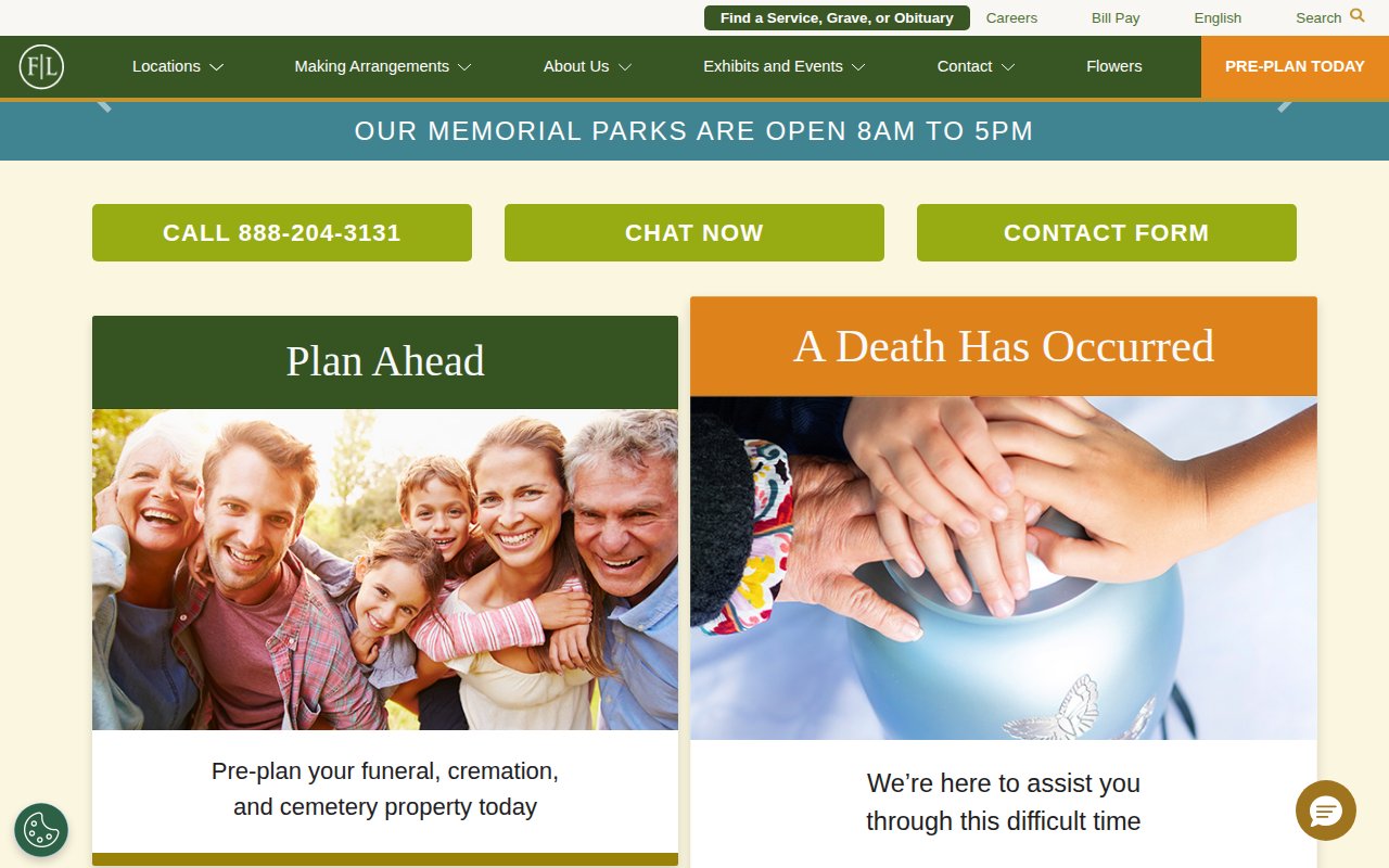
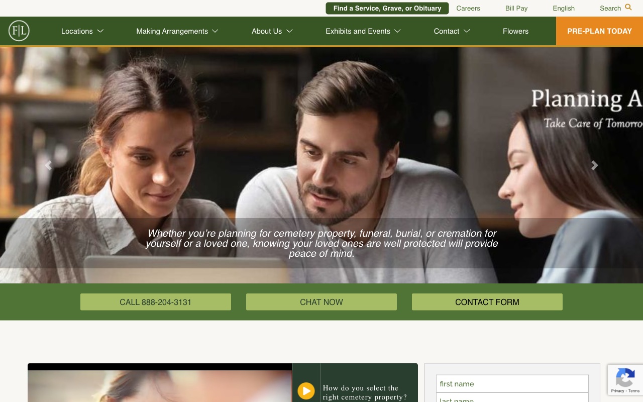
Forest Lawn Memorial-Parks is the institutional end of this spectrum: six LA-area memorial parks, four mortuary centers, and a WordPress site that gives each location its own clear entry point.
Forest Lawn publishes a cremation starting price on the homepage. Showing a number before the phone call reduces anxiety and filters for serious leads.
The trade-off is total anonymity. No people, no stories, no personality. That works at Forest Lawn’s scale, but it’s not a model most funeral homes should copy.
What the best funeral home websites have in common
Phone number visible on every page
Nearly every site we reviewed puts a phone number in the header, often with "24/7" or "For Immediate Support" framing. Families in crisis shouldn't have to hunt for contact information.
Situation-aware CTAs
The best sites acknowledge that someone dealing with a death right now and someone pre-planning for the future need different paths. Splitting these flows increases conversions for both audiences.
Named directors and real founder stories
Sites with a named founder or director scored significantly higher on trust. Specific biographical details beat generic "compassionate professionals" language every time.
Active obituary sections
Fresh obituary listings prove a funeral home is busy and trusted by the community. Email subscriptions and flower-sending integrations turn obituaries into a retention and revenue tool.
Post-service grief resources
The strongest sites invest in content beyond the transaction: grief resource libraries, weekly email programs, grief bookstores, and community calendars. These resources cost almost nothing to create and signal that the relationship with families doesn't end at the service.
How to build your funeral home website
-
Put a phone number and an “immediate need” button above the fold. When someone visits your site at 2 AM after losing a family member, they need to reach a human in seconds. Every top-performing site in our review has the phone number in the header on every page.
-
Write your actual story, not a mission statement. The sites that scored highest on trust all have specific founder or family narratives. Not “serving families for decades” but the concrete details of how and why the business started. If you don’t have a dramatic origin story, write about why you personally chose this work.
-
Add an active obituary section with email subscription. Active obituaries prove your funeral home is busy and trusted. Email subscription drives repeat visits and keeps your brand in front of families before they need you.
-
Create at least one grief support resource page. Several of the best sites in our review offer dedicated content on grief stages, children and grief, veteran benefits, or funeral etiquette. These pages cost nothing to create and generate search traffic from families who may need your services months or years later.
-
Show pricing or explain your pricing process. Families researching funeral homes are anxious about cost. The strongest sites either publish package pricing, link a general price list from the navigation, or explain what factors drive cost. Silence on pricing creates anxiety for visitors who are already overwhelmed.
If you’re still in the naming phase, our funeral home business name guide has 200+ ideas organized by positioning strategy.
Key Takeaways
- The funeral home sites that get families to call put a real person's name and phone number on the homepage, not just generic "compassionate professionals" copy.
- Situation-aware CTAs ("A Death Has Occurred" vs. "Start Planning Now") outperform generic "Contact Us" buttons because they meet the visitor where they are emotionally.
- Your founder's specific story is your strongest trust signal. Write it with biographical detail, not corporate platitudes.
- Active obituary sections with email subscription and flower integration drive repeat traffic and keep your funeral home top of mind in the community.
- Post-service grief resources (book recommendations, weekly email programs, community calendars) cost almost nothing and signal that your relationship with families extends beyond the service.
How we picked these sites
We started with a broad scan of hundreds of funeral home websites, filtering for companies with strong third-party signals: high Google Business Profile ratings, verified reviews, meaningful organic search traffic, and recent site updates. We also reviewed industry publications like The Director (NFDA), Southern Funeral Director Magazine, and Memento Mori to find companies worth evaluating that don’t necessarily rank on page one.
From that pool, we selected dozens of the top sites and scored each on five criteria: UX quality, conversion optimization, social proof integration, team authenticity, and SEO coverage. Every site got a multi-page review covering the homepage, services page, about page, and any standout pages.
The sites featured here earned the highest overall scores. Each one made the cut because it does something specific well, not because it’s the “best” at everything. The goal is a collection where every site teaches a different lesson.
Frequently Asked Questions
What should a funeral home website include to build trust with families?
The strongest funeral home sites we reviewed share three elements: a named director or founder on the homepage (not anonymous 'compassionate professionals' language), a phone number in the header with 24/7 availability, and situation-aware CTAs that acknowledge whether the visitor is dealing with an immediate death or planning ahead. Active obituary sections and specific founder stories consistently scored higher on trust than stock photography and generic mission statements.
How much does a funeral home website cost to build?
A funeral home website can range from under $5,000 using Squarespace (Farrington Mortuary runs on Squarespace and has one of the strongest conversion flows in our review) to $15,000-$30,000+ for a custom WordPress build with multiple location pages. The biggest cost driver is content depth: sites with dedicated service pages, grief resource libraries, and active obituary sections require more upfront work. Our review found that content depth matters more than visual polish for this industry.
Should a funeral home website show pricing?
Most funeral home sites in our review don't show pricing, but the ones that do handle it well. Forest Lawn publishes cremation starting prices on the homepage. Farrington Mortuary lists transparent package pricing with veteran discounts. At minimum, explain what factors drive cost and how families can get a personalized quote. Silence on pricing creates anxiety for visitors who are already overwhelmed.
 14 General Contractor Website Examples That Win Bids (2026)