We reviewed dozens of agency sites across five dimensions and found a clear pattern: the agencies that score highest on conversion optimization and social proof also tend to be the ones with the most client results to show.
The 12 sites below each teach a different lesson about what works, from radical pricing transparency to niche specialization to letting awards do the talking.
Hook Agency
Radical pricing transparency
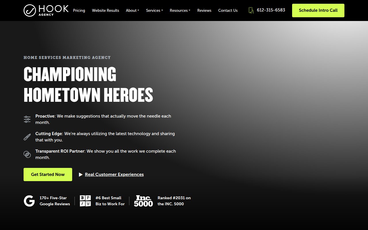
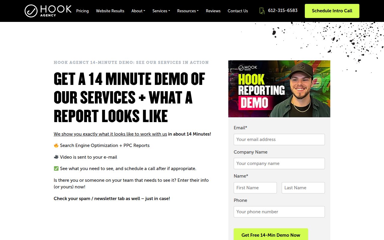
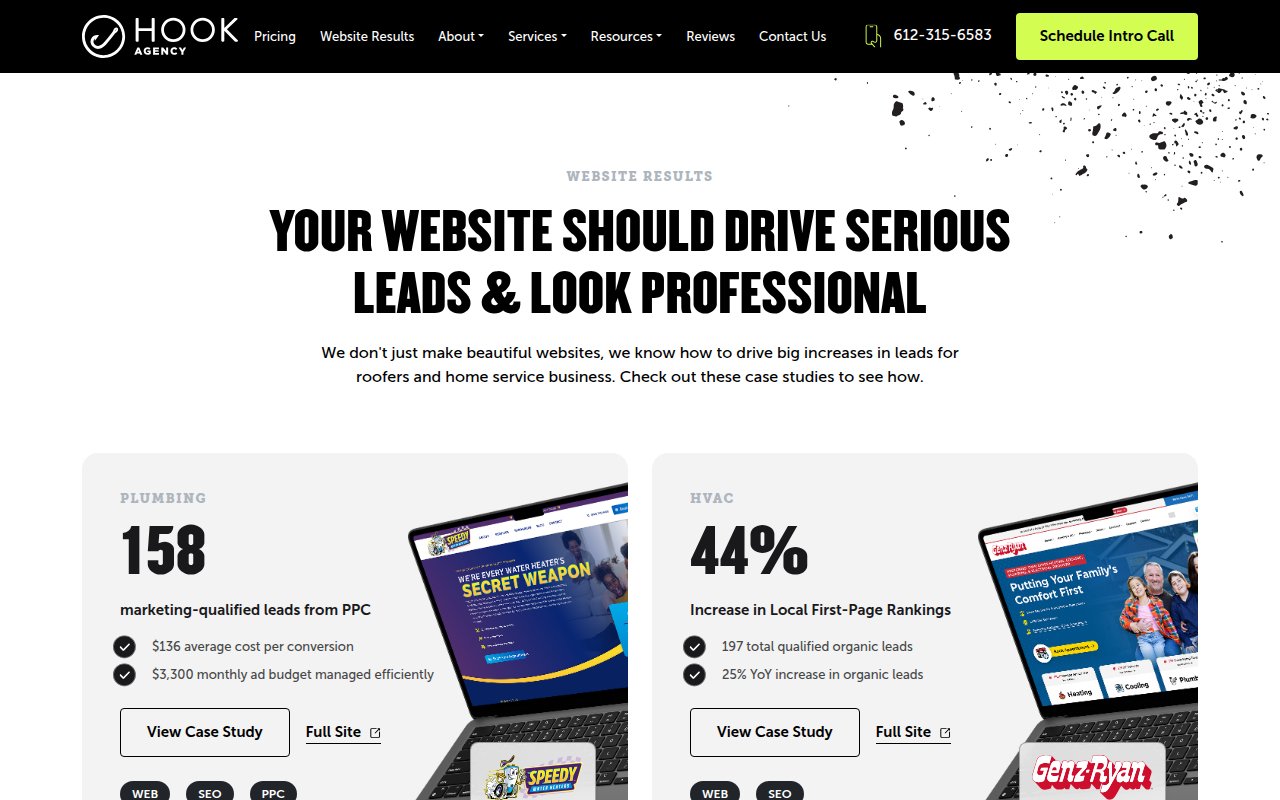
Hook Agency does something almost no marketing agency does: they publish their pricing. A dedicated pricing page, a 14-minute demo video, and 170+ Google reviews on the homepage. In an industry where “contact us for a quote” is the default, that transparency is a real differentiator. “Championing Hometown Heroes” tells plumbers, roofers, and HVAC contractors exactly who this agency is for.
Conversion paths are layered so a visitor who isn’t ready to call can watch the demo video instead, and a visitor who’s already sold can skip straight to scheduling. Inc. 5000 and “#6 Best Small Biz to Work For” badges sit alongside the Google reviews. Case studies show real results for specific home service companies.
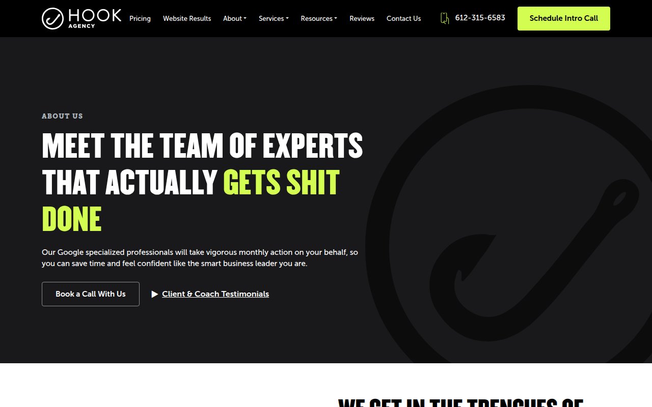
The tradeoff is focus. The homepage tries to do too much above the fold, and the visual hierarchy could be tighter. Detailed team bios help for a company whose people are the product.
SmartSites
Above-fold lead capture done right
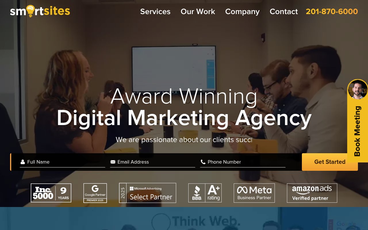
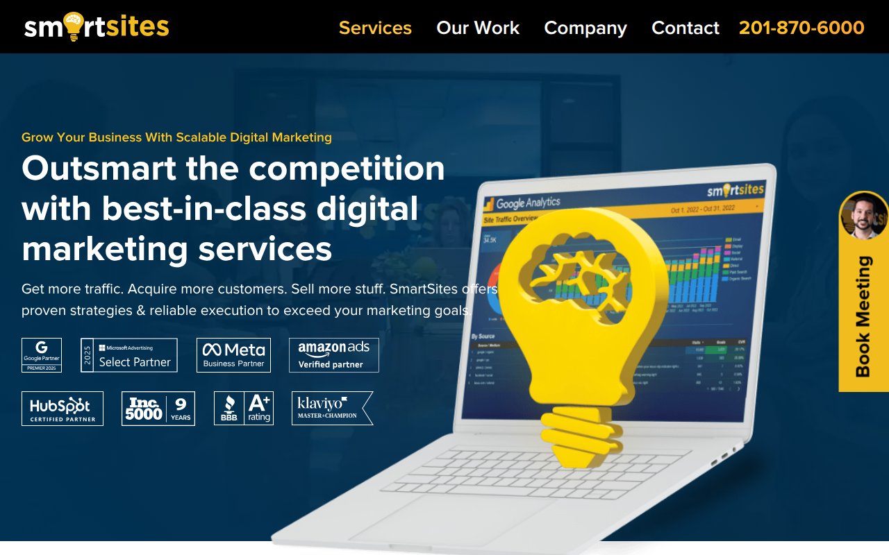
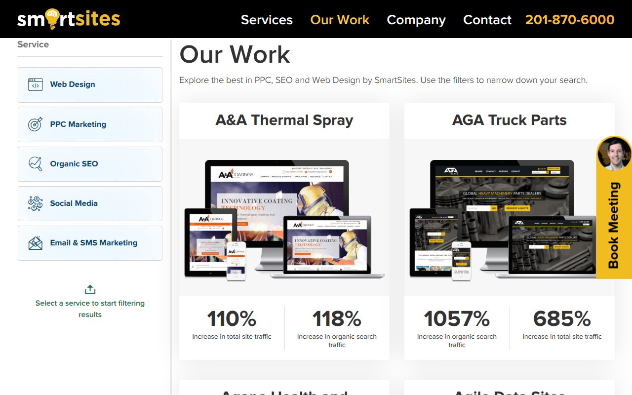
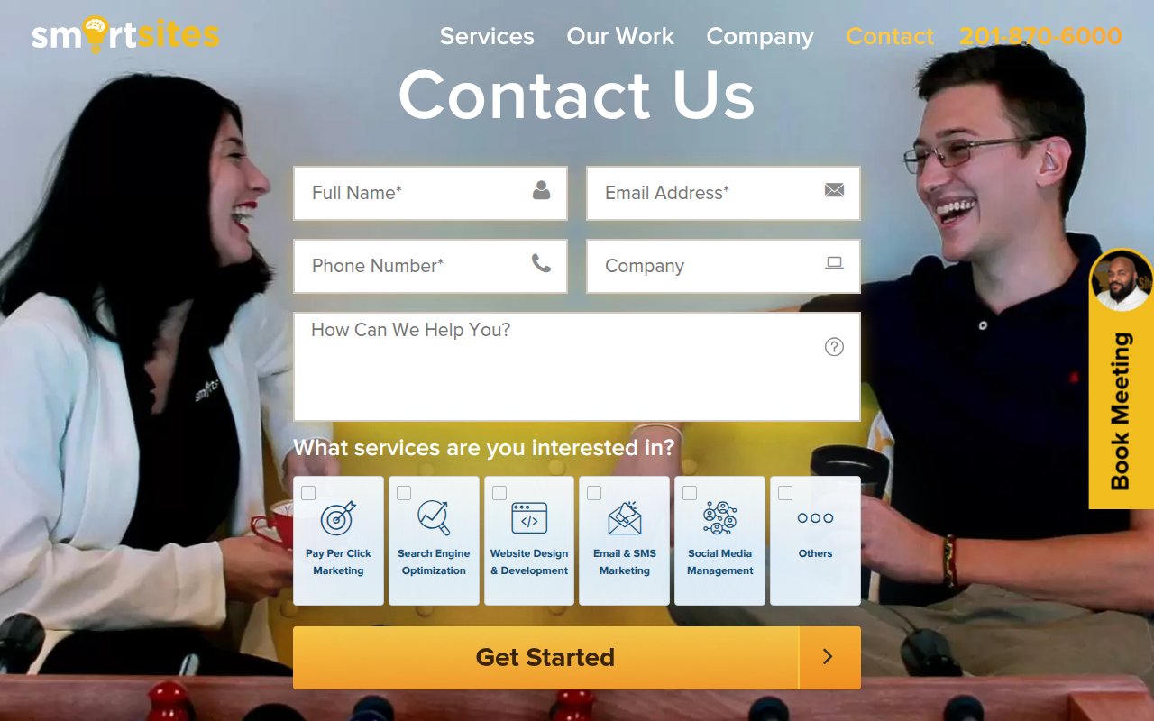
SmartSites puts a lead capture form directly in the hero section. Below it sits a wall of partner badges, including Inc. 5000 (nine consecutive years) and major platform certifications.
A sticky sidebar follows visitors as they scroll, so the path to a conversation is never more than one click away. The work portfolio shows real screenshots and measurable results. The design is clean but not flashy. Trust signals and frictionless contact paths do the converting here, not visual flair.
The gap is team authenticity. The company page doesn’t feature individual team members with any depth. For a prospect choosing between SmartSites and a competitor, knowing who they’d actually work with would help close the deal.
Animalz
AI chatbot as proof of concept
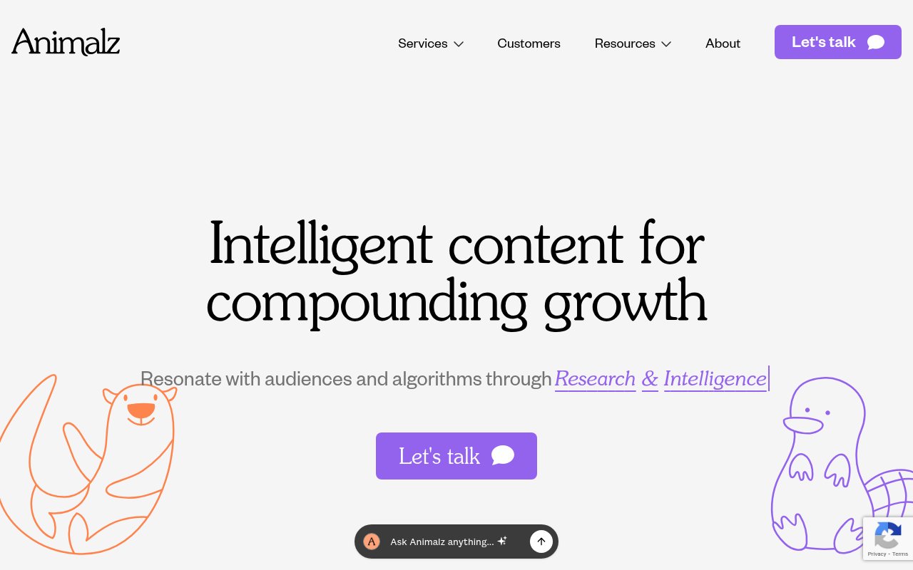
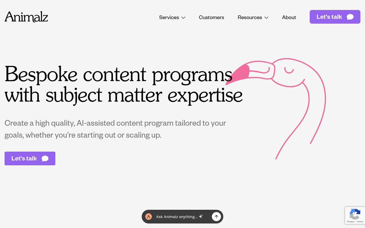
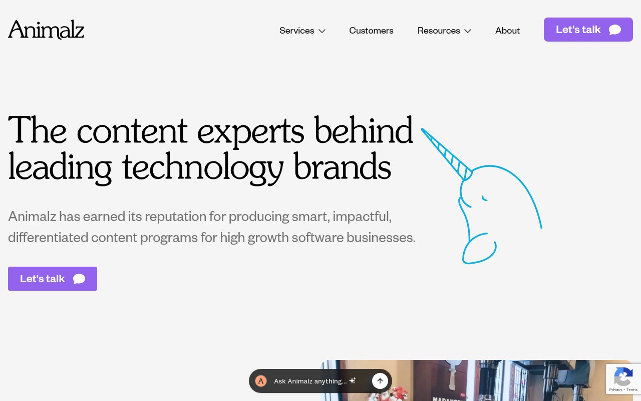
Animalz proves they know content marketing by practicing it. The hand-drawn animal illustrations give the site a personality that most B2B content agencies wouldn’t risk, and “Intelligent content for compounding growth” speaks directly to SaaS companies, their core audience.
An embedded AI chatbot demonstrates the agency’s technical range on-site. The about page has real team bios and a founder story.
The weakness is social proof. No testimonials on the homepage, no review widgets, no partner badges. For prospects who haven’t heard of Animalz through the content marketing community, the site relies almost entirely on brand and design to build trust.
Strictly Plumbers
Founder credibility as conversion tool
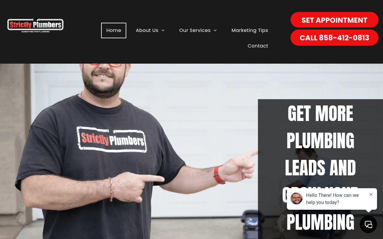
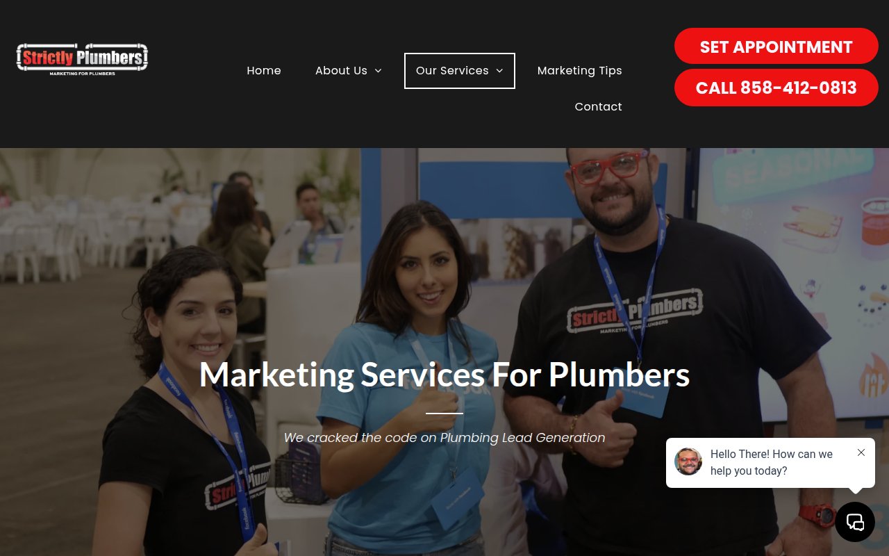
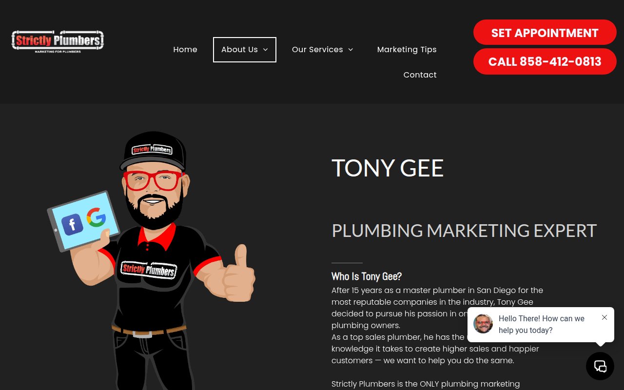
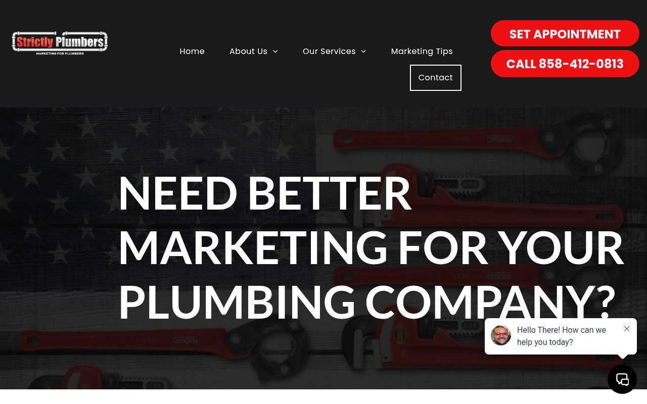
The homepage hero features founder Tony Gee front and center. Tony was a plumber for 15 years before switching to marketing. That story is the entire brand of Strictly Plumbers, and it works because plumbers are reasonably skeptical of marketers who’ve never unclogged a drain.
Conversion optimization is aggressive. The phone number appears seven times on the homepage, backed by an appointment scheduler and chat widget. The homepage is massive (57,000+ characters) packed with testimonials and proof points for 500+ plumbing company clients. The design is loud, but plumbers aren’t shopping for aesthetics.
There’s no case studies page with detailed ROI breakdowns. But for a niche agency targeting a single trade, the founder’s industry background substitutes for the case studies and badges a generalist agency would need.
Collins
Letting credentials speak for themselves
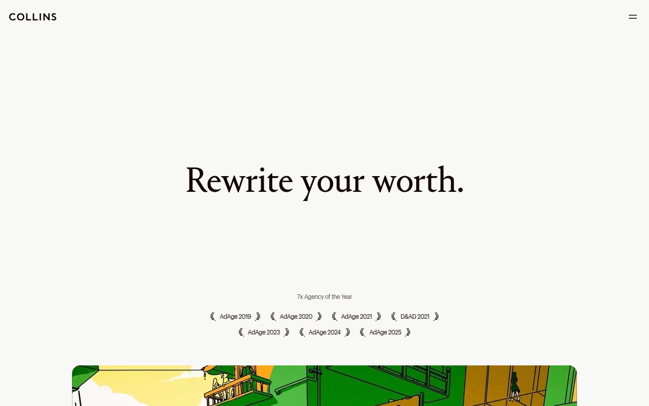
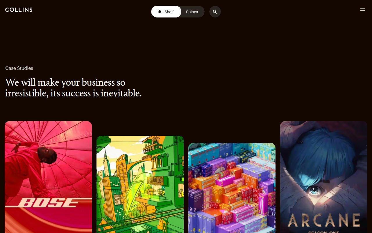
Collins opens with “Rewrite your worth.” in centered serif typography on a cream background. No phone number, no lead form, no chat widget, no CTA above the fold. Seven consecutive AdAge Agency of the Year awards sit below the headline.
Navigation hides behind a hamburger menu. No services page, no blog, no team section. The site optimizes for perception, not inbound leads.
This approach only works if you’re Collins. An agency without seven consecutive Agency of the Year awards would look anonymous, not exclusive. But the lesson is real: if your work is genuinely distinctive, letting it speak without sales infrastructure is a positioning statement.
Scorpion
Four-channel conversion bar
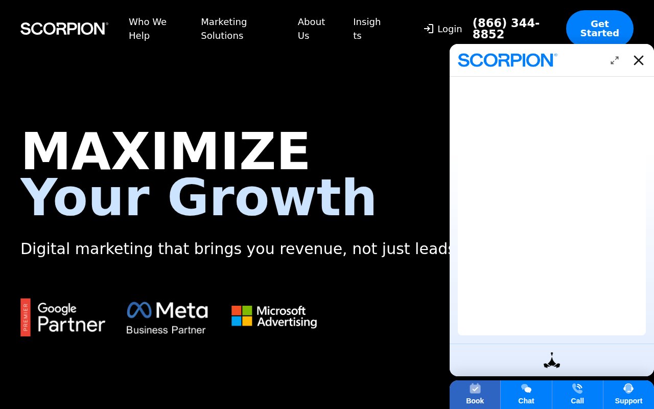
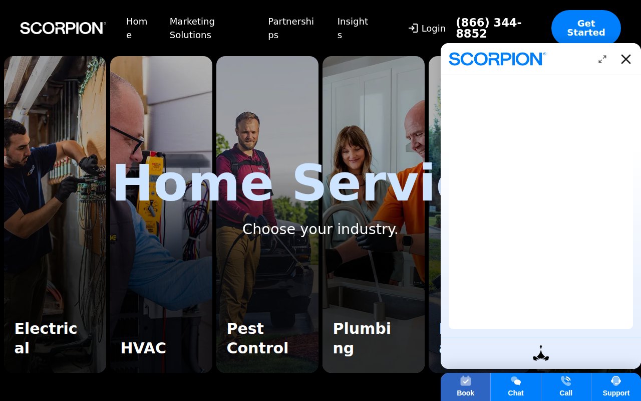
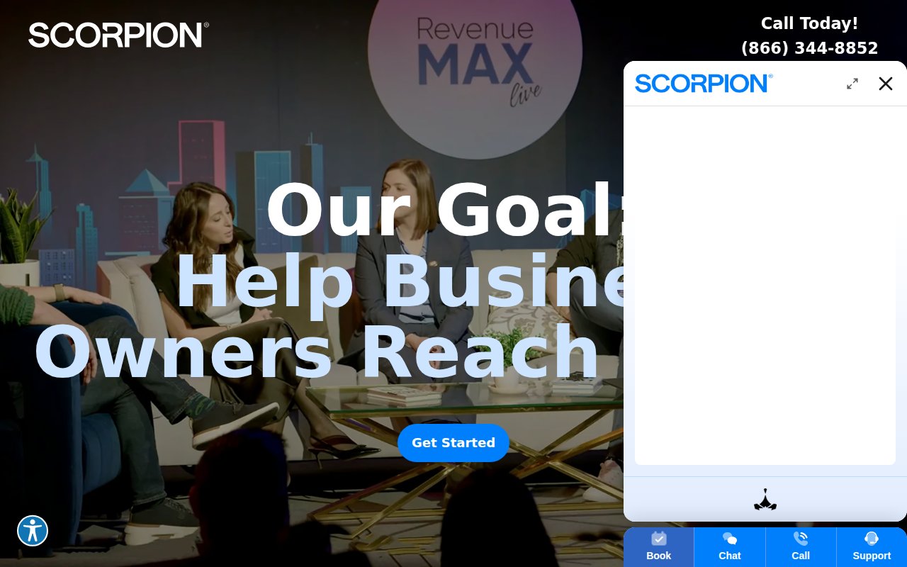
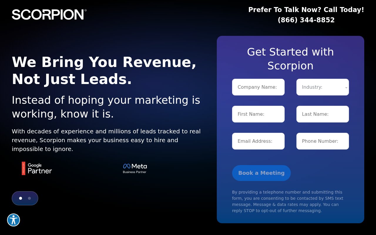
Scorpion organizes its entire site by industry vertical (home services, legal, medical, franchise) rather than by service type. A plumber visiting the site doesn’t care about “PPC management” as an abstract service. They care about “marketing for plumbing companies.” Scorpion speaks their language.
A sticky bottom bar offers four contact options (book, chat, call, support). The headline, “Digital marketing that brings you revenue, not just leads,” speaks directly to business owners tired of vanity metrics.
The weak spot is team authenticity: no staff photos or individual bios on the about page. For a company positioning as a partner to local businesses, showing the humans behind the platform would strengthen the pitch. Their RevenueMAX platform leans on AI, but the site could use more warmth.
NoGood
Visual identity built for enterprise clients
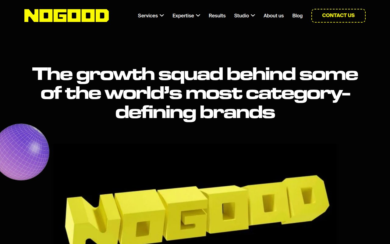
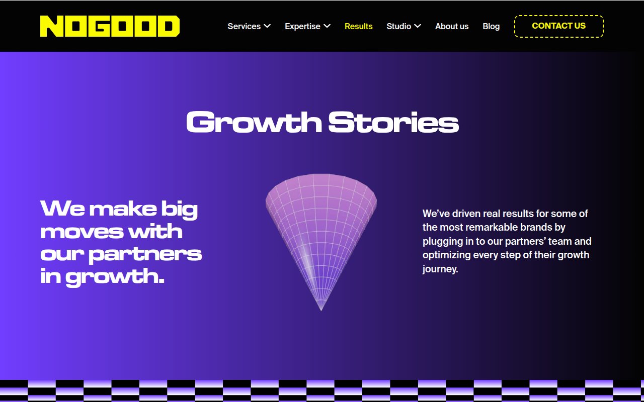
NoGood opens with an animated 3D logo on a black background, positioning as “the growth squad behind some of the world’s most category-defining brands.” Nike and other global brand logos back the claim.
The visual style filters for exactly the clients they want: venture-backed companies and enterprise brands. Their “growth squad model” embeds a cross-functional team inside the client’s business instead of running a traditional retainer, and the results page shows case studies with measurable outcomes.
Conversion paths are basic: a contact link and chat widget, but no phone number and no lead form above the fold. The site relies on brand appeal and case study depth over conversion mechanics. That’s a deliberate trade-off for the enterprise audience (CMOs don’t usually fill out lead forms), but smaller prospects might bounce.
Ignite Visibility
Award badges stacked as trust signals
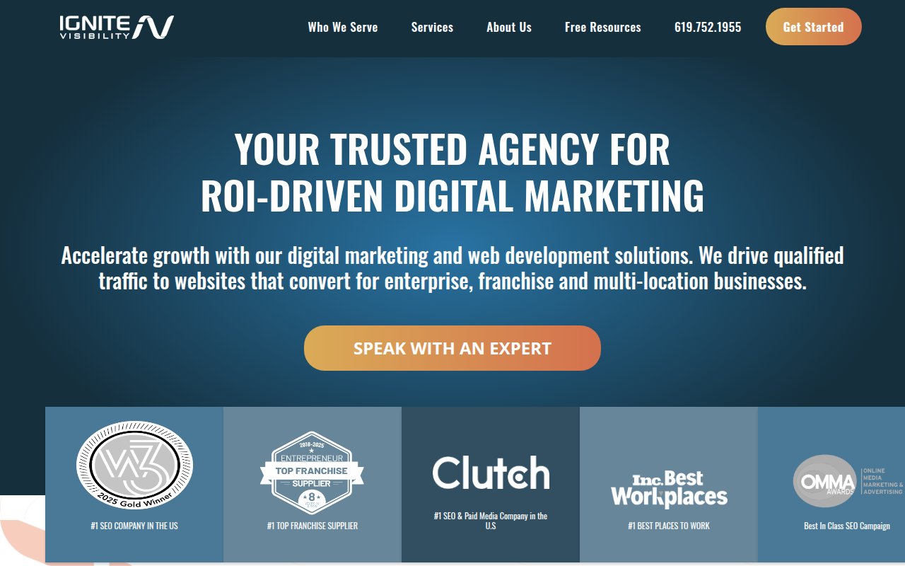
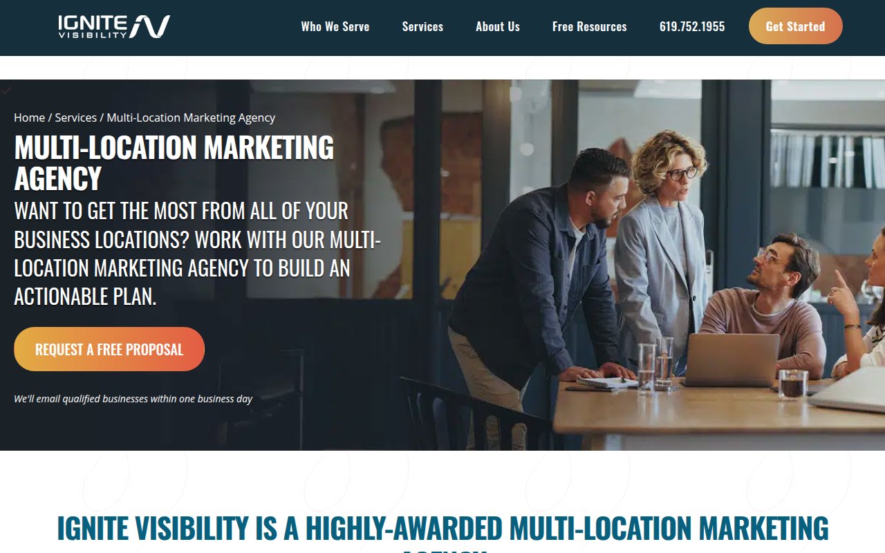
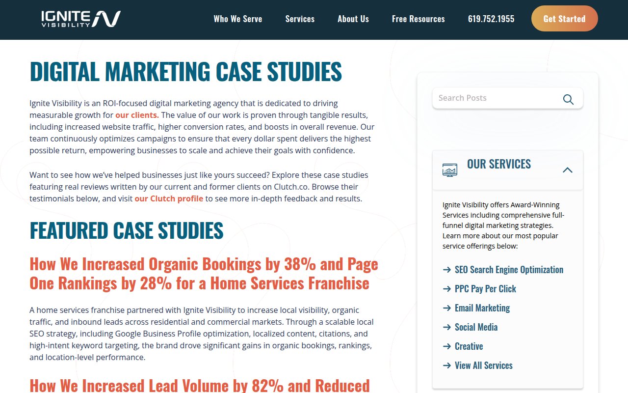

Ignite Visibility leads with sheer volume of third-party validation. Below the fold is a wall of awards, and unlike most badge walls, each one is independently verifiable.
The hero skips straight to ROI and drops visitors into a consultation booking flow. Service pages go deep, especially the multi-location marketing page covering franchise-specific challenges that generalist agencies skip.
The about page stays corporate, with some leadership detail but nothing deeply personal. Adding founder video content or named-team case study attributions would round out the credibility story.
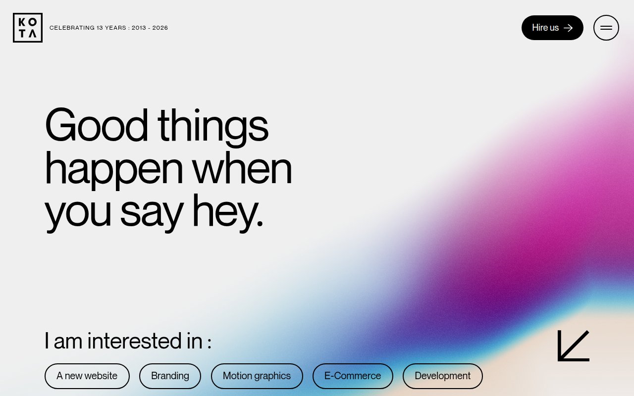
Kota
Design-as-differentiator positioning
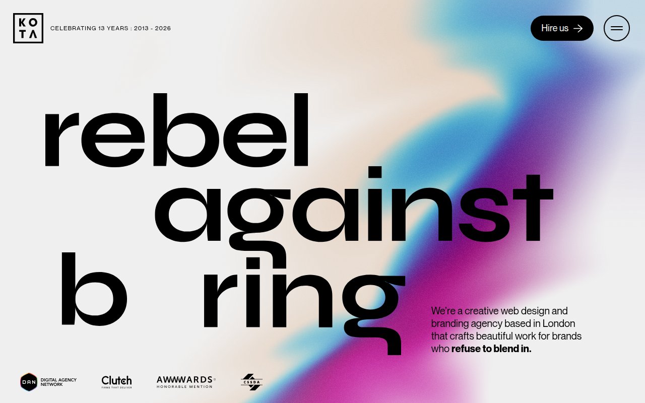
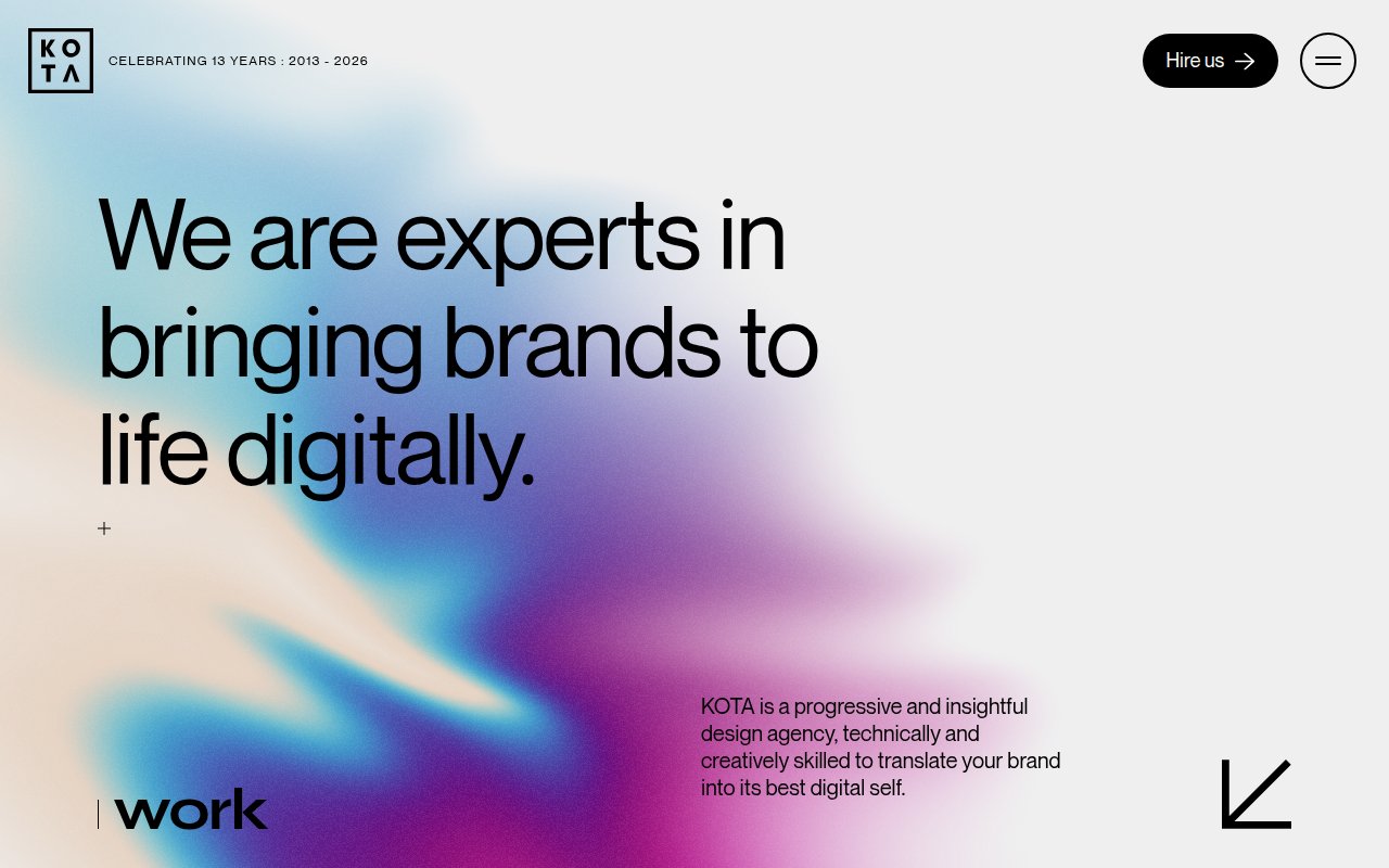
The homepage is a single provocative statement filling the entire screen. Kota is a web design and branding agency, so the homepage is the pitch. Award badges from Clutch, Awwwards, and other design recognition platforms anchor the bottom of the hero.
Built on Next.js (explaining the smooth page transitions), celebrating 13 years of work. The Work page lets the projects sell themselves.
The gap is everything around the portfolio. No services page, no blog, no team section. The portfolio carries the site, but a prospect comparing Kota to another agency has no way to learn about the people, process, or pricing without initiating contact.
True North Social
Content depth as SEO strategy
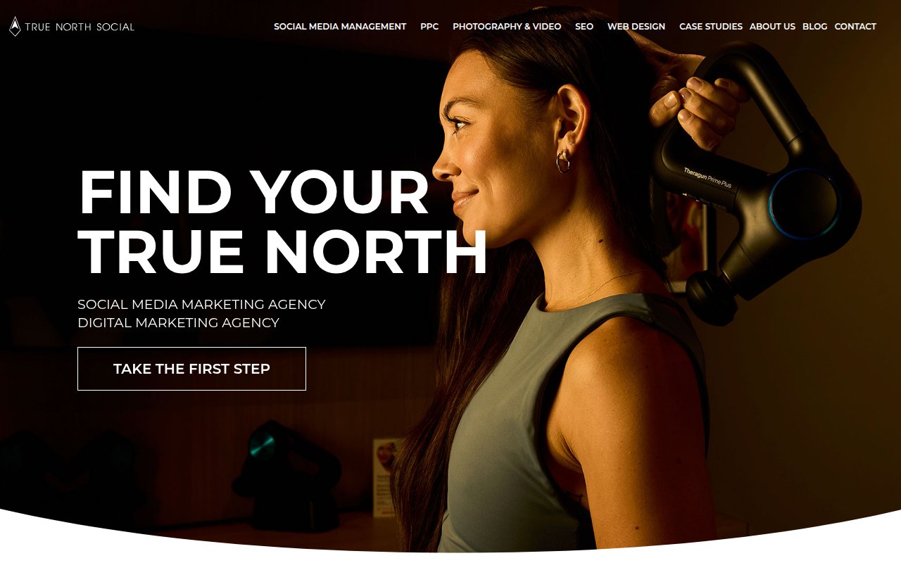
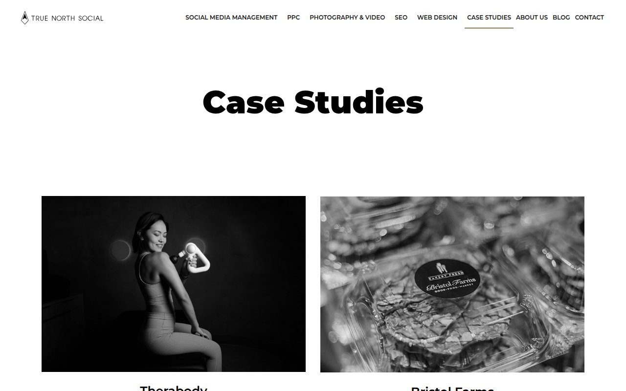
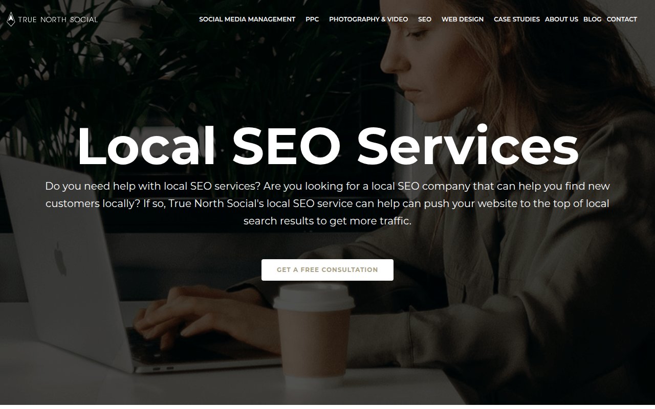
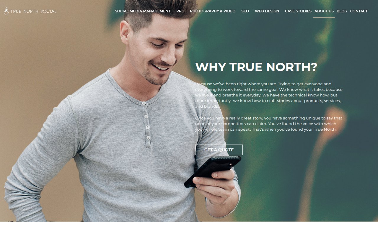
True North Social bets on content volume. Every service page runs 30,000+ characters, and the about page alone exceeds 36,000 characters. The homepage looks more like a luxury brand than a social media agency. Phone number is visible throughout, the navigation lists every service without hiding behind dropdowns, and case studies show real client results with specific metrics.
The volume is also the weakness. Pages run long enough that key information gets buried. A prospect looking for pricing has to scroll through essay-length content. Tighter editing and jump links would help the user experience without sacrificing SEO value.
Digital Silk
Fortune 500 logos as social proof
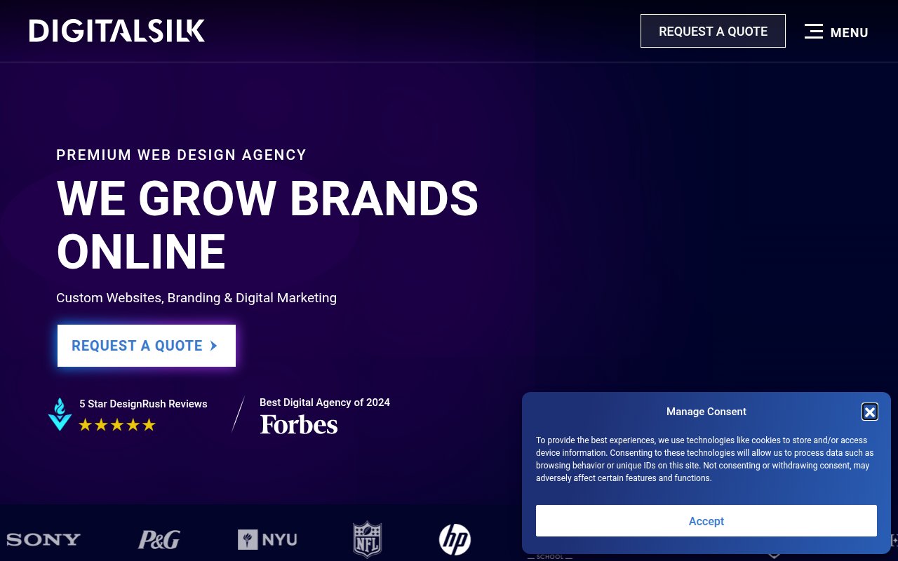

Digital Silk opens with a direct hero headline. Forbes “Best Digital Agency of 2024” and DesignRush 5-star reviews add third-party validation on top of the client prestige.
“REQUEST A QUOTE” appears in the header and as a hero CTA. The phone number shows up five times throughout the page. The overall feel is enterprise-grade, designed for a marketing VP at a Fortune 500 company rather than a small business owner.
Where it falls short is depth. The homepage carries the weight of the entire site, but individual service pages don’t go nearly as deep as competitors like Ignite Visibility or True North Social. For prospects researching a specific service, there’s less content to evaluate before reaching out.
Branding Los Angeles
Tagline paired with persistent booking CTA
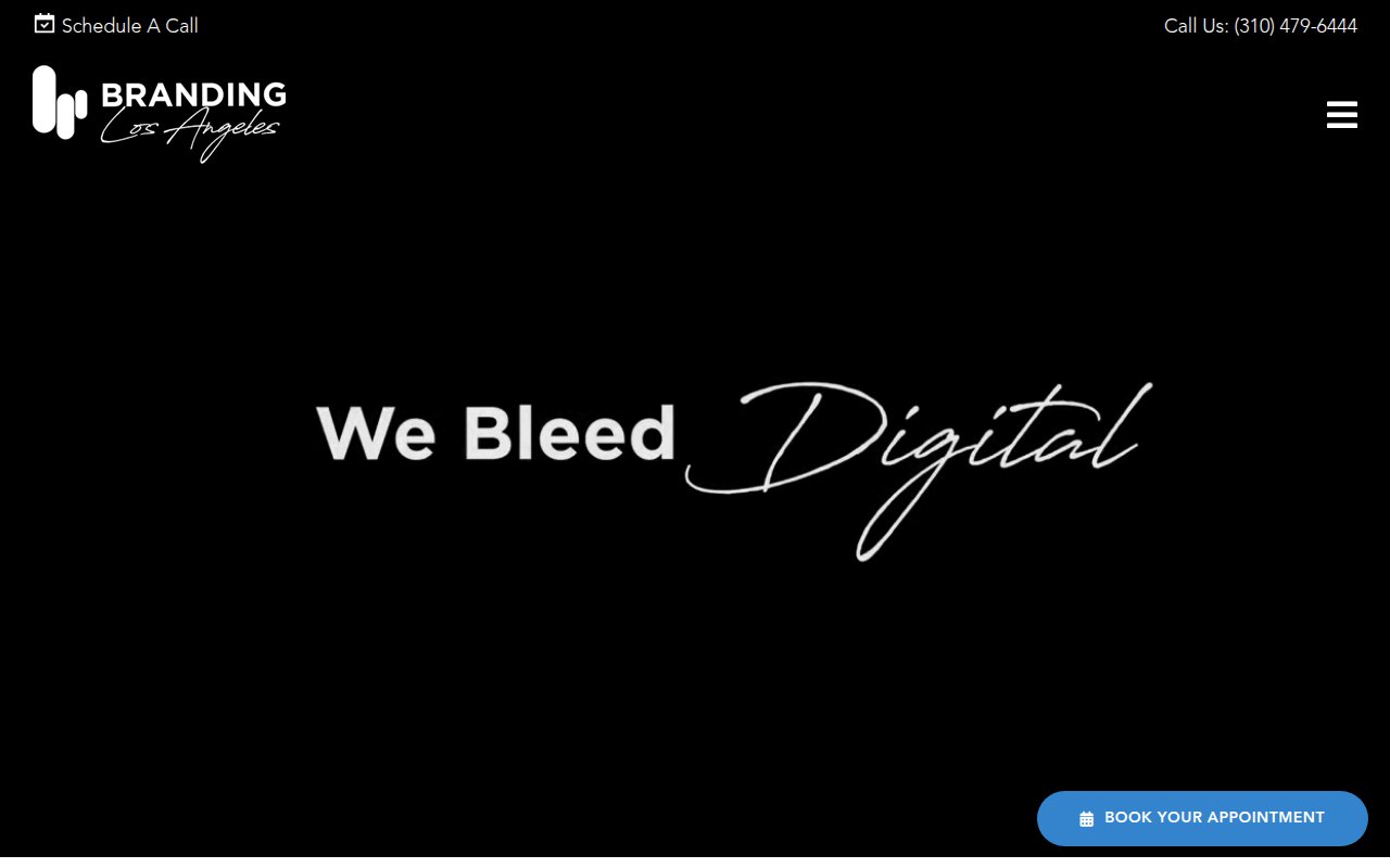
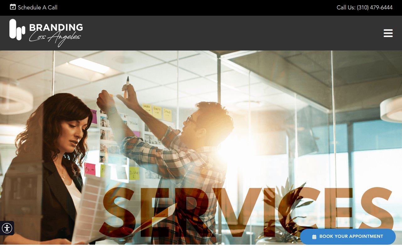
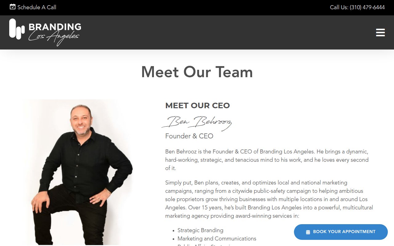
Branding Los Angeles covers a wide range of services and the site reflects that breadth. The phone number and a sticky appointment button follow visitors through every page. The client gallery showcases work across industries, and the team page introduces staff with real photos. Being a multi-cultural branding agency in LA sets them apart from agencies that only do digital.
The breadth is also the challenge. Covering that many services means no single page goes deep. A prospect looking for a social media specialist might wonder whether an agency that also does public affairs can be best-in-class at their specific need. More detailed case studies per vertical would help.
What the best marketing agency websites have in common
Phone number in the header, always
Nearly every top-scoring agency site puts a phone number in the global header. SmartSites, Hook Agency, Ignite Visibility, Scorpion, Digital Silk, True North Social, Branding Los Angeles. The agencies that skip it (Collins, NoGood, Kota) are either prestige brands or targeting enterprise buyers who don't cold-call.
Third-party proof over self-praise
The highest-converting agency sites lead with verifiable awards, partner badges, and review counts rather than self-written claims. Google Premier Partner badges, Inc. 5000 rankings, Clutch reviews, and AdAge awards carry more weight than "We're the best agency in [city]." The agencies with the most third-party validation scored highest on conversion.
Case studies with numbers, not just logos
Most agencies we reviewed show client logos. The best ones go further with dedicated case study pages showing specific results: traffic increases, lead volume, revenue impact. Hook Agency, SmartSites, Ignite Visibility, and NoGood all publish results pages with measurable outcomes. Logos establish who you've worked with. Case studies prove what you actually did.
Audience-specific language over generic marketing speak
The agencies that specialize use their audience's vocabulary. Strictly Plumbers talks about "plumbing leads." Scorpion organizes by industry vertical. Hook Agency says "Championing Hometown Heroes" to contractors. Generic agencies say "we help businesses grow." Specific ones say "we help plumbers book more jobs."
Multiple conversion paths for different buyer types
The strongest sites offer phone, form, meeting scheduler, and chat as parallel options. Scorpion's sticky Book/Chat/Call/Support bar is the best example. SmartSites stacks an inline form, sticky sidebar, and phone number. Prospects have different preferences, and agencies that force everyone through a single contact form leave money on the table.
How to build your marketing agency website
-
Lead with proof, not promises. Your homepage should show third-party validation (awards, partner badges, review counts, client logos) above the fold. The agencies in our research that scored highest on conversion all proved their claims with external evidence rather than self-written copy.
-
Make contact frictionless from every page. Phone number in the header, a CTA that follows the visitor as they scroll, and at least two contact methods (form + phone, or form + meeting scheduler). SmartSites puts a lead form directly in the hero. Scorpion offers four contact methods in a sticky bar.
-
Publish case studies with specific results. “We helped Company X” is a testimonial. “We increased Company X’s organic traffic by 340% in 12 months” is a case study. Dedicated case study pages with measurable outcomes consistently separated the highest-converting agencies in our review from the ones that just looked good.
-
Specialize your messaging, even if your services are broad. Scorpion organizes by industry. Strictly Plumbers serves one trade. Hook Agency targets home services. If you serve multiple industries, create dedicated landing pages for each vertical with industry-specific language and relevant case studies.
-
Show your team. Agency work is relationship-driven. Prospects want to know who they’ll be working with. Hook Agency and Animalz have real team pages with individual bios. Collins and Scorpion skip this entirely. Unless your brand reputation precedes you, a team page with real photos and bios builds trust that no badge wall can replace.
-
Create deep service pages for SEO. True North Social’s 30,000-character service pages are extreme, but the principle is sound. Each service you offer should have its own page with enough depth to rank for “[service] + [location]” or “[service] + [industry]” searches. A single “Services” page listing everything in bullet points won’t rank for anything.
If you’re a solo consultant rather than a multi-person agency, our marketing consultant website examples cover designs built around personal authority.
Key Takeaways
- Put third-party proof (awards, partner badges, verified review counts) above the fold. Self-written claims don't convert. External validation does.
- Offer multiple contact methods from every page: phone in the header, a form or meeting scheduler, and ideally a sticky CTA. Scorpion's four-option bottom bar is the best example we found.
- Publish case studies with specific, measurable results. Client logos prove who you've worked with. Case studies prove what you accomplished.
- Specialize your language by industry or vertical, even if you serve a broad market. "We help plumbers book more jobs" converts better than "we help businesses grow."
- If you have direct industry experience (like Strictly Plumbers' founder who was a plumber for 15 years), lead with it. Authenticity beats polish for niche audiences.
- Create dedicated, detailed pages for each service offering. Each page is a separate SEO entry point and gives prospects the depth they need to self-qualify.
How we picked these sites
We started with a broad scan of hundreds of marketing agency websites, filtering for companies with strong third-party signals: high Google Business Profile ratings, verified reviews on Clutch and G2, meaningful organic search traffic, and recent site updates. We also reviewed coverage from Ad Age, Adweek, and The Drum to find agencies worth evaluating that don’t necessarily dominate search results for “best marketing agency.”
From that pool, we selected dozens of the top sites and scored each on five criteria: UX quality, conversion optimization, social proof integration, team authenticity, and SEO coverage. Every site got a multi-page review covering the homepage, services page, about page, case studies, and any standout pages like pricing or booking flows.
The sites featured here earned the highest overall scores. Each one made the cut because it does something specific well, not because it’s the “best” at everything. The goal is a collection where every site teaches a different lesson about what works for marketing agency websites.
Frequently Asked Questions
What should a marketing agency website include to win clients?
The highest-scoring agency sites in our review all share a few things: social proof above the fold (awards, partner badges, or client logos), a clear conversion path within the first scroll (phone number, lead form, or meeting scheduler), and case studies with measurable results. The agencies that scored lowest had beautiful design but buried their contact information or skipped case studies entirely.
How much does a marketing agency website cost to build?
Based on the sites we reviewed, most run on WordPress ($5,000-$25,000 with a developer) or custom builds ($30,000-$100,000+). Kota runs on Next.js for performance, and Scorpion appears to use a proprietary platform. For a small or mid-size agency, a well-configured WordPress site with a premium theme, case study pages, and a booking integration covers the essentials. The difference between a $10K site and a $50K site is usually custom animation and interactive elements, not conversion effectiveness.
Should a marketing agency website show pricing?
Almost none of the agencies we reviewed show pricing publicly. The notable exception is Hook Agency, which publishes a full pricing page and pairs it with a 14-minute demo video. That transparency is a differentiator precisely because it's rare. For most agencies, the service is too customized for fixed pricing, so the better move is making the path to a quote frictionless: lead form above the fold, phone in the header, meeting scheduler one click away.
 Accounting Firm Websites: 17+ Design Examples (2026)